
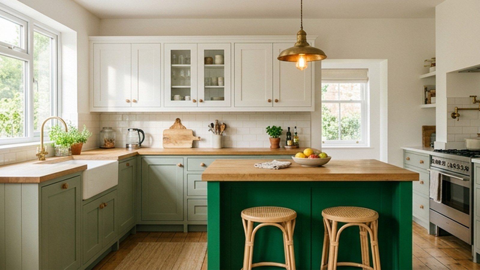
Green is the easiest bold color to live with in a kitchen, and the hardest to pick correctly on the first try. If you want a kitchen that feels calm on a Tuesday morning and still looks intentional at a dinner party, the answer usually sits between sage and moss. This guide walks through fifteen real ways people are using green right now, from a pale gray-green to a nearly black forest shade.
I have repainted my own kitchen island twice chasing the right green, and both times the swatch looked nothing like the wall once it was up. Lighting changes everything with this color family more than almost any other. A sage that reads soft and neutral in a north-facing kitchen can turn distinctly minty under warm bulbs, and a moss that looks rich in a showroom can go muddy in a room with small windows.
By the end of this piece you will know which undertone suits your light and whether to commit to full cabinetry or start with an island. I have included a comparison table and a cost breakdown, because the price gap between a sample pot and a full cabinet repaint is bigger than most people expect. Read through the fifteen approaches before buying a single can of paint.
Why Green Became The Kitchen Neutral
Green earned its place as a genuine kitchen neutral over the last several years, and it happened for a reason that has nothing to do with trend cycles. Unlike navy or black, green sits close enough to the natural world that it reads as calming rather than dramatic, even in a saturated shade. Designers started treating it the way they once treated gray, as a backdrop that carries personality without fighting the room’s other finishes.
The undertone is what determines whether a green reads as a neutral or a statement. A green with more yellow in its base, like olive or moss, behaves like a warm neutral and pairs easily with brass and wood. A green with more blue, like hunter or true forest, behaves more like navy and wants cooler metals such as nickel or matte black.
| Green Family | Undertone | Best Paired Metal | Best Paired Wood |
|---|---|---|---|
| Sage | Cool gray-green | Brushed nickel, unlacquered brass | White oak, ash |
| Moss | Warm yellow-green | Aged brass, bronze | Walnut, honey oak |
| Emerald | True, saturated | Polished brass, gold | White oak, light maple |
| Hunter | Cool, deep blue-green | Matte black, pewter | Walnut, dark oak |
| Olive | Warm, muted | Aged brass, bronze | Reclaimed wood, walnut |
I lean toward sage for most kitchens because it forgives the widest range of lighting conditions. That bias is built from years of watching client kitchens go sideways with a green too saturated for the available light. If your kitchen gets strong afternoon sun, push toward emerald or hunter without it turning garish, but if your light stays mostly indirect, stay closer to sage or a muted olive.
Planning Before You Commit To A Color
Committing to a full green kitchen without testing the color against your walls and counter is the fastest way to end up repainting within a year. Paint swatches under store lighting are close to useless for this decision, since fluorescent bulbs shift green dramatically toward blue. Buy a sample pot in your top two or three choices and paint a two-foot square directly on the surface you plan to change.
Watch that sample patch across a full day, not just once. Morning light, midday light, and evening lamp light will each pull a different quality out of the same green. A shade that looks perfect at 2pm might look flat and gray by 7pm under your kitchen’s overhead fixtures.
Think through your existing fixed finishes before falling in love with a green on a screen. Your countertop, backsplash, and flooring are the hardest and most expensive things to change, so the green needs to work with what is already there. A warm butcher block counter pulls naturally toward moss or olive, while a cool white quartz counter opens the door to almost any green.
Working Around A Fixed Countertop Or Floor
A countertop you are not replacing sets real limits on which undertone will look intentional rather than accidental. Warm beige stone or travertine flooring pushes hard against a cool blue-green like hunter, and that clash reads as unplanned even when both elements are attractive alone. Matching the green’s temperature to your fixed warm or cool elements solves most of this friction before it starts.
If your existing floor or counter sits firmly in warm territory, moss and olive will feel chosen together rather than layered on top. If your fixed elements run cooler, sage or hunter keeps that same cohesive feeling. Figure this out before buying paint, since a cabinet repaint runs into real money if the first attempt misses.
1. Sage Green Cabinets As The Warm Neutral Starting Point
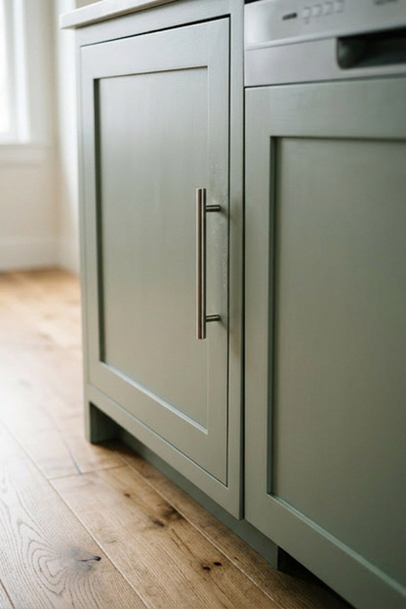
Sage is the green most people should start with if they are nervous about committing to color, because it behaves more like a warm gray than a saturated hue. The gray undertone running through sage means it sits comfortably next to white trim and most countertop colors without demanding the rest of the kitchen change. It is also the shade that photographs most consistently across different lighting setups.
Full sage cabinetry works particularly well in kitchens with generous natural light, where the softness has room to breathe rather than reading as flat. Pair it with brushed nickel or unlacquered brass hardware that develops a soft living finish over time, and keep your countertop lighter so the sage stays the visual anchor. White oak open shelving alongside sage lower cabinets is a combination that has held up well over years.
The risk with sage is picking a version that leans too blue or too yellow for your specific light, since the name covers a wide range of actual formulas. Bring your sample home and test it against your cabinet hardware before ordering doors. A sage that looks perfect on the chip can shift noticeably once it sits next to your specific brass or nickel.
What Sage Costs Compared To A Bolder Green
A full sage cabinet repaint costs close to what any other cabinet color costs, since labor and prep are identical regardless of hue. Where sage saves money over time is resale flexibility, since it reads as a neutral to a wider range of buyers than emerald or hunter would. A professional painter in most markets charges by the linear foot rather than by color choice.
Where you can save further is by painting only the lower cabinets sage and leaving uppers white, cutting material and labor by close to half. This approach also lowers risk if you later decide the shade needs adjusting. Repainting a lower bank of cabinets is a smaller, cheaper project than redoing an entire kitchen.
2. Emerald Green Island For A Bold Focal Point
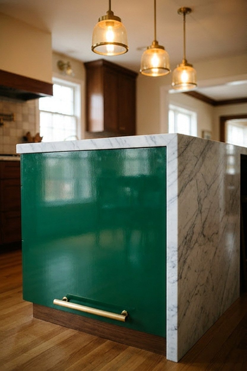
An emerald island lets you commit to a genuinely saturated green without repainting every cabinet, which makes it the lowest-risk way to try a bold shade. Keeping the perimeter cabinets in white or a soft wood tone means the emerald reads as a deliberate focal point rather than an overwhelming wall of color.
The island’s smaller surface also means you can afford a higher-end paint or a lacquered finish that would be cost-prohibitive across a full kitchen. A glossy emerald island under pendant lighting throws genuine drama into an otherwise neutral room, and it gives you an easy exit if your taste shifts. Pair the emerald with polished brass hardware and a stone counter for the fullest version of this look.
Emerald reads differently depending on your lighting temperature, running closer to true green under daylight bulbs and shifting toward teal under warmer bulbs. If your kitchen relies on warm-toned lighting, test the emerald sample under those exact bulbs rather than daylight. The two can look like meaningfully different colors in the same room.
Sizing The Island Color Commitment To Your Space
A small island in a compact kitchen can carry a more saturated emerald than a large island in an open-plan space. In an open kitchen that flows into a living area, a large emerald island competes visually with everything else in view. Consider a slightly muted version, or limit the emerald to the base while keeping the countertop neutral.
3. Moss Green Lower Cabinets With White Uppers
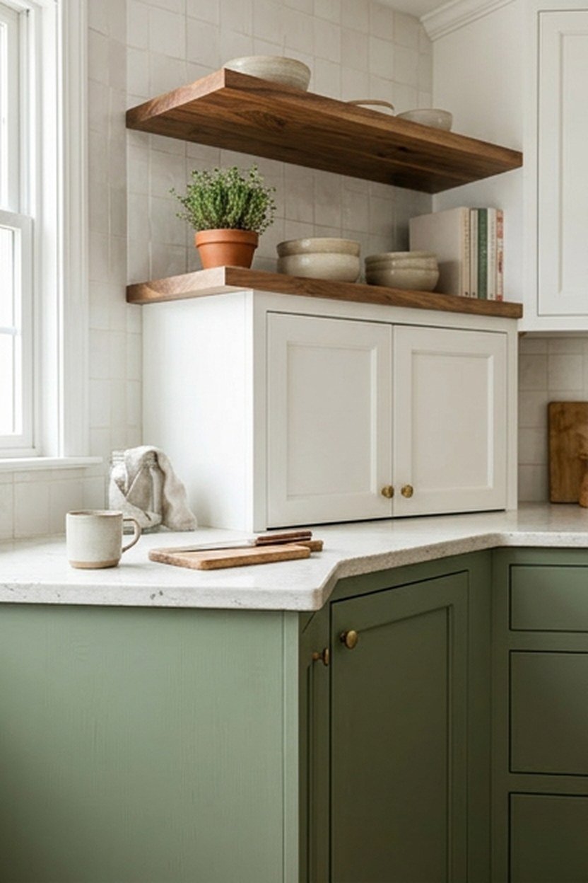
Moss green sits warmer and more muted than sage, closer to the color of actual moss on stone, and it pairs beautifully with warm woods and aged metals. Running moss on lower cabinets while keeping uppers white creates visual weight at the bottom of the room, which tends to feel grounded rather than heavy. This two-tone approach has become one of the most requested layouts in green kitchens.
The warmth in moss means it wants warm-toned companions rather than the cool nickel that suits sage so well. Aged or unlacquered brass hardware develops a living finish that deepens the moss’s warmth over time, and a warm stone counter continues that same temperature through the room. Walnut open shelving above the white uppers ties the palette together without introducing a fourth competing color.
Moss can read muddy in a kitchen with limited natural light, since its yellow-green undertone needs real daylight to stay vibrant rather than sliding toward brown. If your kitchen faces north or has small windows, test moss carefully against sage or a slightly cooler olive before committing. The difference in a dim room can be more noticeable than the paint chips suggest.
Balancing Moss With A Busy Backsplash Pattern
A patterned backsplash tile needs a simpler cabinet color to avoid visual competition, and moss’s muted quality makes it a strong partner for a busier tile choice. Save a more saturated green like emerald for a plain subway or slab backsplash where the cabinet color becomes the pattern itself. This logic holds across most bold cabinet colors, but it shows up especially in moss kitchens paired with handmade tile.
4. Hunter Green Paired With Brass Hardware
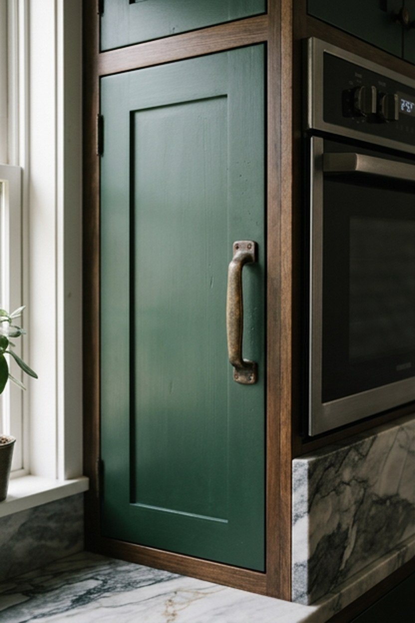
Hunter green is the deepest, most traditional shade in the green family, closer to a true forest color with real blue running through its undertone. It reads formal and a little old-world in the best sense, calling back to wood-paneled studies without feeling costume-like in a modern kitchen. Full hunter cabinetry works best in kitchens with generous ceiling height and strong natural light.
Brass hardware is close to mandatory with hunter green, since the warm gold tone is the one metal that consistently keeps the deep color from reading flat or cold. Polished brass gives a more formal, jewelry-box feeling, while an aged or unlacquered brass softens that formality into something more relaxed. Avoid pairing hunter with chrome or stainless hardware, since the cool metal fights the color.
Hunter’s blue undertone means it wants cooler companion colors elsewhere in the kitchen, even though the hardware runs warm. A white or pale gray countertop keeps the room from feeling too saturated. Marble with gray veining is a classic pairing that has appeared in hunter kitchens for decades because it genuinely works.
When Hunter Green Overwhelms A Small Kitchen
A galley kitchen or small enclosed room can feel noticeably smaller under full hunter cabinetry, since the deep color absorbs light rather than bouncing it back. If your kitchen is under 150 square feet or has limited natural light, consider hunter on an island or a single wall instead of the full room. Keep the majority of the space in a lighter finish that preserves the sense of openness.
5. Olive Green Open Shelving For A Softer Look
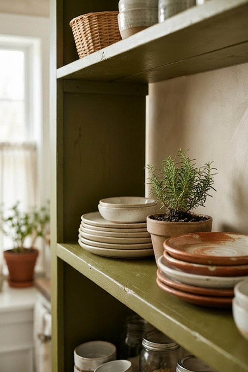
Olive sits at the muted, warm end of the green spectrum, closer to a grayed-out khaki than a true green, and it works exceptionally well on open shelving. Painting a shelf’s back wall in olive creates depth behind stacked dishware without overwhelming the kitchen the way full cabinetry might. This lower-commitment approach suits renters and anyone testing whether green belongs in their kitchen.
The muted quality of olive means it photographs well in almost any lighting condition, since there is less saturation to shift dramatically between warm and cool bulbs. It also ages gracefully alongside wood tones that deepen over the years. A single olive accent wall behind open shelving, paired with white lower cabinets, delivers real personality without asking the whole kitchen to commit.
Because olive leans muted rather than bold, it can occasionally read as simply beige or gray-green depending on the exact formula and the room’s light. If you want the color to read unmistakably as green, test your sample against a true white trim nearby. The contrast helps the eye register the olive correctly rather than folding it into a neutral gray.
Layering Olive With Plants For A Cohesive Palette
Because olive already reads close to a natural, plant-adjacent color, adding real greenery on the open shelves reinforces the palette rather than introducing a competing tone. A few potted herbs or a trailing plant on an olive-backed shelf ties the painted surface to something living in the room.
6. Forest Green Backsplash Tile As An Accent
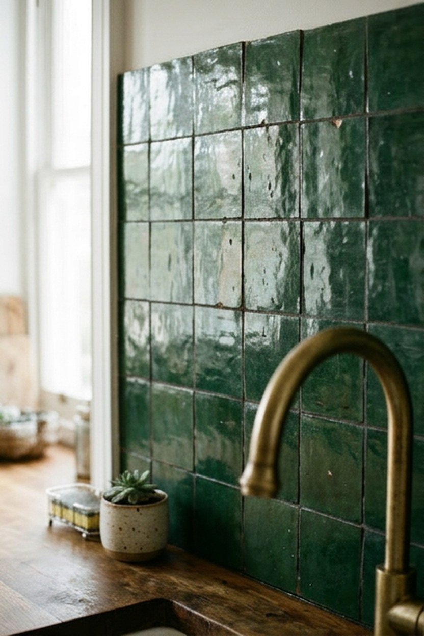
A forest green backsplash lets you introduce a deep, saturated green through tile rather than paint, which changes both the texture and the commitment level. Tile holds its color more consistently across different lighting than paint does, since the glaze reflects light differently than a flat painted surface.
Zellige or handmade tile in forest green adds texture variation across the surface, since no two tiles reflect light identically, which softens the overall effect. Pairing a forest tile backsplash with white or cream cabinetry keeps the tile as the room’s clear focal point. A wood counter in between ties the green to a warm, natural material rather than letting it float against cold stone.
Grout color matters more than people expect with a deep tile shade like forest green. A bright white grout creates strong contrast that emphasizes each individual tile, while a grout closer to the tile’s own tone lets the wall read as a unified block of color. Neither choice is wrong, but decide intentionally rather than defaulting to whatever grout the installer has on hand.
Choosing Tile Size To Control The Green’s Intensity
A small-format tile, like a classic subway or a tiny mosaic, breaks the forest green into more visible grout lines, which softens the overall saturation. A large-format slab tile in the same forest shade reads as a bolder, more continuous block of color. If you want forest green but worry it will feel too intense, a smaller tile format dials back the visual weight without changing the color.
7. Pistachio Green For A Bright Airy Kitchen
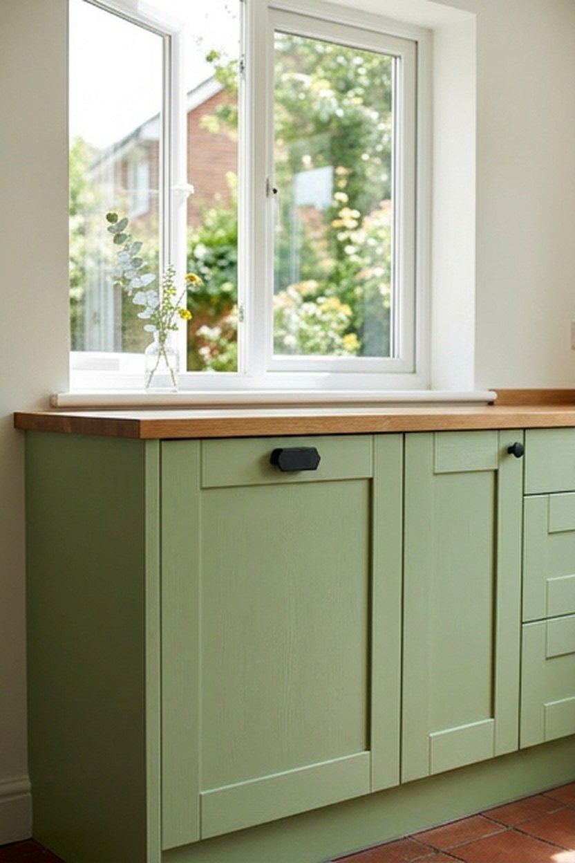
Pistachio sits at the palest, most yellow-leaning end of the green spectrum, closer to a soft mint than a true saturated green, and it brings genuine brightness without the weight that deeper greens carry. This shade works particularly well in smaller kitchens or rooms with limited light, since pale colors bounce available light back into the room. A full pistachio kitchen reads playful and fresh rather than formal.
Pistachio pairs naturally with warm wood tones and brass, since its yellow undertone shares the same temperature family as those finishes. It also works surprisingly well against black accents, where the contrast creates a graphic, slightly retro feeling that has become popular in vintage-inspired kitchens. Keep the rest of the palette simple, since the color already carries enough personality on its own.
The challenge with pistachio is that it can read as dated if paired with the wrong era of fixtures, since pale minty greens have cycled through several decades of kitchen trends already. Pairing it with genuinely current hardware and lighting, rather than anything explicitly retro, keeps the color feeling fresh.
Pistachio In A North-Facing Kitchen
A north-facing kitchen with consistently cool, indirect light is one of the better settings for pistachio, since the pale shade needs less warmth to look good than a saturated color would. The cool light actually flatters pistachio’s minty undertone rather than fighting it, which is the opposite of how that same light treats a warmer moss. If your kitchen struggles with color choices because of cool light, pistachio is worth testing before ruling green out.
8. Dark Green Kitchen Island With Wood Countertop
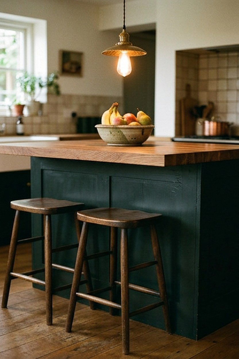
A dark, nearly black-green island paired with a warm wood countertop creates one of the strongest contrast combinations available in a green kitchen. The near-black green reads sophisticated rather than harsh, since there is still a visible hue underneath the depth rather than true black’s total absence of color.
Butcher block or a live-edge wood slab on top of a dark green island softens the color’s intensity and adds warmth that pure stone would not provide. The wood grain becomes genuinely visible against the deep green base, creating a natural focal point that draws the eye without extra decoration. Pendant lighting overhead matters more with this combination, since the dark surface needs illumination to keep its detail visible.
Maintaining a wood countertop requires more care than stone, including regular oiling and caution around standing water. That upkeep is worth knowing before committing if you plan to use the island as a primary prep surface. Many kitchens with this combination reserve the wood top for serving and casual seating, keeping higher-traffic prep on a separate stone-topped counter.
Lighting Requirements For A Very Dark Island
A near-black green surface absorbs significantly more light than a pale or midtone color, so fixture wattage that worked for a white kitchen may leave a dark island looking dim. Plan for slightly brighter or lower-hanging pendants than you might default to. Consider adding under-cabinet or toe-kick lighting nearby to keep the dark surface from reading as a shadowy void in photos.
9. Sage Green Walls With White Shaker Cabinets
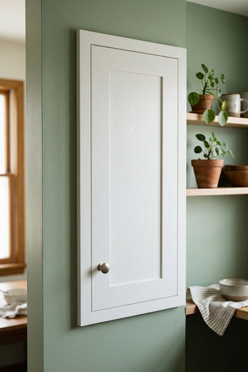
Painting the wall itself sage green, rather than the cabinetry, gives you the color’s calming effect while keeping cabinet doors in a classic white shaker profile that will never feel dated. This approach suits anyone who wants green but is not ready to commit to cabinet doors, since wall paint is a far smaller, cheaper, more reversible project. It also works well in a kitchen open to a dining area, where the sage wall can continue as an accent.
White shaker doors against a sage wall create a clean, classic backdrop that photographs consistently well and suits a wide range of home styles. Open shelving mounted directly on the sage wall lets the paint color show through around displayed dishware, adding depth without a full cabinet commitment. This combination has stayed a steady favorite because it delivers personality while keeping resale considerations firmly in mind.
The one place this approach can fall short is a kitchen with limited wall space visible around the cabinetry, since a narrow strip of sage may not register as a deliberate color choice. Measure your actual visible wall area before committing. Consider extending the sage onto an adjacent breakfast nook or hallway if the kitchen itself does not offer enough exposed wall.
Choosing A Sheen For A Kitchen Wall
Kitchen walls need a more washable sheen than a typical living room wall, since cooking splatter and steam accumulate near the stove and sink over time. An eggshell or satin finish in your chosen sage strikes the right balance between washability and a soft, non-reflective look. A full gloss can feel too clinical and will show every roller mark under kitchen lighting.
10. Two-Tone Green Cabinets, Light Above Dark Below
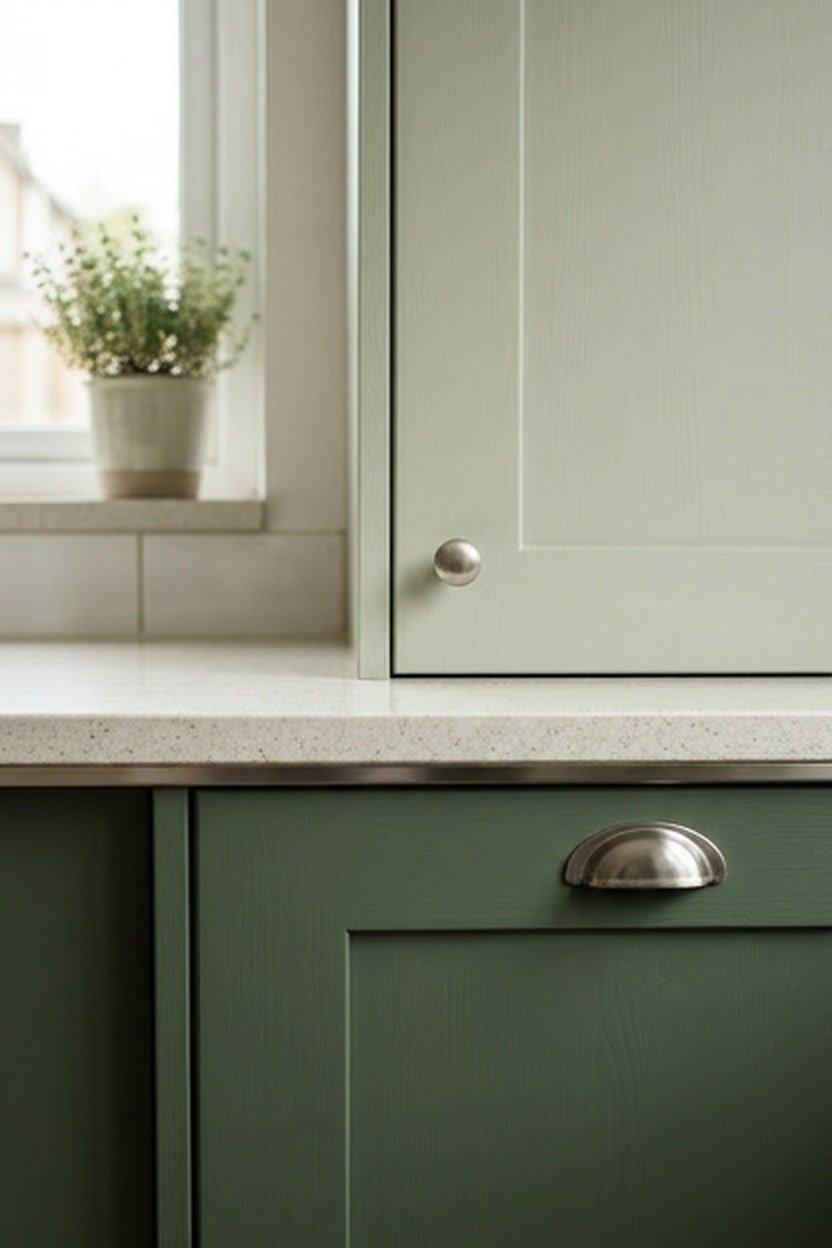
Running two different greens across upper and lower cabinets, rather than pairing green with plain white, lets you build depth entirely within the green family. A common pairing is a pale sage or pistachio on top with a deeper moss or hunter below, keeping the room grounded while bringing lightness up near eye level.
Getting the two greens to work together means staying within the same undertone family rather than mixing a cool sage with a warm moss, since crossing undertones creates a subtle clash. Sticking to either the cool side, sage through hunter, or the warm side, pistachio through moss, keeps the two-tone look feeling intentional. A test board with both samples side by side is worth the extra step before ordering doors.
This approach costs somewhat more than a single-color repaint, since it typically requires more careful masking and two separate paint runs. Most painters charge a modest upcharge for two-tone work over a single flat color. The visual payoff is usually worth the difference for anyone who wants their kitchen to look distinctly custom.
Deciding Which Tone Goes Where
The general rule favors the darker tone on lower cabinets and the lighter tone above, since this mirrors how light naturally falls in a room. Reversing the order, dark on top and light below, is occasionally used for a deliberately dramatic effect but requires taller ceilings and strong lighting. Test this less common arrangement carefully before committing to it.
11. Green Kitchen With Matte Black Fixtures
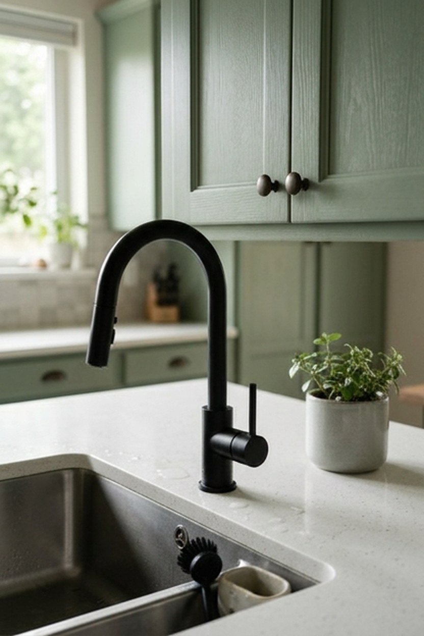
Pairing any shade of green with matte black hardware, faucet, and light fixtures creates a graphic, high-contrast kitchen that reads as distinctly modern rather than traditional. This combination works across nearly the entire green family, from a pale sage to a deep hunter, since black is neutral enough to anchor almost any hue. The black fixtures also tend to photograph sharply, which is part of why this pairing has become common.
Matte finishes read softer and more current than polished black, avoiding the slightly severe look that glossy black hardware can create against a saturated wall. Matte black faucets, pulls, and pendant fixtures work as a cohesive set, and mixing in one warm metal accent keeps the kitchen from feeling entirely cold. This combination pairs particularly well with a white or pale stone countertop for clear visual layers.
The main risk with heavy matte black is that it can read as trend-driven rather than timeless if every fixture in the room matches, since the aesthetic has moved quickly through popularity. Mixing in some warm metal, or keeping less visible elements like door hinges in a different finish, helps the kitchen age more gracefully.
Cleaning Considerations For Matte Black Hardware
Matte black hardware shows fingerprints and water spots more visibly than a brushed or polished finish, since the flat surface has nothing to diffuse the mark. Wiping cabinet pulls and the faucet down regularly keeps the matte black looking intentional rather than smudged. Choosing a slightly textured matte rather than a completely flat finish can also reduce how visible daily marks become.
12. Testing Green Paint Swatches In Your Own Light
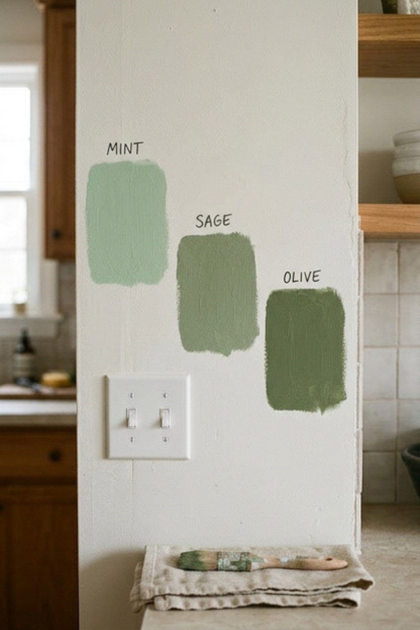
Before committing to any shade above, the single most valuable step is testing real paint samples directly in your kitchen rather than trusting a swatch card. Paint stores sell sample pots for exactly this purpose, and the cost of two or three samples is negligible compared to repainting an entire kitchen that turns out wrong. Paint a section at least two feet square in more than one spot around the room.
Photograph your test patches at different times of day using your phone’s camera without flash, since this approximates how the color will actually look in everyday use. Compare the same patch photographed in the morning, midday, and evening, paying attention to whether the green shifts toward blue, gray, or yellow. This process takes only a few days but prevents the single most common mistake in choosing a kitchen color.
Bring your actual cabinet hardware and a scrap of your countertop material to hold against the test patch, since these fixed elements are what the paint needs to coexist with long-term. A green that looks perfect in isolation can clash unexpectedly with a specific stone pattern. Catching that mismatch on a sample patch costs nothing compared to discovering it after a full repaint.
How Long To Live With A Sample Before Deciding
Give yourself at least a full week living with the test patches before making a final decision, since first impressions of a bold color often shift once the initial excitement settles. A shade that feels thrilling on day one sometimes feels like too much by day five. This waiting period costs nothing and has saved more than a few kitchens from a color chosen in a moment of enthusiasm.
13. Green Cabinetry Paired With Natural Stone Counters
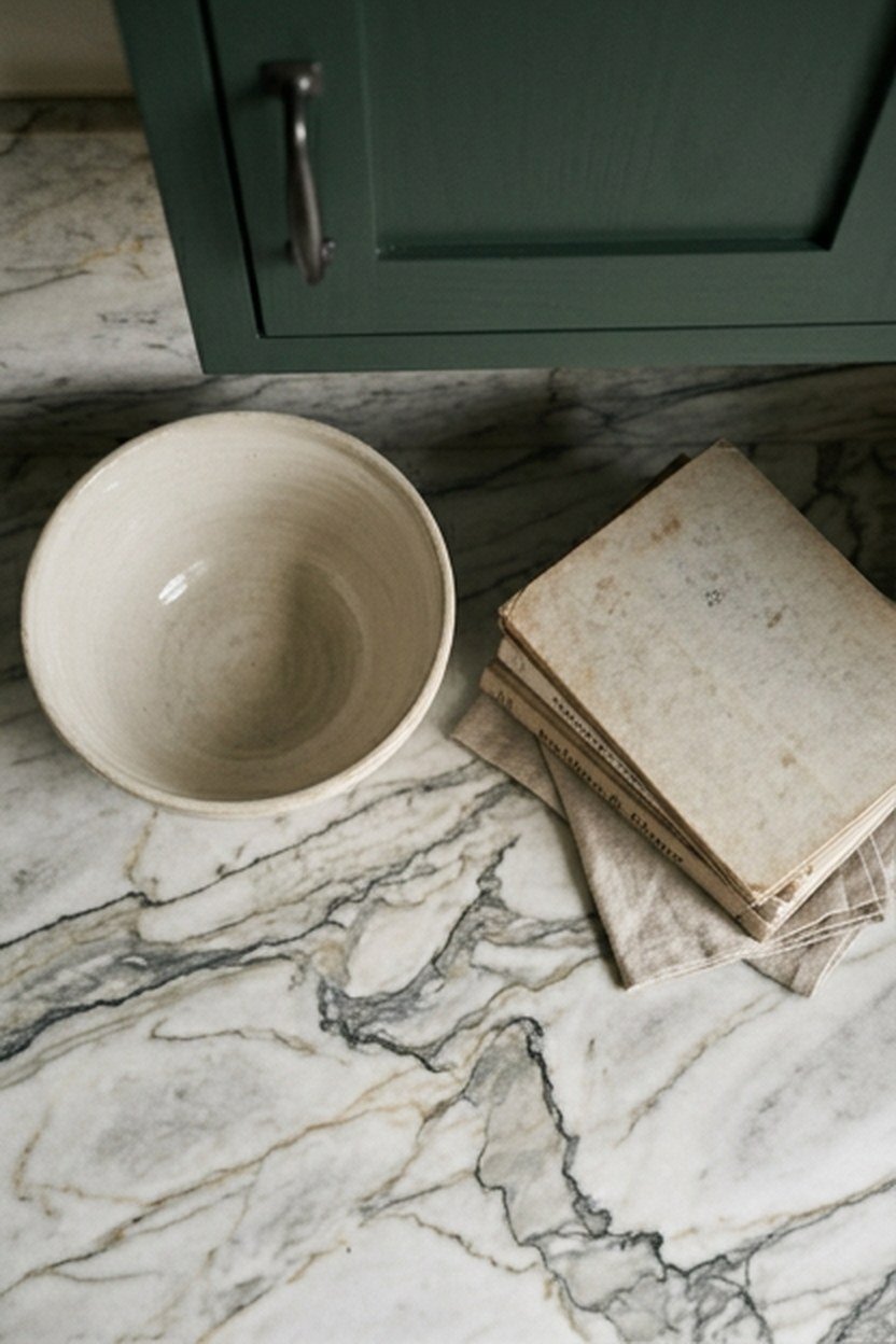
Natural stone, whether marble, quartzite, or granite, brings organic veining and color variation that either sharpens or softens a green cabinet’s presence depending on the specific stone. A cool white marble with gray veining creates crisp contrast against nearly any green, letting the cabinet color read as the clear star of the room. A warmer stone with beige or gold veining pulls the eye toward the countertop instead.
Matching stone veining color to your green’s undertone keeps the pairing cohesive rather than accidental. A cool sage or hunter benefits from a stone with gray or blue-gray veining, while a warm moss or olive looks more intentional against a stone with gold or beige movement.
Natural stone carries a real cost premium over engineered quartz, often running substantially higher per square foot depending on the specific material and its rarity. Quartzite in particular has become popular for green kitchens because it offers the organic movement of marble with better resistance to staining.
Sealing Requirements For Natural Stone Near A Green Cabinet
Porous natural stone like marble needs periodic sealing to resist everyday spills, a maintenance step that engineered quartz does not require at all. Ask your fabricator about the specific sealing schedule for your chosen stone, since granite and quartzite typically need less frequent attention than a soft marble. Staying on top of this maintenance protects the investment in a stone chosen to complement your cabinetry.
14. Green Kitchen Curtains Or Window Treatments
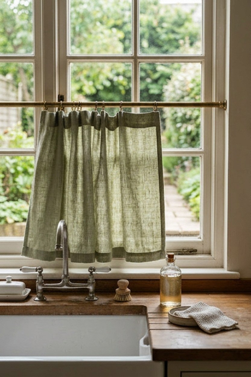
For kitchens where painting or replacing cabinetry is not an option, whether due to renting or budget, a green pattern introduced through curtains delivers real color impact at a fraction of the cost. A botanical print curtain in a range of greens against white cabinetry brings the palette into the room without touching a single fixed surface.
Linen or cotton window treatments in a solid sage or olive tone create a softer, more textural green presence than paint would, since fabric catches and diffuses light differently. This softness works particularly well in a kitchen with several hard, reflective surfaces, since the fabric introduces a textural break that balances the room. A simple curtain covering only the lower half of a window keeps the green visible without blocking light.
Because fabric is easier and cheaper to change than paint or cabinetry, window treatments are also a smart way to test a bolder green before committing to that shade anywhere more permanent. Living with an emerald curtain for a season tells you far more about whether you will tire of the color than any paint chip could. Swapping it out if the answer is no costs nothing beyond the original curtain.
Choosing Fabric Weight For A Kitchen Window
A kitchen window near the stove or sink benefits from a lighter, more washable fabric than a heavy drape, since steam and occasional splatter are simply part of daily kitchen use. A cotton or linen blend in a mid-weight holds its shape without becoming precious. Choosing a pattern or texture that hides minor wrinkling makes machine washing a realistic long-term plan.
15. Choosing Between Warm And Cool Green Undertones
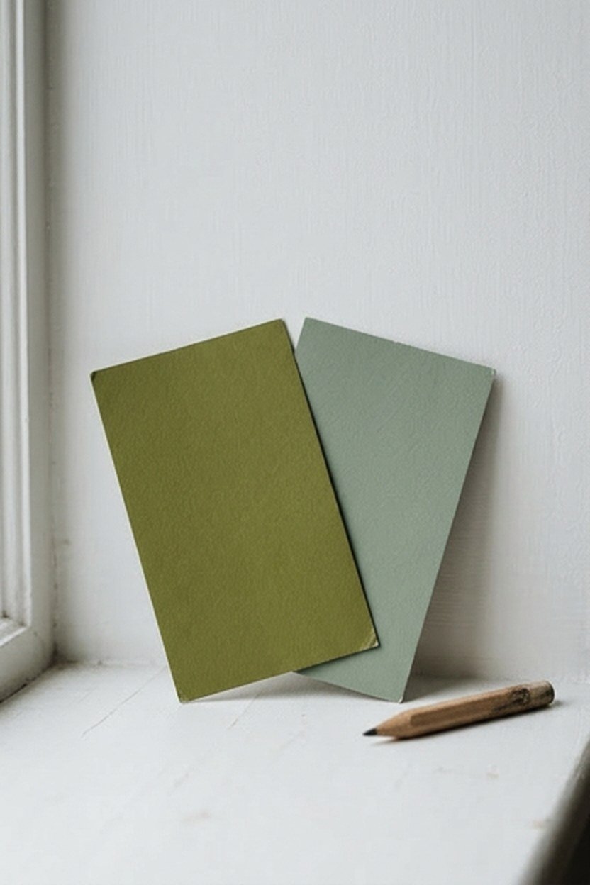
The single decision that determines whether every other choice in this guide will feel cohesive is picking a warm or cool undertone family and staying within it throughout the kitchen. Warm greens, including moss, olive, and pistachio, share yellow undertones that pair naturally with brass, wood, and cream finishes. Cool greens, including sage, hunter, and most true emeralds, share blue undertones that pair naturally with nickel, black, and white or gray stone.
Mixing undertones across a single kitchen, even unintentionally, is the most common reason a green kitchen with individually beautiful elements ends up feeling slightly off. A warm moss island next to cool sage walls creates a subtle visual friction that most people notice without being able to name why the room feels wrong. Identifying your undertone preference before shopping for a single sample pot saves real time.
If you are genuinely unsure which family suits you, look at your own wardrobe or existing home decor for a pattern, since most people gravitate consistently toward warm or cool tones without realizing it. That existing preference is usually a reliable guide for which green family will feel right in your kitchen. It works as a starting point even before you paint a single sample patch on the wall.
A Simple Test For Your Own Undertone Preference
Hold a warm gold-toned object and a cool silver-toned object next to your face or against a plain white background, and notice which one looks more naturally harmonious. This same warm-versus-cool instinct that applies to jewelry and clothing translates directly to which green family will feel right in your kitchen. It is a quick, free test that clarifies a decision people often overthink.
What A Green Kitchen Actually Costs
The price of adding green to a kitchen ranges enormously depending on whether you are painting an accent wall or repainting every cabinet door, so it helps to see the real range laid out before you commit to a plan. Paint itself is inexpensive regardless of color, meaning the cost difference between choices in this guide comes almost entirely from how much surface area you are covering. Labor is the variable that moves the price most.
A DIY approach on cabinetry saves significantly on labor but demands real time and careful prep work, including sanding, priming, and multiple thin coats. Skipping that prep is how a DIY cabinet repaint ends up looking obviously amateur within months. Professional painters charge by the linear foot in most markets, and a full kitchen typically runs into several thousand dollars once labor and materials are included.
| Approach | Typical Cost Range | Time Investment |
|---|---|---|
| Accent wall paint only | Under $100 | One weekend |
| Curtains or window treatment | $50 to $300 | One afternoon |
| Painted open shelving | $50 to $150 | One weekend |
| DIY full cabinet repaint | $200 to $600 in materials | One to two weeks |
| Professional cabinet repaint | $3,000 to $8,000+ | One to two weeks |
| New green cabinetry, full replacement | $10,000 and up | Several weeks |
Starting with the lowest-commitment options, an accent wall, curtains, or a painted shelf, lets you live with green before deciding whether a full cabinet commitment is worth the larger investment. This staged approach has saved more than one client from a full repaint they later regretted. Giving yourself real time with the color before the expensive decision is the cheapest insurance available.
Common Mistakes When Choosing A Kitchen Green
The most frequent mistake is skipping the sample-testing step entirely and ordering cabinet paint based on an online photo or a swatch card viewed under store lighting. Green shifts more dramatically under different light sources than almost any other color family, and a shade that looked perfect in someone else’s kitchen can read completely differently in your own. This single shortcut causes more repainting regret than any other decision in this guide.
A second common error is mismatching undertones between the cabinet color and the room’s fixed elements, like flooring or existing tile. A cool sage cabinet next to warm honey-oak flooring can create a subtle clash that undermines an otherwise well-executed kitchen. Taking the time to identify your fixed elements’ undertones before selecting a green prevents this friction.
The third mistake is choosing too saturated a green for the available natural light, particularly in kitchens with limited windows or a north-facing orientation. A deep hunter or forest green that would look rich in a sun-filled kitchen can read as dark and closing-in in a dimmer room.
Overcorrecting After A Failed First Attempt
When a first attempt at green does not work out, the common overcorrection is abandoning color entirely and retreating to plain white, which often leaves people missing the personality they wanted. A better path is usually to identify specifically what went wrong, whether it was the undertone, the saturation, or the lighting mismatch. Try a more carefully chosen second green rather than giving up on the color family altogether.
Conclusion
Green earns its reputation as a livable, flexible kitchen color because the family spans such a wide range, from a barely-there pistachio to a nearly black hunter. The undertone match between your chosen green and your fixed elements matters more than which specific shade you pick, so spend your testing time there before falling in love with a single paint chip. Start small if you are unsure, with an island, an accent wall, or a curtain.
The fifteen approaches in this guide cover the realistic range of how people are actually using green in their kitchens today, from full cabinetry repaints to a single tiled accent wall. Whichever direction you choose, the testing process matters more than the final shade, since even the most beautiful green on a chip can disappoint if it was never checked against your own light. Take the extra week with a sample patch before committing further.
Frequently Asked Questions
What is the most popular shade of green for kitchen cabinets right now? Sage remains the most requested shade because its gray undertone behaves like a neutral, pairing easily with a wide range of metals and countertop colors.
Does green kitchen cabinetry hurt resale value? A well-executed green kitchen, particularly in a versatile shade like sage or muted olive, has not shown a consistent negative effect in markets where green has become mainstream.
Can I paint over green cabinets easily if I change my mind? Yes, assuming the original paint was properly primed, repainting over green follows the same prep as any cabinet repaint, though a deep hunter may need an extra primer coat.
Is green hard to match with existing stainless steel appliances? No, stainless steel is neutral enough to pair with any green in this guide, though matching your hardware finish to your appliance finish generally looks more cohesive.
Should I choose green for a small kitchen or stick with white? A small kitchen can carry green, especially a pale shade like sage or pistachio that reflects light rather than absorbing it, though test a deep hunter carefully first.
How do I know if a green will look too trendy in a few years? Sticking with a shade that has historical precedent, like sage, hunter, or olive, rather than a color tied to one viral moment tends to age more gracefully.
What is the cheapest way to add green to a kitchen without repainting cabinets? Painting a single accent wall, adding a green curtain, or painting the back wall of open shelving all deliver real color impact for under a hundred dollars.