
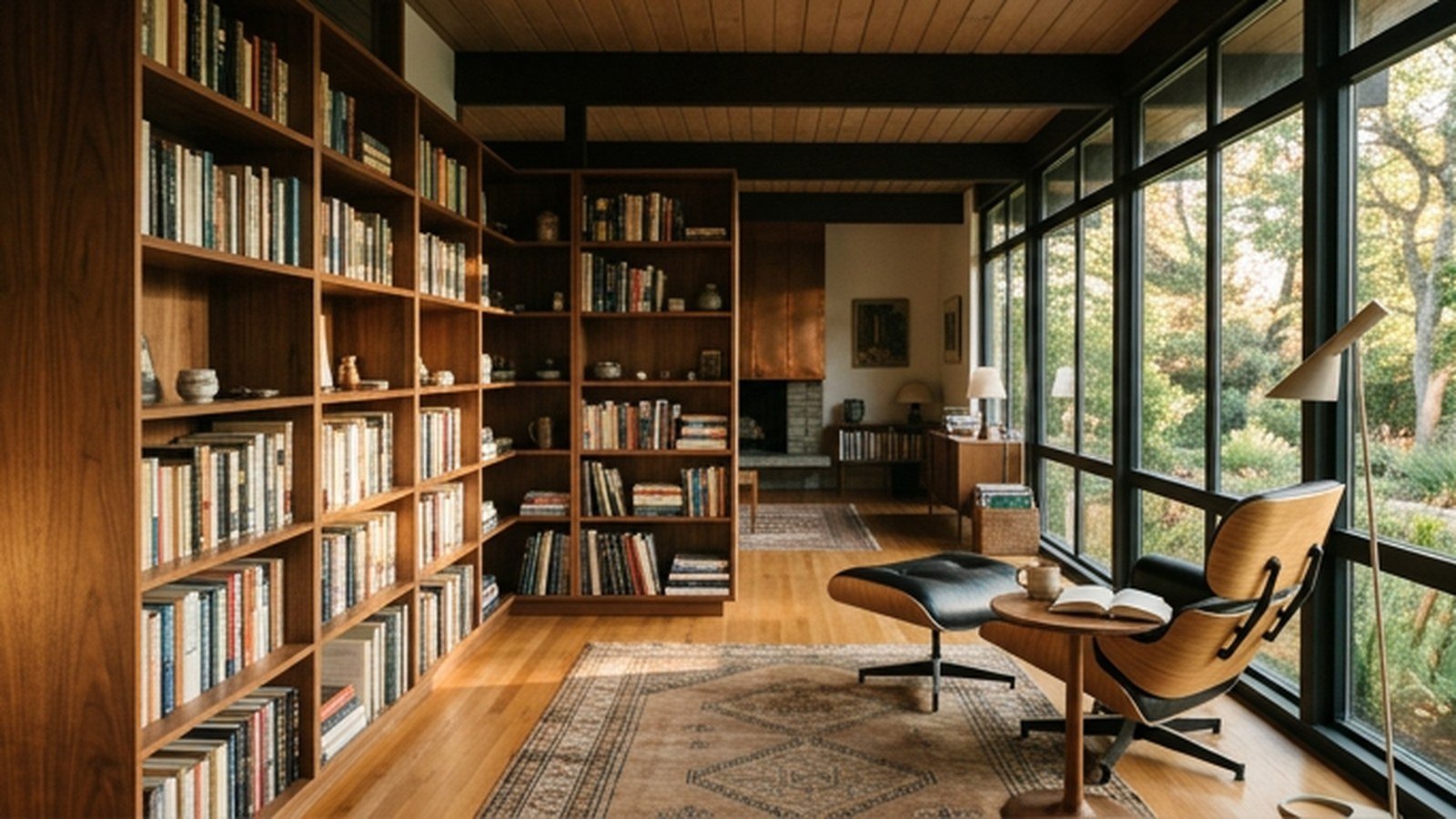
A mid-century modern home library balances warm wood, clean lines, and genuine reading comfort in a way that feels considered rather than themed. The style’s core ideas, exposed structure, organic shapes, and honest materials, translate naturally into a room built around books and quiet time. This guide walks through fifteen real design concepts, from a walnut shelving wall to a sculptural reading chair.
I have designed more than one home library in this style, and the detail that keeps a room from feeling like a period reproduction is restraint. Mixing one or two genuine mid-century pieces with simpler, quieter furniture reads as considered, while filling every corner with era-specific icons reads as a themed set. Getting that balance right matters more than any single piece.
By the end of this piece you will know which concepts are simple weekend updates and which call for real carpentry, along with real costs for each. I have included a comparison table and a cost breakdown, since prices swing enormously between a single accent chair and a full custom shelving wall. Read through all fifteen before planning your own library.
Why Mid-Century Style Suits A Home Library So Well
Mid-century modern design grew out of a genuine belief that furniture should be honest about its materials and structure, favoring exposed wood grain over ornate decoration hiding the construction underneath. A library, defined by function as much as feeling, benefits from this same honesty, since shelving that shows its own grain reads as purpose-built rather than decorative.
The era’s warm wood tones, particularly walnut and teak, bring a genuine coziness that pairs well with the quiet, contemplative mood a library is meant to hold. This warmth also photographs beautifully against the visual texture of book spines lining a shelf, since both elements share an organic, slightly irregular quality.
| Element | Mid-Century Material | Typical Cost |
|---|---|---|
| Shelving wall | Walnut veneer or solid walnut | $1,500 to $6,000 |
| Reading chair | Molded plywood, leather | $500 to $3,000 |
| Area rug | Wool, geometric pattern | $200 to $800 |
| Pendant light | Brass, walnut, glass | $150 to $600 |
| Side table | Walnut, teak, brass legs | $150 to $500 |
Choosing furniture with visible tapered legs, rather than pieces that sit flush to the floor, keeps a mid-century library feeling light and open despite the visual density that a wall of books naturally creates. This detail matters more in a library than in almost any other room, given how much a floor-to-ceiling shelving wall can otherwise weigh down the space.
Planning A Mid-Century Library Around Your Book Collection
Before choosing any furniture or shelving system, take an honest count of your actual book collection, including how much it is likely to grow, since undersized shelving is one of the most common and frustrating mistakes in library design. Planning shelving capacity with real room for growth prevents an expensive retrofit within just a few years of finishing the room.
Consider your library’s natural light and how it interacts with both reading comfort and the books themselves, since direct sunlight can fade book spines and dust jackets over years of exposure. Positioning shelving away from a south-facing window, or adding sheer curtains to diffuse direct light, protects your collection while still keeping the room bright and inviting.
Think about how the room will actually be used, whether primarily for quiet solo reading, as a shared family space, or occasionally for hosting guests, since this use case shapes decisions about seating quantity and layout. A library built purely for solitary reading can prioritize a single excellent chair, while a more social library needs multiple seating options arranged for conversation.
Measuring Wall Space Before Ordering Shelving
Measuring your library’s actual wall dimensions, including any windows, doors, or outlets that interrupt a continuous run, prevents ordering a shelving system that does not fit the specific configuration of your room. This measurement step matters especially for a modular or built-in system, where a mismatch is far more expensive to correct than with a simple freestanding bookcase. A few minutes with a tape measure before ordering protects a significant investment.
1. Floor-To-Ceiling Walnut Shelving Wall

A floor-to-ceiling walnut shelving wall anchors a mid-century library with the era’s signature warm wood tone, creating a genuine focal point that also solves the practical need for real book storage capacity. The visible wood grain running through solid walnut or high-quality veneer catches light differently throughout the day, adding a living quality to what is otherwise a purely functional storage wall.
Choosing open shelving without doors keeps the wall of books themselves as the primary visual texture, letting spines and covers contribute genuine color and pattern to the room without additional decoration. Incorporating a few adjustable shelf heights within the overall design accommodates oversized art books or boxed sets that a uniform shelf spacing cannot handle.
Because a full wall of shelving is a substantial, largely permanent installation, working with a carpenter experienced specifically in built-in furniture ensures the shelving is properly anchored and level across its full span. This professional installation matters more for a floor-to-ceiling piece than for a shorter, freestanding bookcase, given the weight a fully loaded wall of books represents. Budgeting for this professional labor from the start avoids an unpleasant cost surprise partway through the project.
Choosing Between Solid Wood And Veneer Shelving
Solid walnut delivers the most authentic mid-century material experience but carries a real cost premium and can be prone to warping if not properly seasoned, while a high-quality veneer over engineered wood offers similar visual warmth at a lower price point with better dimensional stability. Choosing veneer for a large installation like a full shelving wall often makes practical sense given the cost difference, reserving solid wood for smaller accent pieces. This tradeoff between authenticity and practicality is worth weighing honestly before committing.
2. Sculptural Molded Plywood Reading Chair
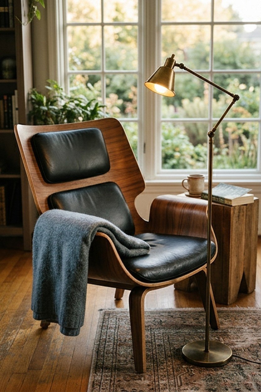
A molded plywood chair, the design language most closely associated with mid-century furniture innovation, brings genuine design history into a library alongside its practical function as reading seating. The curved shell shape, achieved through techniques pioneered in the era, creates an ergonomic seat that supports the body differently than a traditional upholstered armchair.
Pairing the molded plywood chair with a simple wool throw and a floor lamp positioned for reading light creates a complete, inviting reading nook without requiring additional furniture. This minimal pairing lets the chair’s sculptural silhouette remain the clear visual focus rather than competing with a cluttered surrounding setup.
Because a genuine mid-century molded plywood chair, whether an original vintage piece or an authorized reissue, represents a real investment, testing the chair’s comfort in person before purchase matters given how much time you plan to spend reading in it. A visually striking chair that proves uncomfortable for extended sitting fails at its primary function.
Vintage Versus Reissue Molded Plywood Chairs
An original vintage molded plywood chair carries genuine collector value and historical authenticity, though sourcing one in good condition requires patience and often a higher budget than a licensed reissue produced by the original manufacturer today. A quality reissue offers the same design and often improved manufacturing consistency at a somewhat lower cost than a true vintage piece. Choosing between the two comes down to how much the object’s specific history matters to you personally.
3. Geometric Wool Area Rug Underfoot
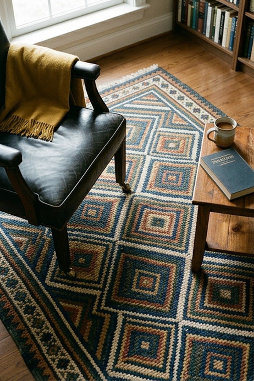
A geometric wool area rug grounds a mid-century library’s seating area, introducing pattern and color at floor level in a way that complements rather than competes with the wood tones dominating the shelving and furniture above. Mid-century geometric patterns, often based on simple repeated shapes, read as considered and period-appropriate without requiring an overly literal reproduction print.
Choosing a rug in a muted, earthy color palette, rather than the boldest possible print, lets the pattern read as sophisticated rather than costume-like. Sizing the rug generously enough to extend beyond the seating area’s furniture footprint, rather than choosing something undersized, creates a more grounded, intentional look. This sizing principle applies to a library rug just as strongly as it does in any other room.
Wool holds up considerably better than synthetic alternatives to years of foot traffic near a reading chair, developing a richer texture with age rather than flattening and pilling. This durability matters given how much time is spent in the same seating area of a library, where foot traffic tends to concentrate in a smaller zone than in a larger living room.
Layering A Smaller Rug Within A Larger Room
In a library large enough to hold both shelving and a separate seating area, layering a smaller geometric rug specifically within the reading nook, distinct from any larger rug covering the room’s main floor, helps define that zone as a distinct space within the larger room. This layering technique is a common mid-century styling approach that translates well into a modern library design. Defining the reading zone this way makes the room feel more intentionally organized rather than furnished as a single undifferentiated space.
4. Brass And Walnut Pendant Light Fixture
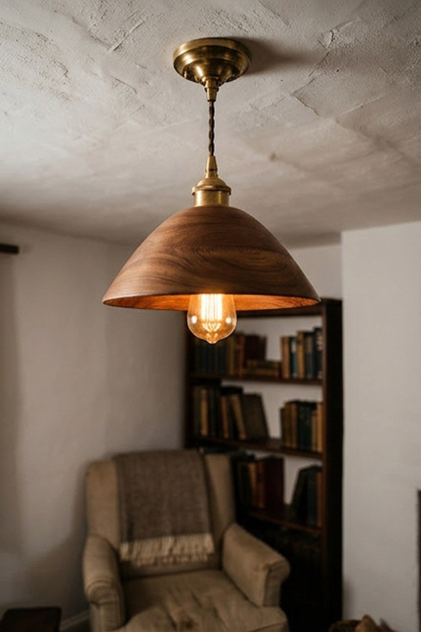
A pendant light combining brass hardware with walnut wood accents brings the era’s signature material pairing directly into the library’s lighting, a detail that affects the room’s mood as much as any furniture choice. Positioning the pendant over a reading nook or centered in the room, depending on the library’s specific layout, provides genuine functional lighting alongside its aesthetic contribution.
Choosing a pendant with a warm-toned bulb, rather than a cooler daylight tone, supports the overall warm, inviting mood mid-century material choices are meant to create throughout the room. A dimmable fixture adds flexibility, letting the room shift between brighter task lighting for active reading and a dimmer, more atmospheric glow for evening relaxation.
Because a pendant light’s exposed brass will develop a natural patina over years if left unlacquered, deciding upfront whether you want this aging process or prefer a lacquered finish that resists tarnishing shapes your long-term maintenance expectations. Both choices are historically accurate to different mid-century pieces, so this comes down to personal preference for how the fixture will look over time.
Positioning A Pendant Relative To Seating
Hanging a pendant light at a height where the bulb sits above eye level when seated, typically around thirty inches above a side table or the arm of a reading chair, provides adequate task lighting without creating glare directly in the sightline of someone reading. This positioning detail matters more for genuine reading function than for a purely decorative fixture. Testing the height with an actual book in hand before finalizing the installation confirms the fixture serves its practical purpose.
5. Teak Wood Library Ladder On A Rail
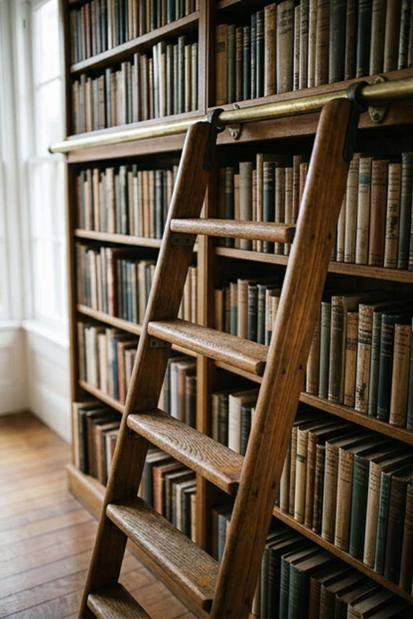
A rolling library ladder mounted on a wall rail brings genuine function to a floor-to-ceiling shelving wall, since upper shelves become difficult to reach safely without one once shelving extends beyond a comfortable arm’s reach. Teak, with its natural weather resistance and warm tone, was a favored mid-century material choice that suits this application both practically and aesthetically.
Choosing a ladder with a secure locking mechanism at each position along the rail prevents unwanted rolling while someone is actually climbing, a genuine safety consideration rather than a purely aesthetic detail. Testing this locking mechanism thoroughly before regular use confirms it holds securely under real weight.
Because a rolling ladder and rail system represents a specialized installation requiring precise measurement and mounting, working with a supplier experienced specifically in library ladder systems ensures proper fit and safe operation. This is not a project suited to rough estimation or a general contractor unfamiliar with the specific hardware involved. Budgeting for this specialized expertise protects both the investment and genuine physical safety.
Ladder Wheel Types For Different Floor Surfaces
Library ladder systems use either a hook-and-rail design, where the ladder hangs from a track, or a floor-guided design with wheels running along a track at the base. Hardwood floors generally accommodate either system well, while a floor with rugs or uneven surfaces may suit the hanging rail design better.
6. Low-Slung Walnut Credenza As A Media And Storage Piece
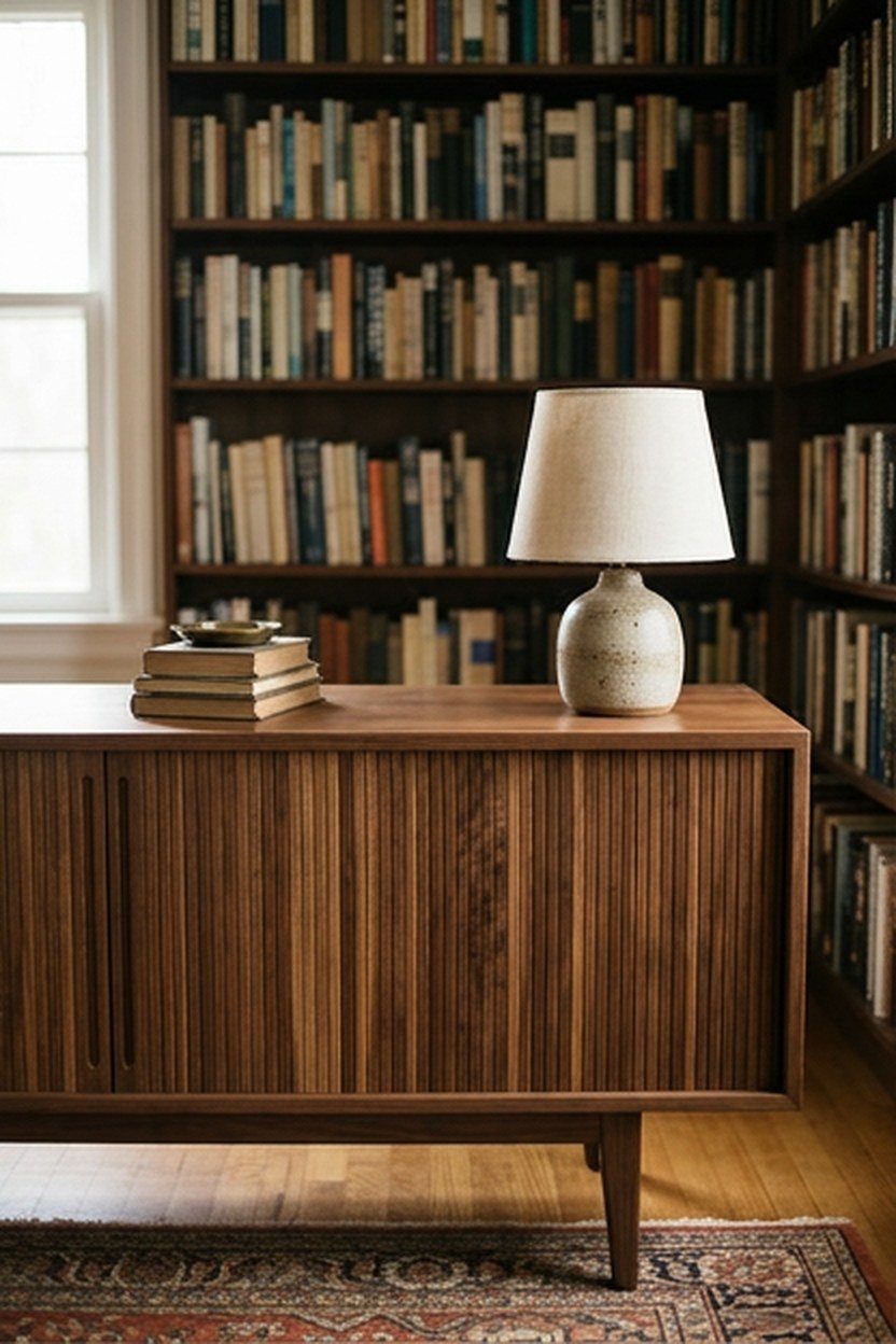
A low-slung walnut credenza, positioned along a wall not dedicated to book shelving, provides additional storage for media, files, or display items while maintaining the horizontal, grounded silhouette characteristic of mid-century furniture. This piece complements a floor-to-ceiling shelving wall by introducing a different scale and function within the same room, preventing every surface from reading as identical vertical storage.
Choosing a credenza with sliding or tambour doors, rather than swinging cabinet doors, suits a library where floor space in front of the piece may be limited by nearby furniture or foot traffic patterns. This door style is also historically authentic to many original mid-century credenza designs.
Positioning the credenza at a height that allows a lamp, small sculpture, or a stack of current reading material to sit comfortably on top keeps the surface functional rather than purely decorative storage. This dual use of surface and interior storage capacity maximizes the value of what is otherwise a single furniture footprint.
Choosing Credenza Length For Your Library’s Wall
Measuring the specific wall length available for a credenza, and choosing a piece sized to leave some breathing room on either side rather than spanning the entire wall edge to edge, keeps the piece from feeling like an oversized, awkward fit. A credenza with a few inches of clearance on either side reads as more intentionally placed than one crammed into every available inch.
7. Floor Lamp With An Adjustable Arm For Task Reading
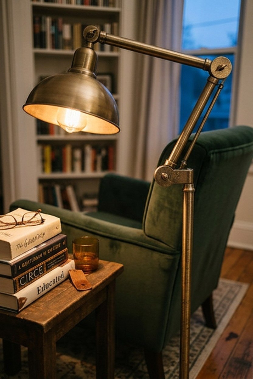
A floor lamp with a genuinely adjustable arm, allowing the light source to be positioned precisely over a book or reading material, solves the practical lighting need a library demands more specifically than a fixed overhead fixture alone. Mid-century floor lamp designs often incorporated exactly this kind of articulated, sculptural arm, making the concept both historically appropriate and genuinely functional.
Choosing a lamp with a warm-toned, dimmable bulb supports extended reading sessions without the eye strain a too-bright or too-cool light source can cause over time. Positioning the lamp beside, rather than directly behind, a reading chair avoids casting the reader’s own shadow across the page.
Because an adjustable arm lamp is a piece that gets handled and repositioned regularly, choosing a model with a sturdy, well-engineered joint mechanism prevents the arm sagging or losing its position over years of use. Testing the arm’s tension and adjustability in person, if possible, before purchase reveals build quality that photos alone cannot show.
Choosing Lamp Base Material For Stability
A floor lamp with an extended, adjustable arm needs a genuinely heavy, stable base to prevent tipping when the arm is extended to one side, a real practical concern given how far some mid-century designs allow the arm to reach. Choosing a lamp with a cast metal base, rather than a lightweight material, provides this stability.
8. Built-In Window Seat With Storage Below
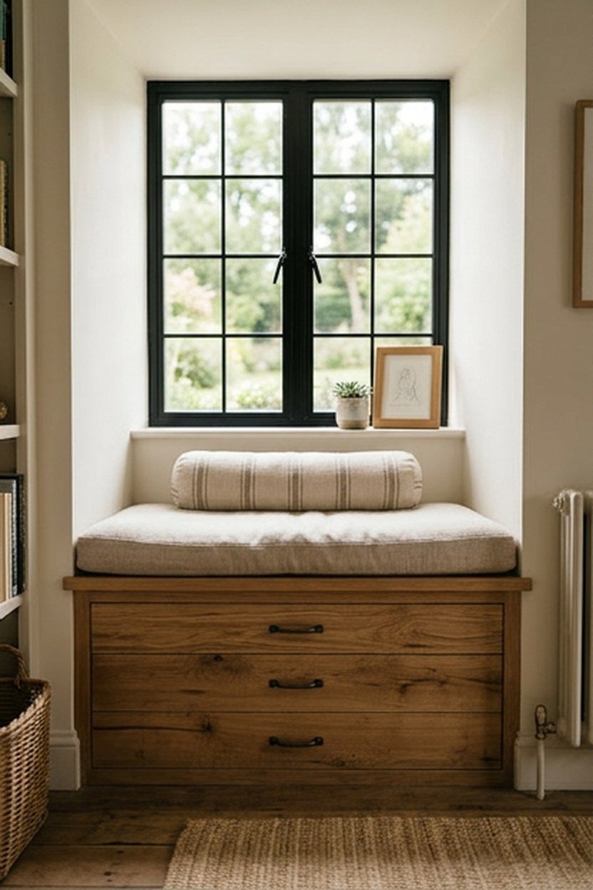
A built-in window seat, positioned beneath a library’s window and fitted with storage compartments underneath, combines additional seating, a reading nook with natural light, and hidden storage capacity within a single built-in feature. This concept works particularly well in a library with a window that would otherwise go underutilized as simply a source of light rather than a functional part of the room. This built-in suits a library undergoing a more substantial renovation rather than a simple furniture refresh.
Choosing a cushion and bolster pillows in a wool or textured fabric, rather than a slick, low-texture material, supports genuine lounging comfort for extended reading sessions in this nook. Building the storage compartments with hinged lids or pull-out drawers, depending on which mechanism suits your specific space, adds real function to what might otherwise be purely decorative built-in seating.
Because a window seat is a genuinely permanent built-in feature, working with a carpenter to ensure proper structural support and correctly sized cushions matters more here than for a freestanding furniture piece that can be adjusted or replaced later. This upfront planning protects the investment in what is meant to be a long-term feature of the room. Getting the cushion depth and seat height right before construction begins prevents an uncomfortable finished result.
Sizing A Window Seat Cushion For Comfort
A window seat cushion should be deep enough, typically at least eighteen inches, to allow someone to sit with their back against the wall and legs extended or bent comfortably, rather than perching on an insufficiently deep seat. Measuring this depth against your specific window seat’s dimensions before ordering a custom cushion prevents an uncomfortable finished result.
9. Leather And Brass Accent Chair For A Reading Corner
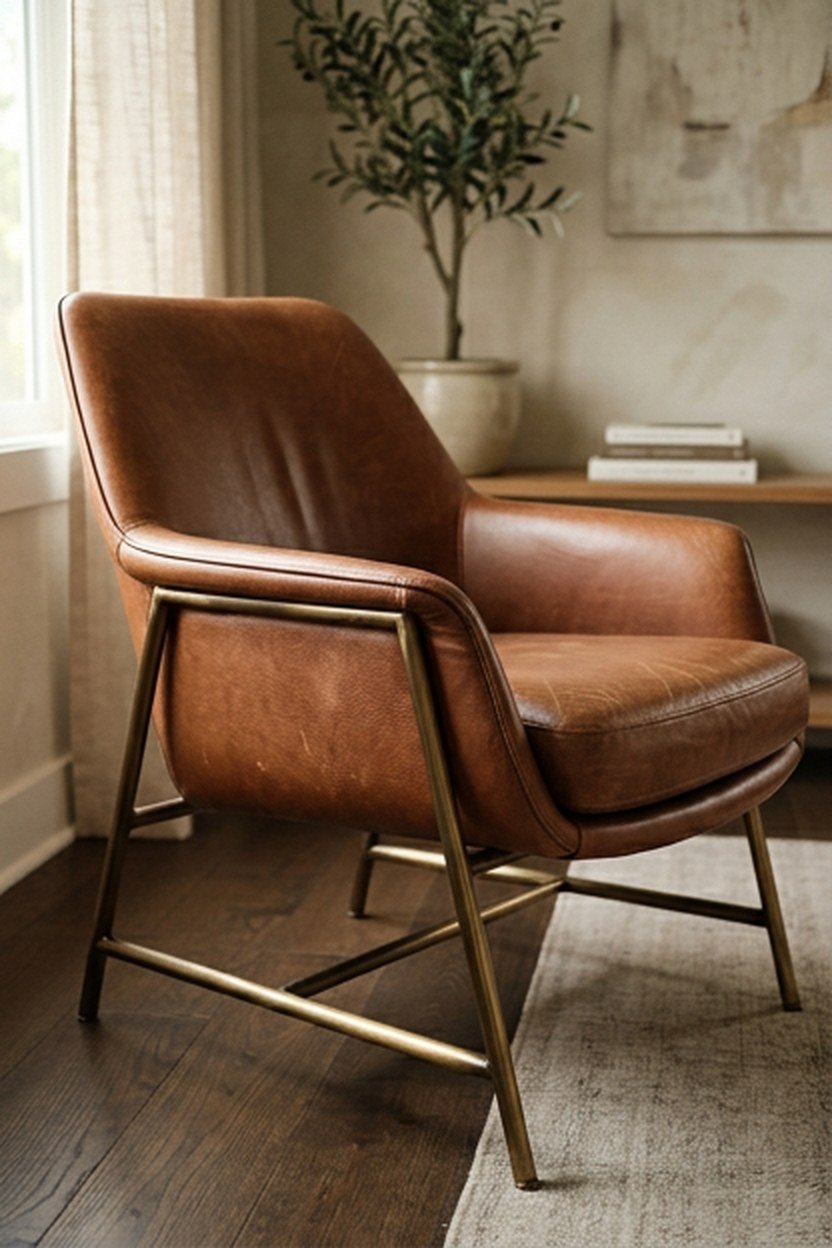
A leather accent chair with exposed brass or wood legs brings a more formal, polished counterpoint to a library otherwise dominated by wood shelving and softer textiles. This concept suits a library wanting a second distinct seating option beyond a primary reading chair, whether for a guest or simply for variety within the room. The leather’s smooth texture also contrasts effectively against the visual texture of nearby book spines and wool textiles.
Choosing a leather in a rich cognac or deep brown tone, rather than a stark black, keeps the piece feeling warm and aligned with the broader mid-century palette this guide has emphasized throughout. Genuine leather develops a natural patina and softness with years of use, a quality many people specifically seek out when choosing this material for a piece meant to age well.
Positioning this accent chair at an angle to the primary reading chair, rather than directly facing it, creates a more relaxed conversational arrangement without forcing eye contact for anyone using the space for quiet parallel reading rather than active conversation. This positioning detail is a subtle but genuine consideration for how comfortable the room feels during actual use. Testing the arrangement with real people in the space before finalizing furniture placement confirms it works as intended.
Maintaining Leather Furniture In A Library
Genuine leather furniture benefits from an occasional conditioning treatment to prevent drying and cracking, particularly in a room that may experience temperature and humidity swings from nearby windows or heating vents. Keeping leather out of direct, prolonged sunlight also protects both the material and any dye or finish from premature fading. This maintenance routine, though simple, extends the furniture’s lifespan considerably compared to leaving it untreated for years.
10. Modular Shelving System With Adjustable Components
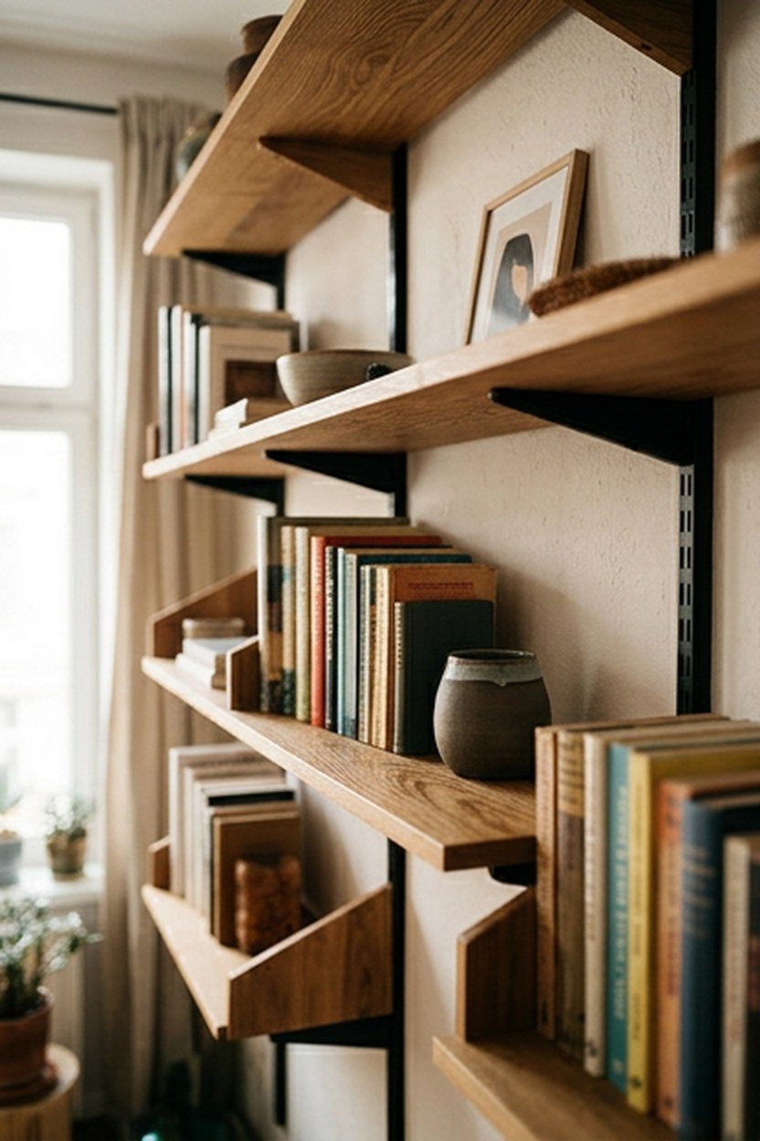
A modular shelving system, built from a repeating set of components that can be reconfigured as needs change, offers genuine long-term flexibility that a single fixed built-in cannot match. Several actual mid-century designers developed shelving systems specifically built around this modular principle, making the concept historically grounded rather than a purely modern convenience.
Choosing a system with components in a consistent wood tone and hardware finish, even as you add pieces gradually over months or years, keeps the growing system looking cohesive rather than mismatched. This consistency consideration matters more for a modular system, built incrementally, than for a single piece purchased all at once. Planning for this consistency from the very first purchase protects the system’s long-term cohesive appearance.
Because modular systems are typically wall-mounted using a track or panel system, proper installation into wall studs matters as much here as with any other wall-mounted shelving discussed throughout this guide. Skipping this structural consideration risks the entire system’s stability under a full load of books.
Expanding A Modular System Over Time
Starting with a smaller modular shelving footprint and adding components as your collection grows lets you spread the cost of a full system across months or years rather than committing to the complete configuration all at once. This staged approach also lets you confirm the specific configuration genuinely suits your space before committing to its full extent.
11. Wool Throw Blanket In A Muted Earth Tone

A wool throw blanket, draped over a reading chair’s arm or folded at the foot of a window seat, introduces genuine texture and warmth at a low cost compared to most other concepts here. Choosing a muted earth tone, like rust, olive, or warm gray, keeps the throw aligned with the broader mid-century palette rather than introducing a jarring color note.
Draping the throw with a relaxed, slightly asymmetrical fold, rather than perfectly squared corners, reads as genuinely lived-in rather than staged for a single photograph. This casual draping style is a small styling detail that meaningfully affects how inviting the overall reading nook feels.
Because a wool throw sees regular use and handling in an actively used library, choosing a washable wool or wool blend, rather than a delicate dry-clean-only material, keeps ongoing maintenance realistic for a piece meant for daily comfort rather than purely decorative display. This practical material consideration matters more for a genuinely used throw than for one kept purely for appearance.
Layering Multiple Throws For Visual Depth
Layering two throws in slightly different but complementary tones, rather than relying on a single blanket, adds visual depth to a reading chair or window seat without requiring any additional furniture. This layering technique is a simple, low-cost way to add richness to a seating area that might otherwise feel sparse. Choosing tones that sit close together on the color wheel, rather than high-contrast combinations, keeps this layered look feeling cohesive rather than mismatched.
12. Sunburst Or Starburst Wall Clock As A Focal Accent
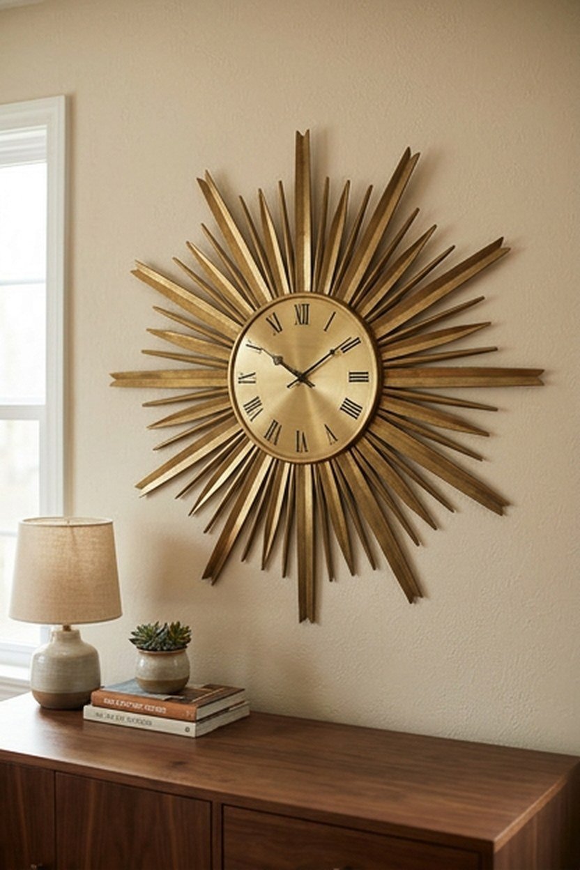
A sunburst or starburst wall clock, one of the most immediately recognizable mid-century decorative motifs, adds a genuine period accent to a library wall without requiring any furniture-level investment or installation complexity. This concept works particularly well positioned above a credenza or on a wall not otherwise occupied by shelving, giving it room to read clearly as a standalone accent.
Choosing a clock in brass or wood, rather than a painted or plastic version, keeps the material quality consistent with the more substantial furniture pieces elsewhere in the room. Sizing the clock appropriately for its wall, neither so small it disappears nor so large it overwhelms the available space, matters as much as the material choice itself.
Because a sunburst clock is such a recognizable and specific design motif, using just one within the room, rather than repeating the same shape in multiple accents, keeps it reading as a deliberate focal point rather than a themed pattern repeated to excess. This restraint is part of the broader principle, discussed at the start of this guide, of mixing genuine mid-century pieces with quieter surrounding elements. Limiting yourself to one strong iconic accent per room is a reliable design discipline worth following.
Positioning A Statement Clock Within The Room
Hanging a sunburst clock where it can be seen from the library’s main seating area, rather than tucked behind a door or in a rarely viewed corner, ensures the piece earns its place as a focal accent. This matters more for a purely decorative piece than for functional furniture, since its entire value comes from being seen. Testing sightlines from the actual reading chair before finalizing placement confirms it will be genuinely visible.
13. Ceramic Table Lamp With An Organic Form
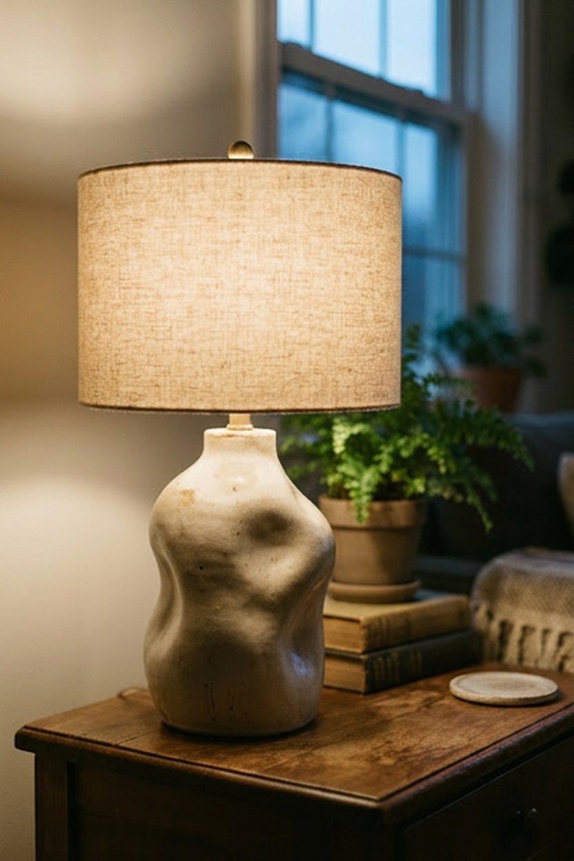
A ceramic table lamp with a genuinely organic, sculptural base brings the era’s interest in biomorphic shapes into the library’s lighting scheme, offering a softer visual counterpoint to the room’s more geometric shelving and furniture lines. This concept works well on a side table beside a reading chair or atop a credenza, providing both ambient light and a genuine decorative object.
Choosing a ceramic base in an earthy glaze, like a matte cream, sage, or terracotta tone, keeps the lamp aligned with the broader natural material palette this guide has emphasized. Pairing the ceramic base with a simple linen or paper shade, rather than an ornate or heavily patterned option, lets the base’s sculptural form remain the clear visual focus.
Because ceramic lamp bases are genuinely fragile compared to metal or wood alternatives, positioning the lamp somewhere it will not be regularly bumped or knocked, particularly in a library with foot traffic near shelving, protects the investment. This placement consideration is worth thinking through before finalizing the room’s layout. A beautiful but easily broken piece deserves a genuinely protected spot.
Choosing Lamp Shade Color For Warm Light
A cream or warm white lamp shade diffuses light with a naturally warmer cast than a stark white or gray shade, supporting the cozy, inviting mood this guide has emphasized throughout for a mid-century library. This shade color consideration is a small detail but genuinely affects the quality of light the lamp actually produces in the room. Testing the lamp lit in the room’s actual evening lighting conditions, rather than judging it under bright daylight alone, gives a truer sense of its effect.
14. Room Divider Or Screen In Slatted Wood
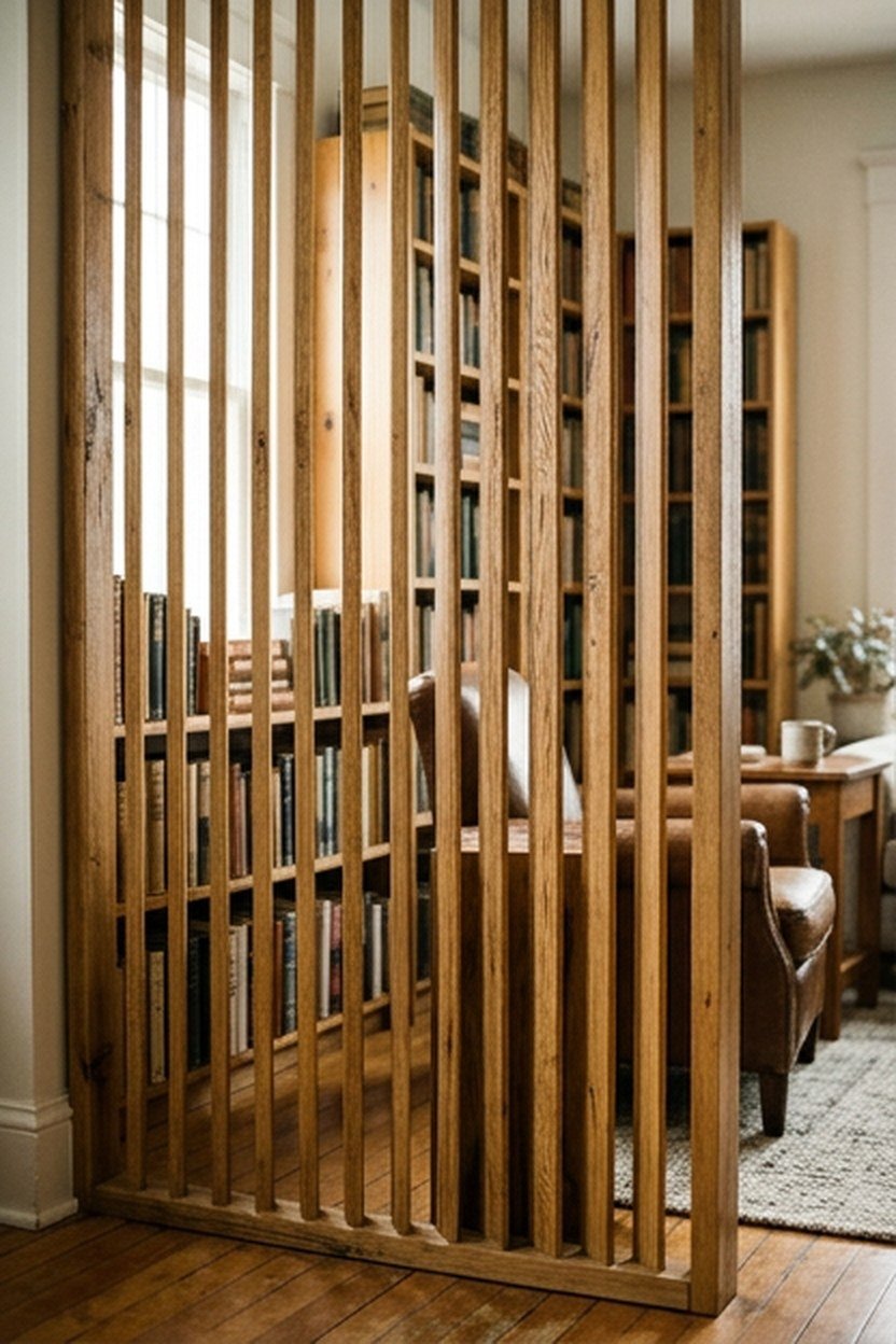
A slatted wood room divider or folding screen, common in mid-century interiors for creating separation without fully enclosing a space, works well in a library sharing an open floor plan with an adjacent room. The slats let light and sightlines pass through partially, keeping a connection to the rest of the home while defining the library as its own zone.
Choosing a divider in the same wood tone as the library’s shelving or furniture ties the piece visually into the room’s broader material story rather than feeling like an unrelated addition. A folding screen offers more flexibility than a fixed panel divider, since it can be repositioned or folded away entirely if the room’s layout needs change over time.
Because a room divider is a freestanding piece rather than a built-in installation, it suits a renter or anyone hesitant to make permanent modifications to an open floor plan. This non-permanent quality is a genuine practical advantage over other more construction-intensive concepts on this list.
Choosing Divider Height For Partial Versus Full Separation
A shorter divider, roughly chest height, defines a library zone while still allowing sightlines and conversation across the space, suiting a household that wants the room to feel connected to adjacent areas. A taller, ceiling-height divider creates a more complete visual separation, better suited to a household prioritizing quiet and privacy for the library specifically. This height decision should match your household’s actual priorities for how separate the space needs to feel.
15. Curated Vintage Object Display On Open Shelves

Interspersing a few genuine vintage decorative objects, whether pottery, sculptural bookends, or a small collection of art glass, among the books on open shelving adds visual interest and personality beyond the books themselves. This curated display approach is a hallmark of well-designed mid-century interiors, where shelving was treated as a genuine display opportunity rather than purely utilitarian storage. This concept costs relatively little if you already own suitable objects, or can be built gradually through secondhand and vintage shopping.
Grouping objects in small clusters of two or three, rather than spreading single items evenly across every shelf, creates a more intentional, gallery-like display than a scattered, even distribution. Leaving genuine negative space between groupings, rather than filling every available inch of shelf, keeps the display from feeling cluttered despite the visual richness it adds.
Because this concept relies on genuine vintage or well-chosen objects rather than mass-produced decor, building the collection gradually through thrift stores or estate sales keeps the styling feeling authentic. This gradual collecting process, similar in spirit to building a book collection, suits the patient approach mid-century design generally rewards. Treating this as an ongoing project rather than a one-time purchase keeps the shelving feeling like it continues to evolve.
Balancing Books And Objects On A Single Shelf
A shelf holding both books and display objects benefits from treating the objects as punctuation within the books rather than competing equally for space, keeping objects to roughly a quarter or less of the shelf’s width. This ratio keeps the shelving reading primarily as a working library rather than a display case that happens to hold books. Adjusting the ratio to your own collection is reasonable, but this rough guideline helps avoid an imbalanced first attempt.
What A Mid-Century Library Design Actually Costs
The cost of designing a mid-century library ranges enormously, from built-in elements like a full shelving wall or window seat to simpler additions like a throw blanket or sunburst clock. Smaller, affordable pieces deliver genuine style impact without a large upfront investment, while structural elements cost more but deliver a bigger transformation. Understanding where your budget fits helps prioritize which of the fifteen concepts above matter most for your room.
Starting with the more affordable, easily implemented concepts lets you test which specific design directions genuinely suit your taste before committing to a larger investment like custom shelving or a built-in window seat. A throw blanket, a sunburst clock, and a curated shelf display together cost relatively little and can be assembled within a single weekend. Save the shelving wall and window seat for a second phase once you understand your room’s specific needs more precisely.
| Concept | Typical Cost Range | Installation Effort |
|---|---|---|
| Wool throw blanket | $40 to $150 | None |
| Sunburst wall clock | $60 to $250 | Minutes |
| Ceramic table lamp | $80 to $300 | None |
| Floor-to-ceiling shelving wall | $1,500 to $6,000 | Professional required |
| Built-in window seat | $2,000 to $5,000+ | Professional required |
Budgeting for this project in phases, smaller styling elements first and structural built-ins second, keeps the whole process financially manageable and lets your specific taste refine itself as you live with the room. Many of the most successful mid-century libraries were built up gradually rather than fully designed in a single renovation.
Common Mistakes In Mid-Century Library Design
The most common mistake is filling the room with too many literal era-specific icons at once, resulting in a themed set rather than a genuinely considered, livable space. Mixing one or two authentic pieces with simpler, quieter furniture reads as far more sophisticated than an entire room furnished exclusively in recognizable mid-century silhouettes.
A second common error is underestimating shelving capacity needs, resulting in a beautiful design that runs out of storage within a few years of actual use. Planning shelving with genuine room for collection growth, rather than sizing it exactly to your current book count, prevents this frustrating and expensive shortfall.
The third mistake is prioritizing visual style over genuine reading comfort, choosing furniture and lighting purely for their design credentials without testing whether they actually support extended reading sessions. A stunning chair that proves uncomfortable, or lighting that causes eye strain, fails at the room’s fundamental purpose regardless of how well it photographs. Testing furniture and lighting in actual use before finalizing the room’s design protects against this genuine functional failure.
Recovering From An Overly Themed Library
If an existing library feels more like a period showroom than a lived-in space, the fix usually involves removing one or two of the most literal era-specific pieces rather than adding more. Introducing a few simpler furniture pieces or personal objects that do not slavishly follow the aesthetic often solves the themed feeling faster than further curation. A library that feels genuinely yours, rather than a museum recreation, is the actual goal here.
Conclusion
A mid-century home library succeeds by combining the era’s honest materials and warm wood tones with genuine reading comfort and restraint in how many iconic pieces appear in the room. The fifteen concepts here range from simple additions like a wool throw to bigger investments like custom shelving, giving you a realistic path regardless of budget. Start with whatever addresses your room’s biggest needs, whether storage capacity, seating comfort, or genuine period character.
Whichever concepts you choose first, prioritize your actual book collection and reading habits over an idealized design photograph, since a library that photographs beautifully but fails to support real daily reading has missed its fundamental purpose. Build the room gradually if budget requires it, testing smaller styling changes before committing to larger, more permanent investments. A library that genuinely gets used every week beats one that only looks finished in photographs.
Frequently Asked Questions
What wood is most associated with mid-century modern design? Walnut and teak are the two woods most closely associated with the style, both prized for their warm tones and the way their natural grain reads as honest, unornamented material.
How much shelving capacity should I plan for a home library? Planning for genuine collection growth, rather than sizing shelving exactly to your current book count, prevents an expensive retrofit within just a few years of finishing the room.
Is it possible to achieve this style on a smaller budget? Yes, affordable additions like a wool throw, a sunburst clock, or a ceramic lamp deliver genuine style impact without the larger investment a custom shelving wall or window seat requires.
How do I avoid my library looking like a themed period room? Mixing one or two genuine mid-century pieces with simpler, quieter furniture, rather than filling every corner with recognizable era-specific icons, keeps the room feeling considered rather than costumed.
What lighting works best for reading in this style? An adjustable-arm floor lamp or a table lamp with a warm-toned, dimmable bulb supports genuine reading comfort while staying aligned with the era’s sculptural lighting designs.
Should I choose vintage or reissue furniture for a mid-century library? Vintage pieces carry genuine historical authenticity and collector value, while licensed reissues offer the same design with more consistent manufacturing, so the choice comes down to budget and how much original history matters to you.
How do I protect books from sun damage in a library with large windows? Positioning shelving away from direct south-facing sunlight, or adding sheer curtains to diffuse the light, protects book spines and dust jackets from fading over years of exposure.