
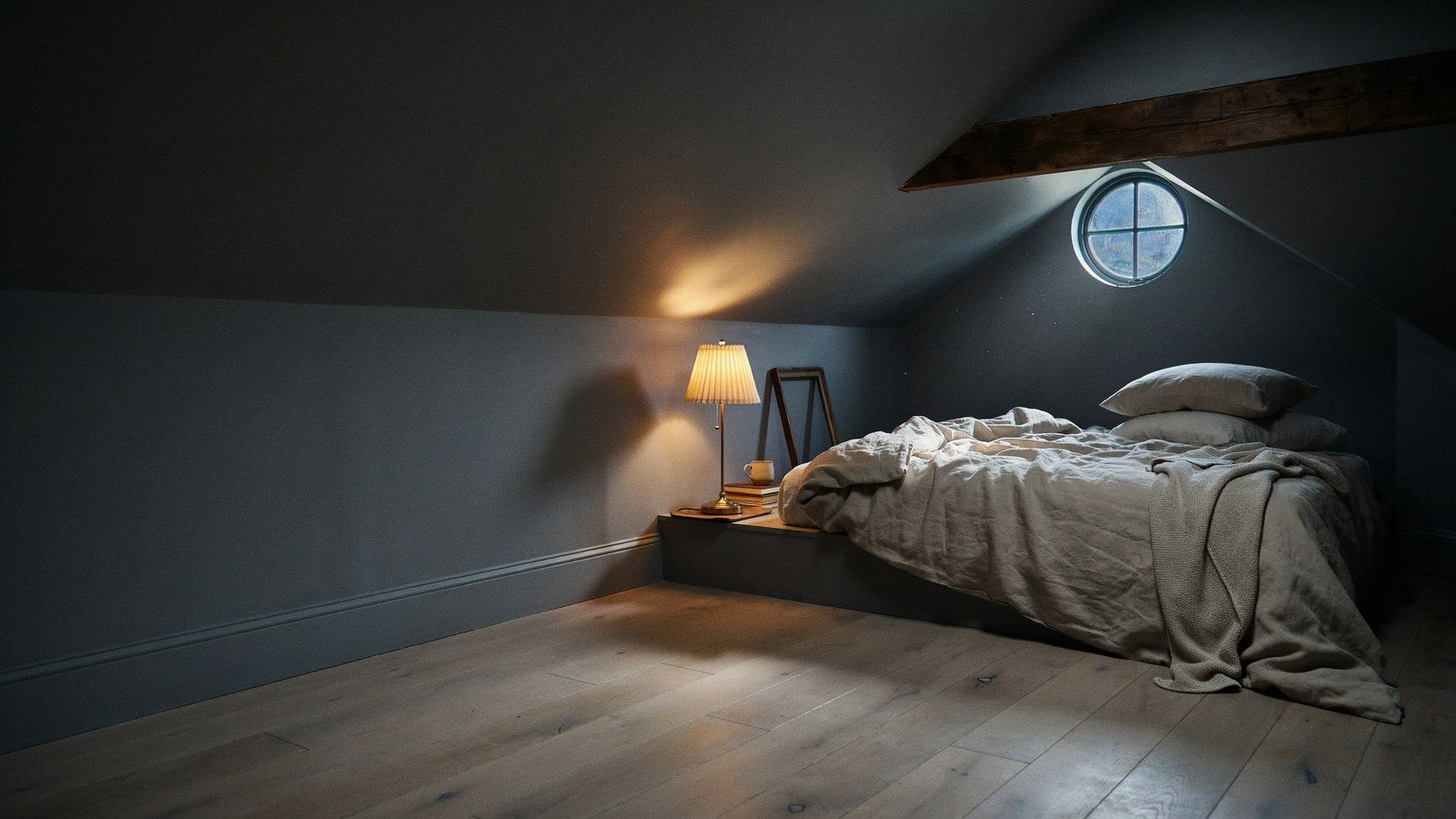
Charcoal gray works better in an attic than in almost any other room, and the reason is counterintuitive. Dark paint hides the awkward angles that light paint puts on display.
I resisted this for years. My attic had four different roof planes and I kept painting it white to open it up, which only made every junction more obvious.
Painting it charcoal solved it in a weekend. Below are fifteen versions of that idea, from the safest to the boldest, with what each one actually needs.
Why Charcoal Gray Suits A Sloped Ceiling
Dark colour blurs edges. When walls and ceiling share one deep shade, the corners stop announcing themselves and the room reads as a single volume.
Light does the opposite up here. White surfaces catch every change of angle, so a small attic ends up looking like a folded paper model.
Charcoal also handles low light honestly. A dim attic painted white looks grubby by evening, while the same room in charcoal looks intentional.
| Attic Feature | White Ceiling | Charcoal Ceiling |
|---|---|---|
| Multiple roof angles | Every junction visible | Edges disappear |
| Low headroom | Emphasised by contrast | Reads taller and softer |
| Small windows | Room looks starved of light | Light becomes a feature |
| Exposed beams | Beams dominate | Beams recede or frame |
1. Paint The Walls And Ceiling The Same Charcoal
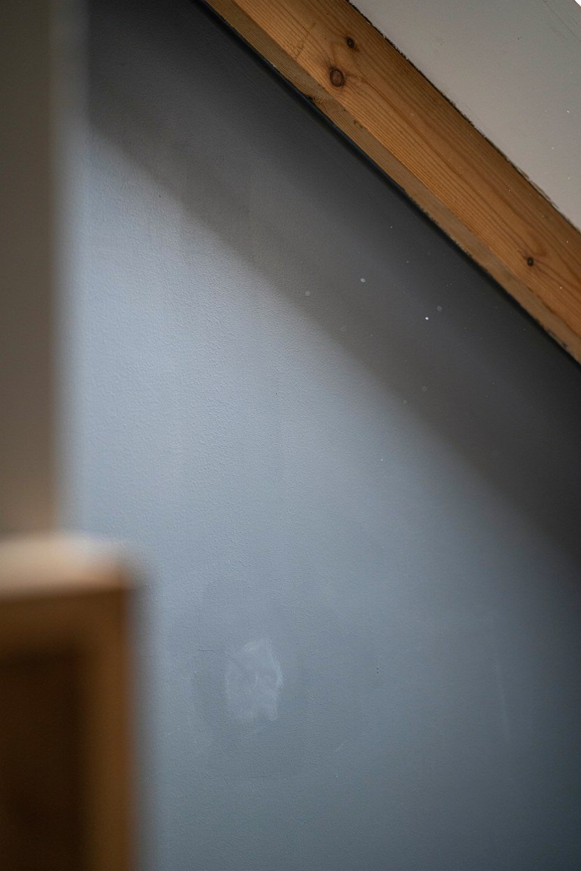
The single highest impact move is using one colour everywhere, ceiling included. Stopping at the wall line draws a hard edge exactly where you want softness.
Take the paint over the slopes and into the reveals. Any surface left lighter becomes the thing your eye lands on.
Use a matt finish. Sheen picks out every ripple in old plaster, and attics rarely have flat walls. Matt also absorbs light evenly, which is what lets the angles disappear in the first place.
2. Keep The Floor Considerably Lighter
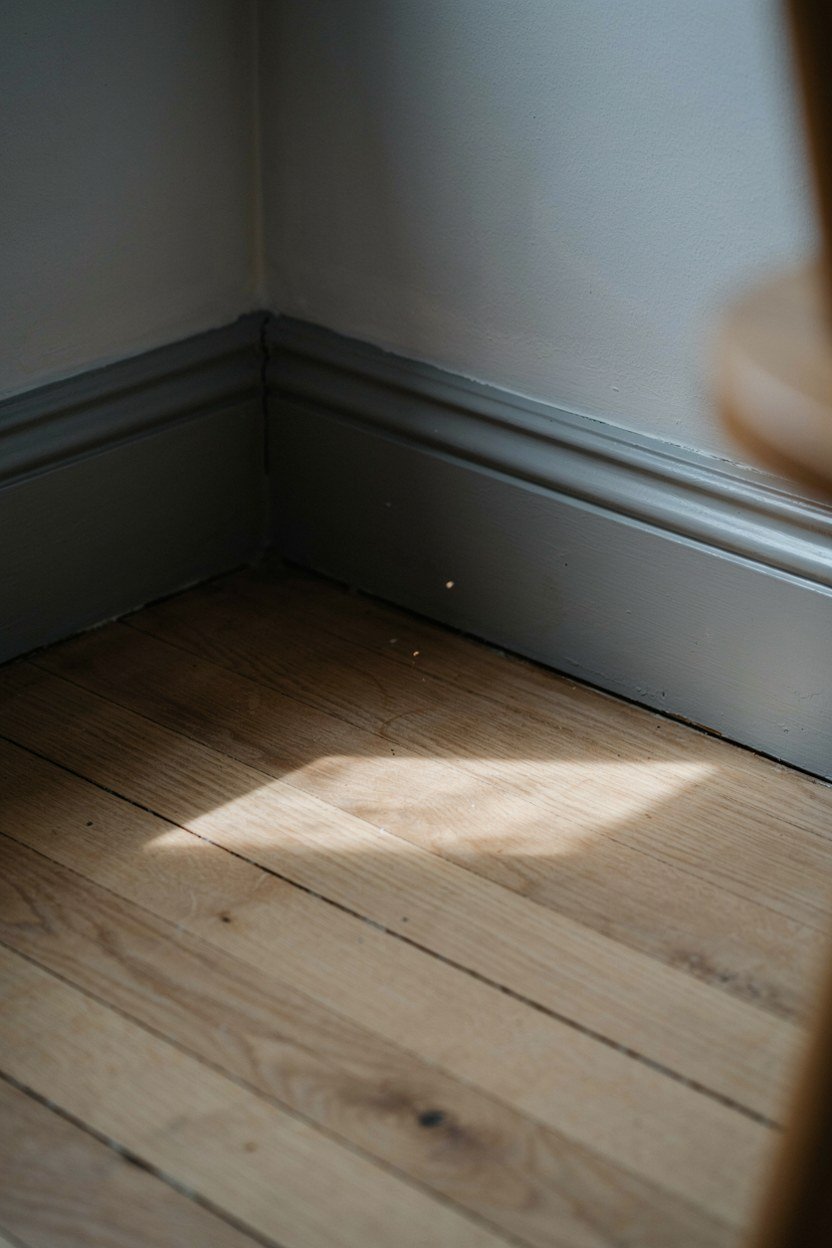
Contrast belongs underfoot. A pale oak, natural jute or warm sisal floor stops the room feeling like a box.
The floor is also where you get warmth back. Charcoal above and cool grey below reads cold; charcoal above and honey timber below reads cocooned.
Skip dark carpet unless the room is large. It closes the last open surface and the space starts to feel airless. One pale plane somewhere in the room gives the eye a place to rest.
3. Add One Warm Metal For Relief
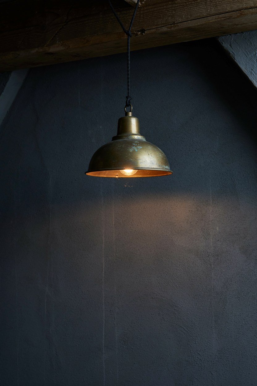
Charcoal needs something to catch light. Aged brass, bronze or antique copper does it without breaking the mood.
Two touches is the right amount. A pendant and a set of drawer pulls reads deliberate, while brass everywhere reads like a showroom.
Avoid chrome and polished nickel here. Cool metals against cool grey flatten the whole scheme. Warmth is doing the work here, and chrome removes it.
4. Use A Low Bed To Buy Headroom
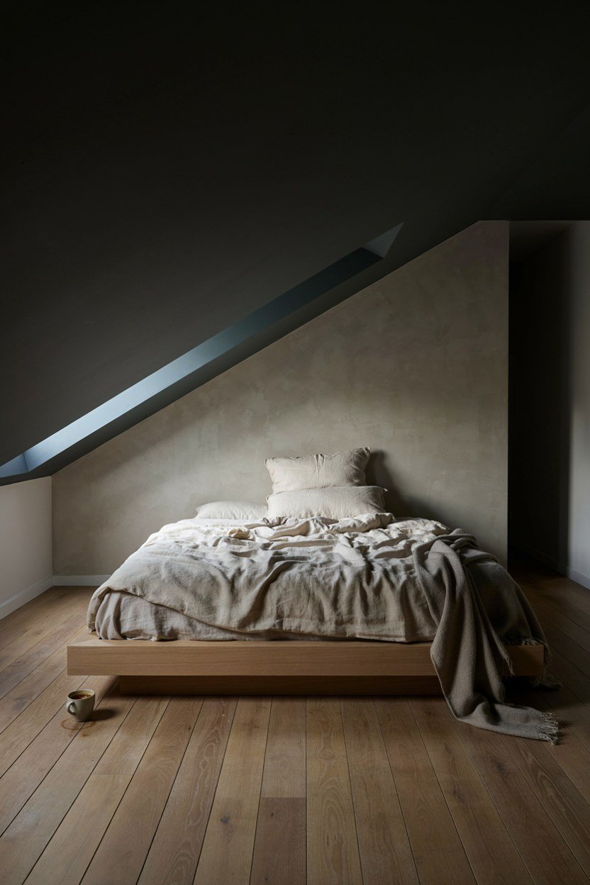
Bed height is the difference between cosy and cramped. A low platform frame gives you inches of visual headroom under a slope.
Position the bed where the ceiling is lowest. That is dead space for standing anyway, and lying down under a slope feels sheltered rather than tight.
Skip the tall headboard. A low upholstered panel, or none at all, keeps the sightline along the ceiling unbroken. A tall headboard also blocks the light from a low window, which attics rarely have to spare.
5. Layer Bedding In Three Tones Of The Same Family
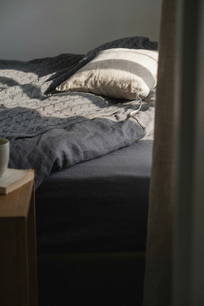
Flat charcoal bedding against charcoal walls disappears. Three shades in one family gives depth without introducing a competing colour.
Mix the textures rather than the colours. Linen, brushed cotton and a chunky wool throw read as layers even in one tone.
Add one lighter element. A pale pillow or folded cream throw stops the bed reading as a dark hole in a dark room. The bed is the largest object up here, so it needs some internal contrast of its own.
6. Put Lighting At Three Heights
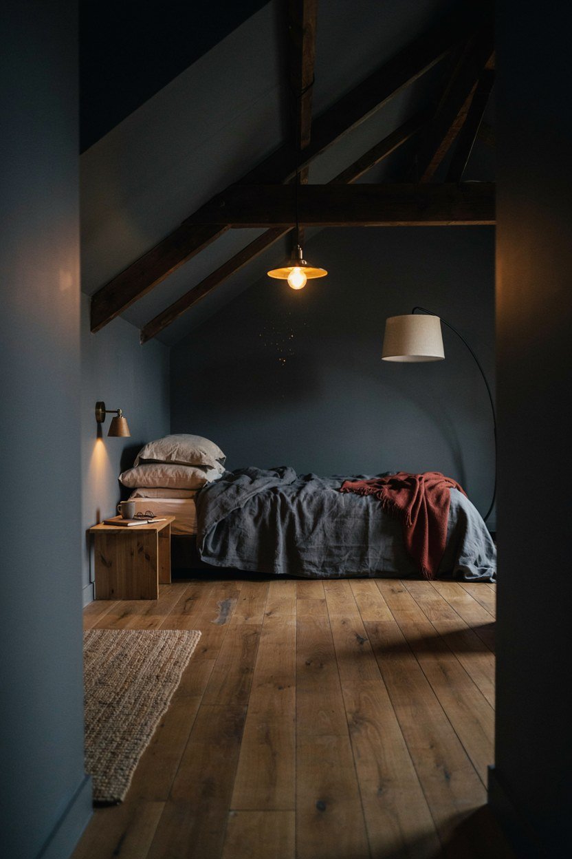
One overhead fitting is what makes dark rooms feel grim. Charcoal absorbs light, so you need more sources at lower levels.
I run a pendant, two wall lights beside the bed and a floor lamp in the corner. Nothing is bright on its own and the room glows.
Warm bulbs only, around 2700K. Cool white against charcoal turns the walls a dead blue grey. Bulb temperature changes the paint colour more than most people expect.
7. Let The Beams Stay Dark
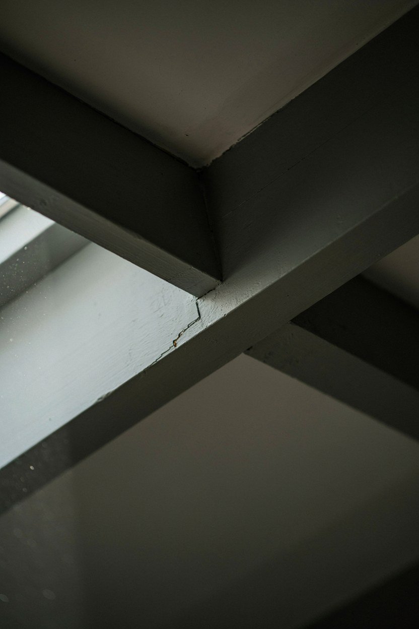
Painting beams white against charcoal creates a stripe pattern that fights the calm you are building.
Painting them the same charcoal makes them structural rather than decorative. They read as shadow, and the ceiling feels higher.
Leaving them raw timber is the third option and it works when the timber is warm rather than orange. If the beams read orange, a thin grey wash calms them without hiding the grain.
8. Treat The Window As The Focal Point
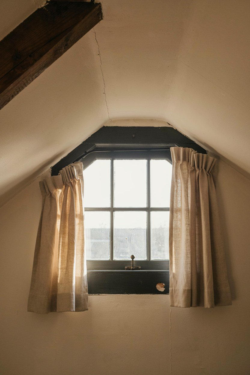
In a dark room the window becomes the brightest object, so it deserves attention. A deep charcoal reveal frames the view like a picture.
Hang curtains high and wide. The same trick that works downstairs works harder here because the contrast is stronger.
Keep the glass clear of clutter. Anything on the sill silhouettes against the light and reads as mess. Anything you do put there should be worth seeing in outline only.
9. Add A Single Large Mirror
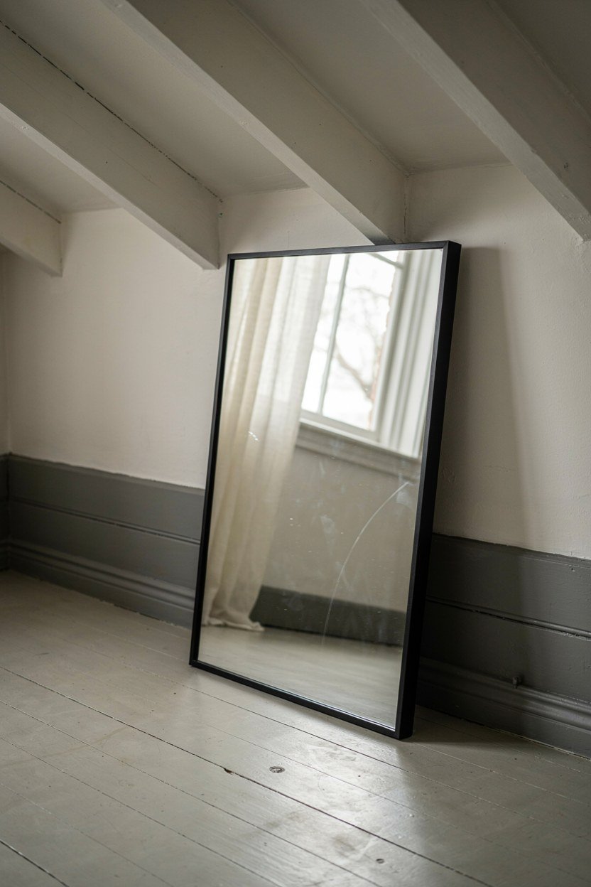
A mirror in a dark attic doubles the useful light without adding a light source. Position it opposite or adjacent to the window.
Go large and go plain. One oversized mirror looks confident, while a cluster of small ones adds visual noise to an already busy ceiling line.
Lean it if you cannot fix into the slope. A leaning mirror also softens the vertical line of the knee wall. Leaning also means you can move it once you see where the light actually falls.
10. Build Storage Into The Knee Wall
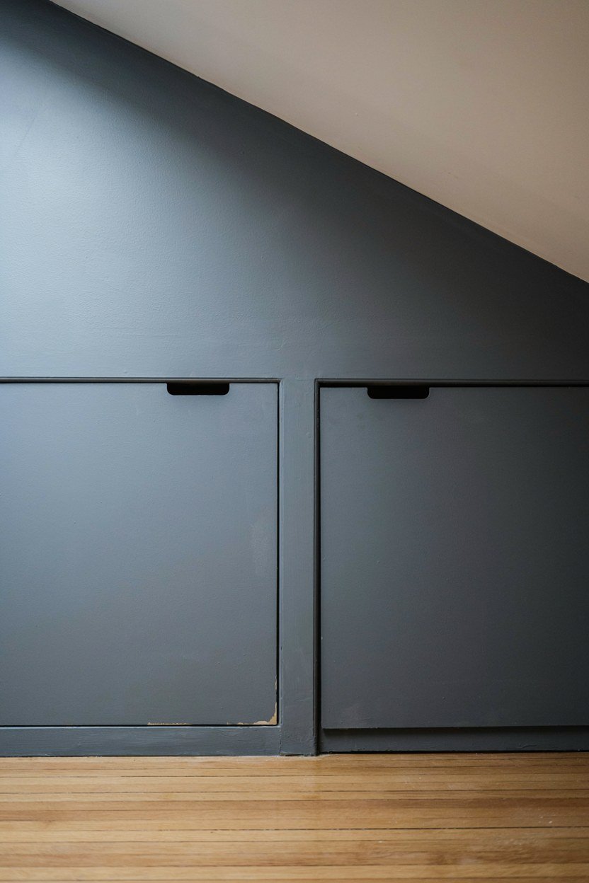
Every attic has that awkward low triangle behind the knee wall. Doors into it turn dead space into the room’s main storage.
Paint the doors the same charcoal so they vanish. Contrasting doors turn storage into the first thing you notice.
Push handles or simple recessed pulls keep the wall plane unbroken. Handles are the detail that turns hidden storage back into visible cupboards.
11. Introduce One Deep Accent Colour
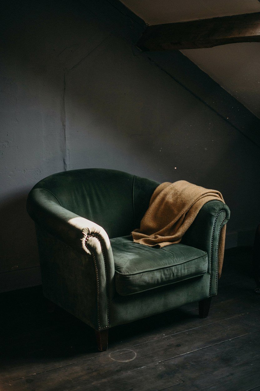
Charcoal takes a single strong partner well. Forest green, oxblood and inky navy all sit comfortably against it.
Keep it to one item. A green velvet chair or an oxblood throw does the job; two accents start to compete.
Test in evening light. Deep colours shift considerably under warm bulbs, and attics are mostly used after dark. A green that looks fresh at noon can turn brown under a warm bulb.
12. Choose Matte Textures Over Shine
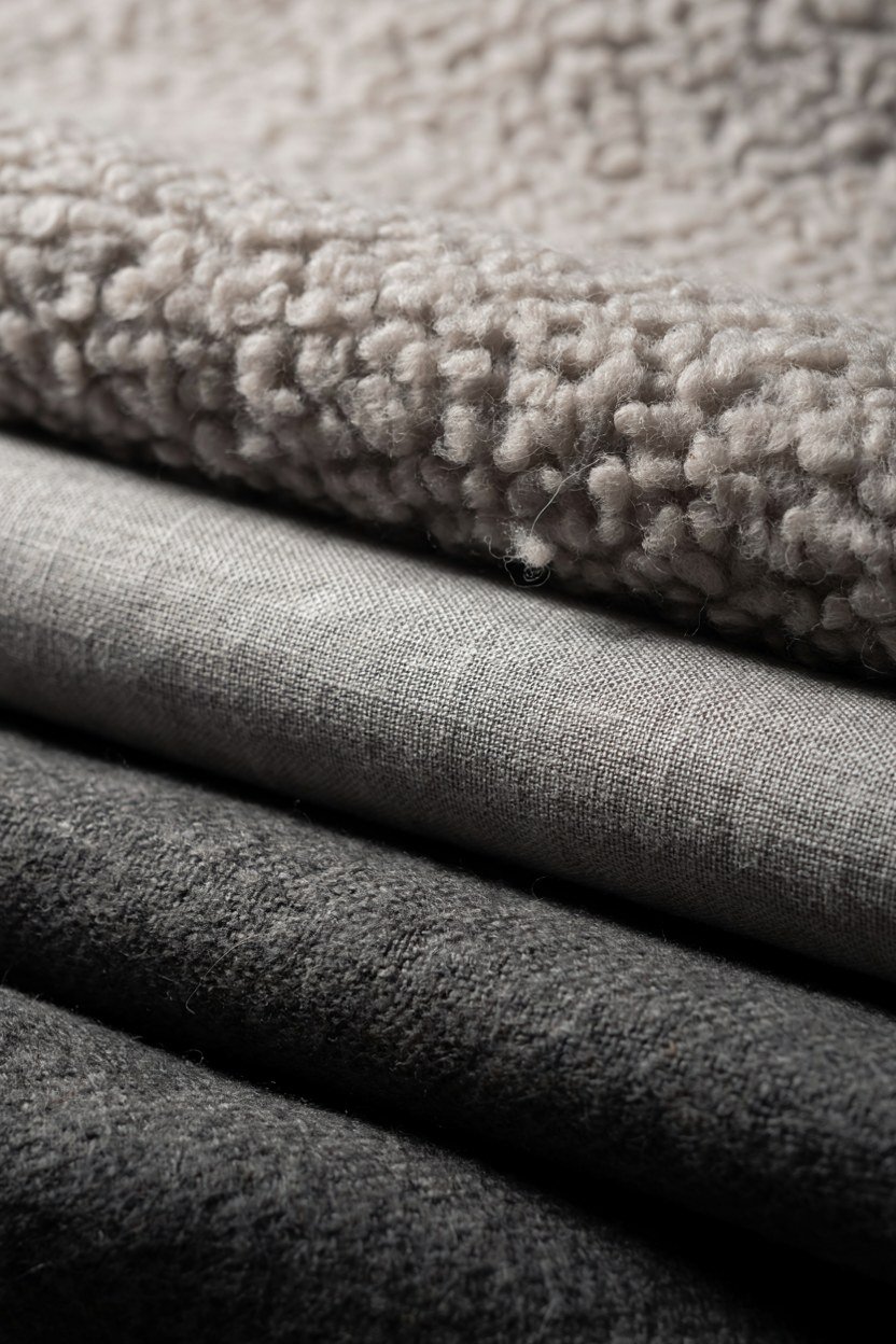
Texture is what stops a dark room feeling flat. Wool, linen, boucle and unfinished timber all read richly in low light.
Avoid glossy surfaces. High shine reflects the ceiling angles straight back and undoes the softening you painted in.
A textured rug matters most. It is the largest soft surface after the bed and it warms the whole floor plane. Underfoot texture matters more in a room you mostly experience barefoot.
13. Hang Art Low And Sparingly
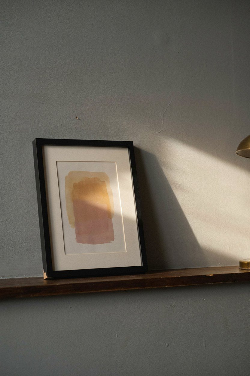
Sloped walls limit hanging space, so use it deliberately. One or two pieces at seated eye level beat a gallery wall here.
Choose art with some light in it. Dark art on dark walls disappears, while a piece with a pale ground reads as a window.
Lean smaller pieces on a shelf or the floor. It suits the informality of an attic and avoids drilling into awkward slopes. Fixings into a sloped ceiling are rarely worth the patching if you change your mind.
14. Keep The Palette Going Into The Landing
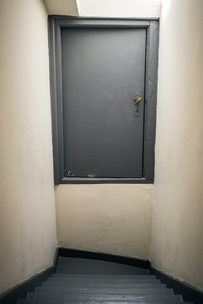
Stopping the colour at the door creates a jolt. Carrying charcoal onto the stair wall or landing makes the attic feel like part of the house.
Even painting just the door and its frame helps. It signals the transition rather than interrupting it.
If the landing must stay light, use a deeper version of the landing colour on the door. That gives you a step rather than a wall. Transitions read better than boundaries when two rooms share a staircase.
15. Commit Fully Rather Than Half Way
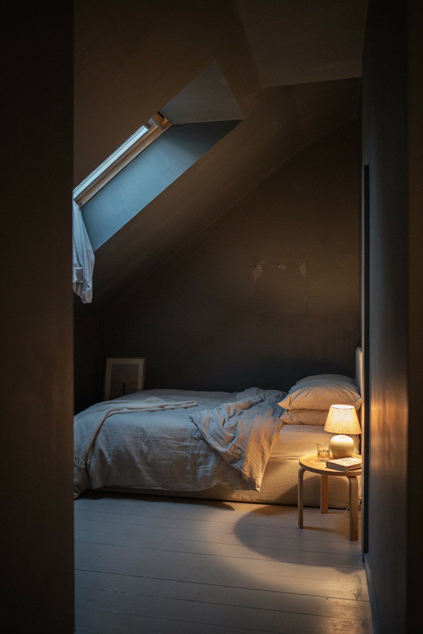
The version that fails is the timid one: charcoal on a single feature wall, white everywhere else. That reads as an unfinished decorating job.
Half measures also lose the benefit. The angle hiding effect only works when the surfaces share a tone.
If you are unsure, paint a large sample across a corner and a slope. Seeing it wrap an angle is what convinces people. A flat swatch on one wall tells you almost nothing about how it will behave up here.
What A Charcoal Attic Bedroom Costs To Achieve
The paint is the cheap part and the lighting is where the money goes. Three light sources cost more than the tins. Two tins of matt emulsion will usually cover a small attic including the ceiling, though dark colours over white often need a third coat.
Storage in the knee wall is the biggest single item if you have it built. Doing it yourself with simple ply doors cuts that sharply, and painted ply is indistinguishable once it is the same colour as the wall.
Textiles are where you can spend gradually. Bedding, rug and curtains can arrive over months without the room looking unfinished. Starting with the rug gives the biggest visible change for the money.
| Item | Priority | Rough Spend |
|---|---|---|
| Matt charcoal paint | Do all surfaces at once | Low |
| Layered lighting | Highest impact after paint | Mid |
| Pale flooring or rug | Stops the room closing in | Mid |
| Knee wall storage | Turns dead space usable | Mid to high |
| Warm metal fittings | Two touches only | Low |
| Textiles in three tones | Build up over time | Low to mid |
Conclusion: The Three Moves That Matter Most
If you only do three things, paint every surface including the ceiling, add light at three heights, and keep the floor pale.
Those three fix the problems attics actually have: visible angles, poor light and a tendency to feel like a box.
Then commit. Charcoal rewards confidence and punishes hesitation, and a single dark feature wall gives you none of the benefit and all of the darkness.
Frequently Asked Questions About Charcoal Gray Attic Bedrooms
Does dark paint make a small attic feel smaller?
Usually the opposite. Dark paint hides the corners and angles that tell your eye where the walls stop, so the room reads as one volume rather than several planes.
Should I paint the sloped ceiling too?
Yes. Stopping at the wall line creates a hard edge and undoes the main benefit of the colour. The ceiling is most of what you see from a bed.
What finish works best on old attic plaster?
Matt, without exception. Any sheen highlights ripples and patches, and attic plaster is rarely flat enough to survive that.
How do I stop the room feeling gloomy?
Three light sources at different heights, warm bulbs and a pale floor. Overhead light alone is what makes dark rooms feel grim, because charcoal absorbs most of what a single fitting puts out.
Which accent colours suit charcoal gray?
Forest green, oxblood and inky navy all work well. Keep it to one accent rather than several, and test the shade under the bulbs you actually use.
Do beams look better painted or bare?
Painted the same charcoal if you want calm, or left bare if the timber is warm rather than orange. Painting them white creates stripes across the ceiling.
What flooring goes with charcoal walls?
Pale oak, jute or sisal all work. Something light underfoot stops the room closing in from every direction, and it gives the eye somewhere to rest.