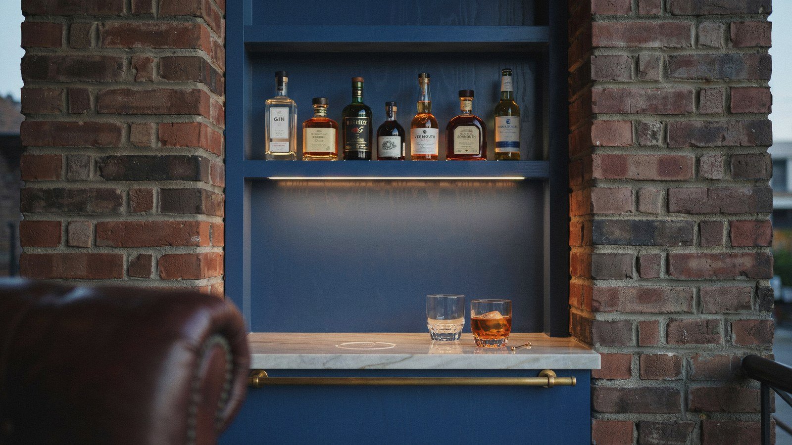
Midnight blue is the colour that makes a home bar look deliberate instead of improvised. It is dark enough to feel like an evening room, but it keeps a warmth that black never manages. Put brass and a decent stone against it and the corner stops looking like a shelf with bottles on it.
I built my first one in an alcove that had held a broken printer for two years. The blue went on over a Saturday, the brass rail arrived a week later, and the whole thing cost less than the sofa facing it. That is the useful part about a home bar: it is a small area, so good materials are still affordable.
Below are fifteen designs that make midnight blue work in a real house, from the paint choice through to the power supply. Some are a weekend of work, others are a joinery job. Most of them fit into a space you already have.
What Makes Midnight Blue Work Behind A Home Bar
Midnight blue sits in a useful place on the colour wheel, dark enough to read as moody but with enough pigment to stay a colour. Black absorbs everything and flattens whatever you put in front of it. Blue holds its depth under lamplight, which is when a bar actually gets used.
The colour also flatters almost every material a bar needs. Brass and copper glow against it, clear glass reads as clean rather than smeared, and amber spirits look like they belong there. I have tried the same shelf against charcoal and the bottles just looked dusty.
The one thing midnight blue needs is a light source that is warm. Cool white bulbs turn it grey and slightly institutional, which is the opposite of what you want at nine in the evening. Warm light is not optional here, it is the thing that makes the colour work at all.
| Material | Against Midnight Blue | Why It Works |
|---|---|---|
| Unlacquered brass | Excellent | Warm metal against cool pigment, ages well |
| Fluted glass | Excellent | Breaks the flat panel, catches lamplight |
| Pale marble or quartzite | Very good | Light top stops the run going heavy |
| Walnut | Good | Warm wood, but keep it to one element |
| Chrome or cool steel | Poor | Reads cold, drains the warmth out of the blue |
| Pure white gloss | Poor | Too much contrast, looks like a bathroom |
Where A Home Bar Actually Fits In A Normal House
Most people picture a dedicated bar room and then give up, which is a shame because the good ones are almost never separate rooms. An alcove beside a chimney breast, the end of a run of kitchen units, or a shallow cupboard with the doors taken off all work. The trick is finding a space around three feet wide and two feet deep.
Dining rooms take a bar better than living rooms in my experience. People already stand up in a dining room, and the bar becomes the thing they gather round before eating rather than a display nobody touches. A living room bar tends to sit behind the sofa and get ignored.
Think about the route from the bar to wherever people sit, because that walk decides whether it gets used. If you have to cross a room with a full glass, you will use it twice a year. Put it near the seating and it earns its space every week.
1. Pick The Right Midnight Blue Before Anything Else
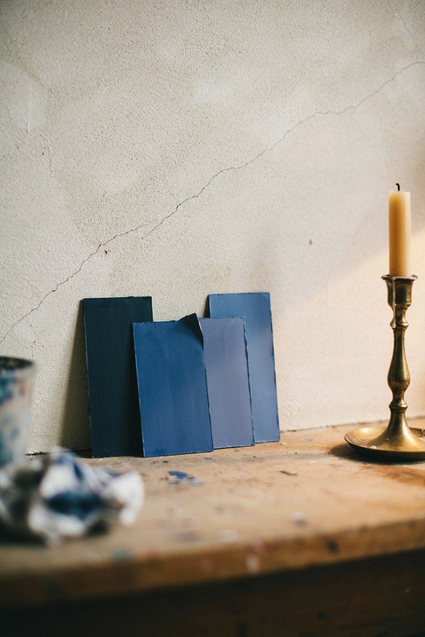
Not every dark blue works, and the wrong one goes purple or navy-uniform under artificial light. Look for a blue with a grey or green undertone rather than a red one, because red undertones turn violet at night. Paint a large test patch and look at it after dark with the lamps on, which is the only test that matters here.
Buy a sample pot and paint a piece of card rather than the wall itself. You can then move it around the alcove and see how it behaves in shadow, which is where most of the bar will sit. I wasted a full tin learning this on a wall that only ever saw one angle of light.
Test the blue against the wall it will actually sit on, not a white sheet of paper. Surrounding colour shifts your perception more than most people expect, and an alcove flanked by warm plaster reads differently from one beside white gloss. Hold the card in the real position for a minute before deciding.
How To Judge A Blue Under Lamplight
Set up the actual bulbs you plan to use before judging any swatch. A 2700K bulb and a 4000K bulb will make the same paint look like two different colours, and the second one will look wrong. This is a fifteen minute test that saves repainting a whole alcove.
Look at the swatch next to a brass object and a glass, not on its own. Colour on its own tells you very little, but colour beside the materials it has to live with tells you everything. If the brass looks muddy against it, choose a different blue.
2. Put The Bar Where People Already Stand
The best home bars go where people naturally congregate, which is usually near the kitchen door or the end of the dining table. Fighting that pattern never works, and a bar in the wrong corner becomes an expensive shelf. Watch where people drift at your next gathering and put it there.
Corners are better than the middle of a wall because they give you two surfaces to work with. You get a back panel and a return, which means somewhere for the bottles and somewhere for the glasses. A flat wall gives you a single line and it always feels thin.
Height is the measurement people forget, and it decides whether the top shelf is usable or decorative. Anything above about six feet turns into storage you need a stool to reach, which defeats the point. Keep the working shelves between waist and shoulder and treat the rest as display.
Checking The Space Before You Commit
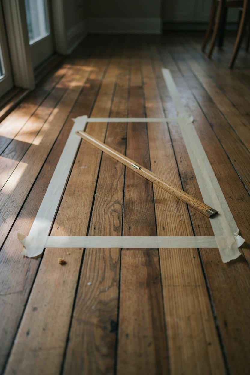
Mark the footprint on the floor with tape and live with it for a week. You will find out quickly whether the door swings into it or whether people cut that corner on the way to the kitchen. Tape costs nothing and joinery does not.
Stand at the tape and reach for an imaginary bottle at shoulder height. If your elbow hits a wall or a radiator, the layout needs adjusting before anything gets ordered. Reach matters more than looks in a space this small.
3. Use Brass Against The Blue
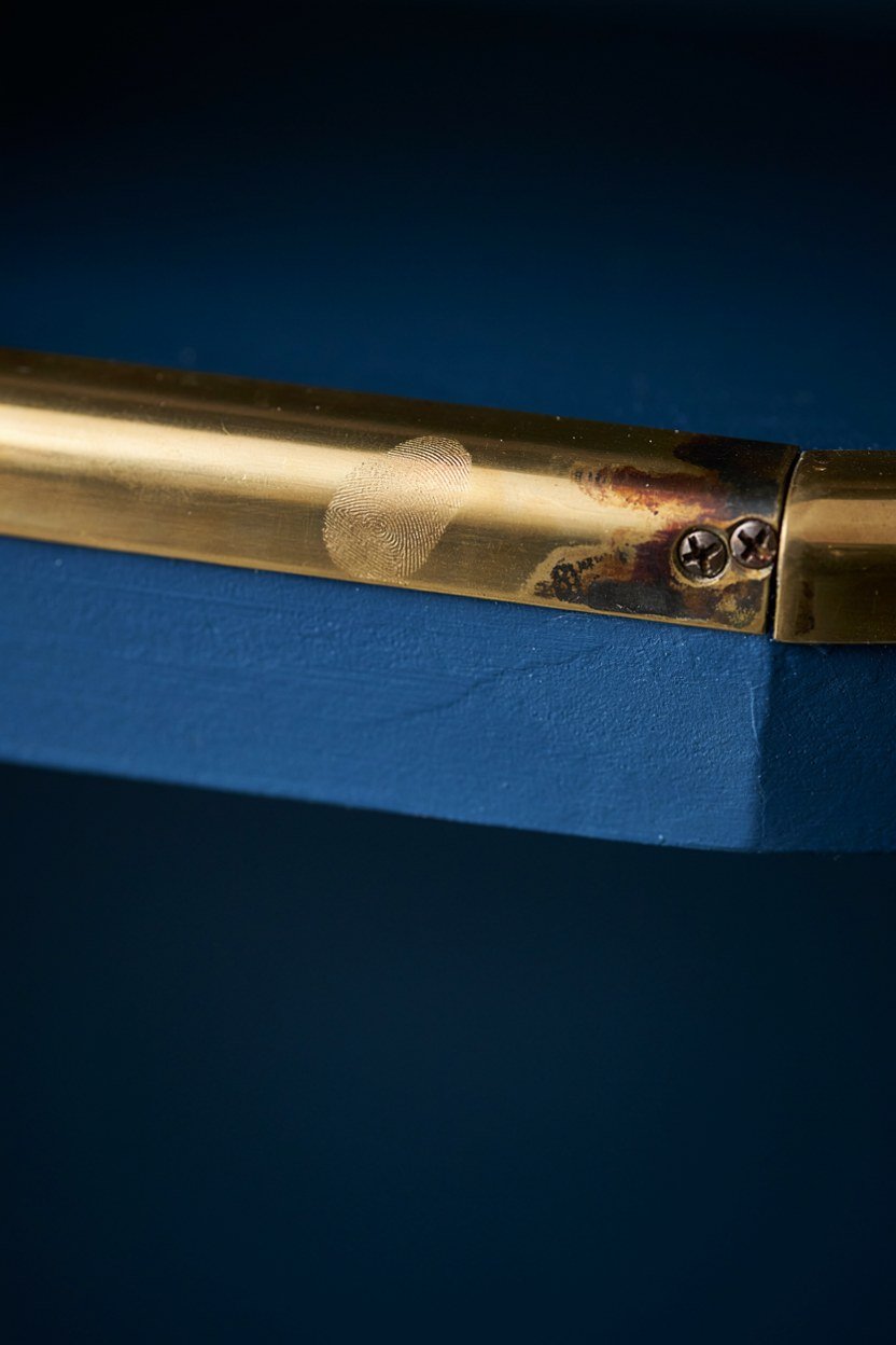
Brass is the metal that makes midnight blue look intentional rather than merely dark. A brass rail, brass shelf brackets or a brass tap pull the warmth out of the colour and stop it going flat. One warm metal is enough, and mixing three finishes in a small bar looks accidental.
Unlacquered brass will darken over a year or two into something considerably better looking than it started. If you want it to stay bright, buy lacquered and accept that it will never develop a patina. I prefer the unlacquered because a bar is a place where wear reads as use.
Solid brass and brass plated look identical in a showroom and completely different after two years. Plating wears through at exactly the points you touch most, leaving a dull grey patch on a handle or rail. For the small quantities a bar needs, solid is worth the difference.
Where To Put The Metal
Concentrate the brass at hand height, on rails, handles and the edge of a shelf. Metal high up disappears into shadow and metal at floor level gets kicked. The band between waist and shoulder is where the eye goes and where hands actually land.
Repeat the finish at least twice so it reads as a scheme. A single brass object in a blue alcove looks like something left behind rather than a decision. Two or three repeats and the whole corner ties together.
4. Light The Bottles, Not The Room
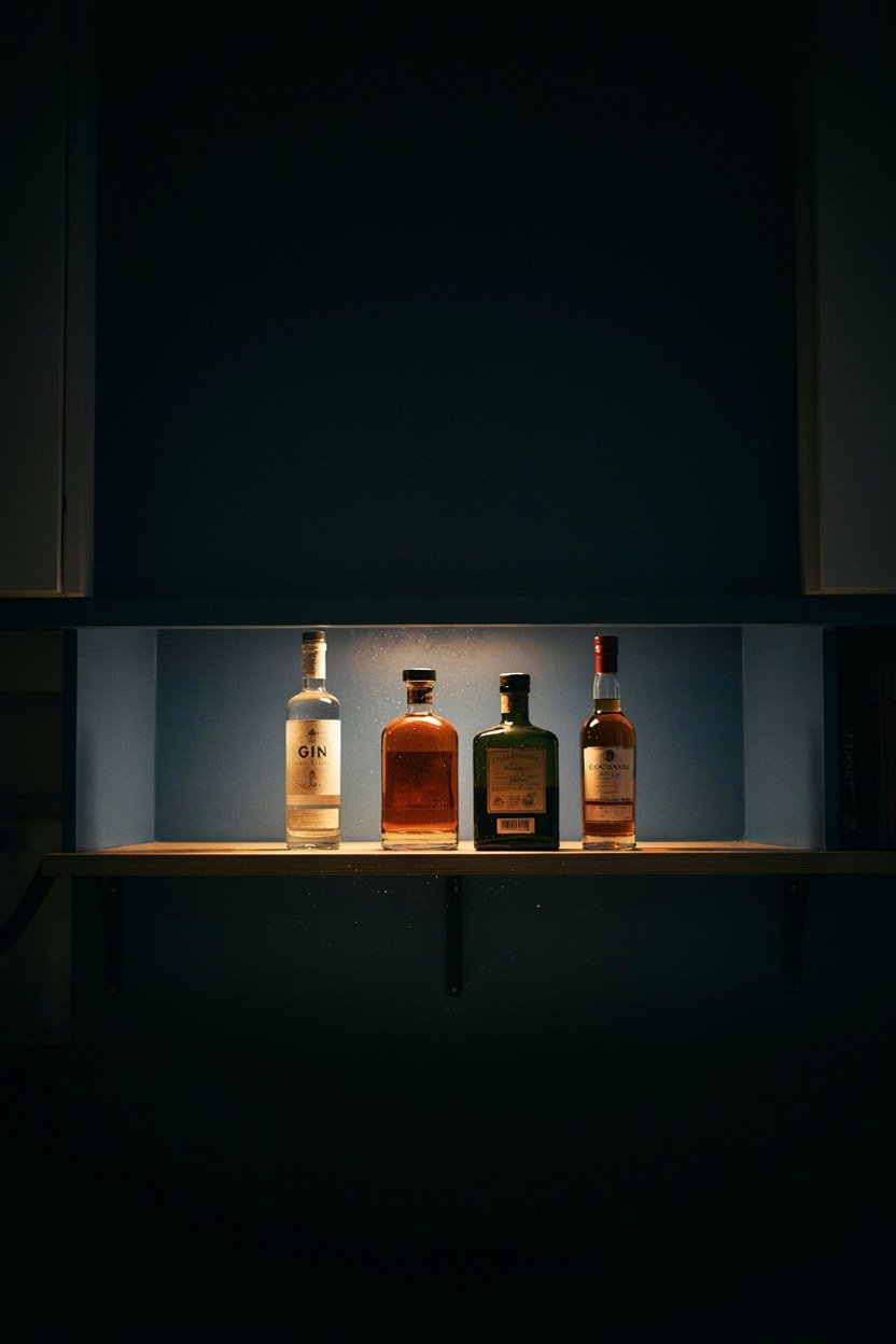
The single biggest difference between a home bar that looks good and one that looks like storage is where the light comes from. Overhead light flattens everything and casts shadow down the front of the bottles. Light from behind or below turns the same bottles into the decoration.
A warm LED strip tucked under the top shelf, aimed down at the bottles, costs very little and changes the whole corner. Hide the strip behind a lip so you see the light and not the diodes. Anything visible ruins the effect immediately.
Aim the light down the face of the bottles rather than straight at them. A strip mounted at the front edge of the shelf, pointing back and down, lights the labels without the glare you get from a light sitting behind the glass. That small change in angle is the difference between a display and a shop window.
Getting The Colour Temperature Right
Stay at 2700K or below for a bar, because anything cooler makes spirits look grey. Whisky and rum in particular need warm light to look like anything at all. This is the same rule that applies to a dining table and for the same reason.
Put the bar lighting on its own switch or dimmer rather than the room circuit. You want the bar lit while the rest of the room is dim, which is impossible if they share a switch. A single dimmer module is a cheap upgrade with a large effect.
5. Choose A Stone Top That Can Take A Spill
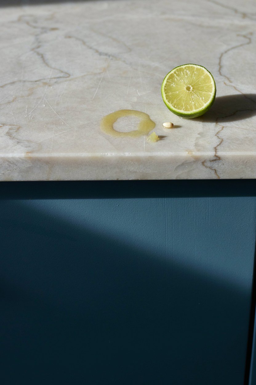
The bar top takes citrus, alcohol and water rings, so the material matters more here than almost anywhere else in a house. Quartzite and engineered quartz both shrug off spills, while marble stains if you leave a lime wedge on it overnight. I have a marble top and I have made my peace with the marks.
A pale top is worth the risk because it lifts the whole run and stops the blue turning into a dark hole. The contrast between a light stone and a deep blue cabinet is most of what makes these bars look good. Going dark on dark rarely reads as sophisticated, it just reads as dim.
Seal any porous top before the first drink is poured rather than after the first stain. Impregnating sealers take twenty minutes to apply and last a couple of years on a domestic bar. Doing it later means living with whatever marked it in the meantime.
Practical Alternatives To Stone
Stainless steel and solid timber both work if stone is out of budget. Timber needs an oil finish that you top up once a year, and it will show rings, which some people like and others cannot stand. Steel is bulletproof but pulls the warmth out of the scheme.
Whatever you pick, add a small overhang at the front edge. Drips run down the face of a flush top and mark the cabinet below within a month. Twenty millimetres of overhang solves it permanently.
6. Add A Mirrored Or Fluted Back Panel
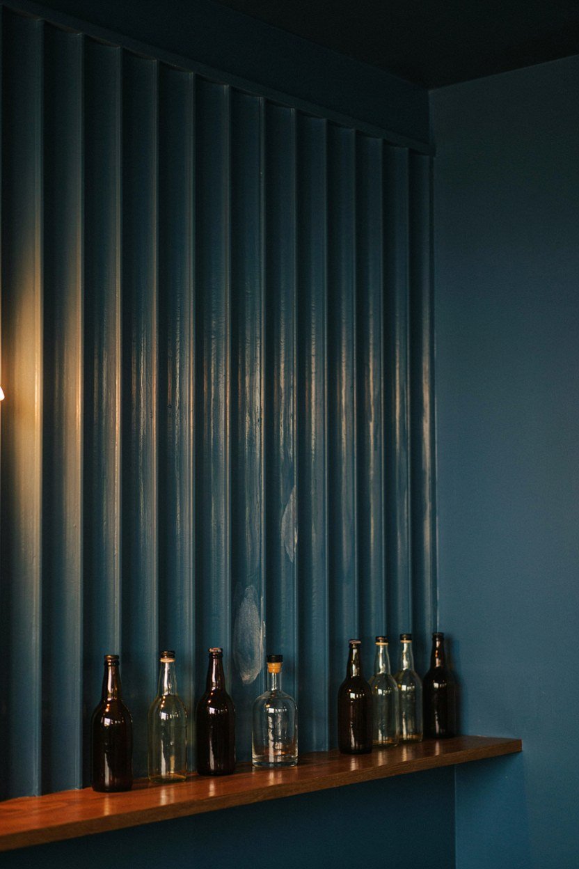
A back panel is the detail that separates a bar from a bookshelf, and it does most of the visual work for very little cost. Antique mirror doubles the bottles and bounces the light around the alcove. Fluted glass does something similar but softer, breaking the reflection into vertical lines.
Neither needs to be expensive because the panel is small. A piece of fluted glass cut to fit a three foot alcove costs less than most light fittings. Fix it to a painted backing board rather than the wall so you can remove it later.
When To Skip The Panel
If the alcove already has a window or a strong architectural feature, leave the back plain. Competing details in a space this small cancel each other out and the result looks busy. Painted blue plaster behind the bottles is perfectly good on its own.
A mirror also shows whatever is opposite it, so check the reflection before committing. Doubling a view of the hallway radiator helps nobody. Hold a hand mirror in position and look at what comes back.
7. Keep Glassware Visible And Reachable
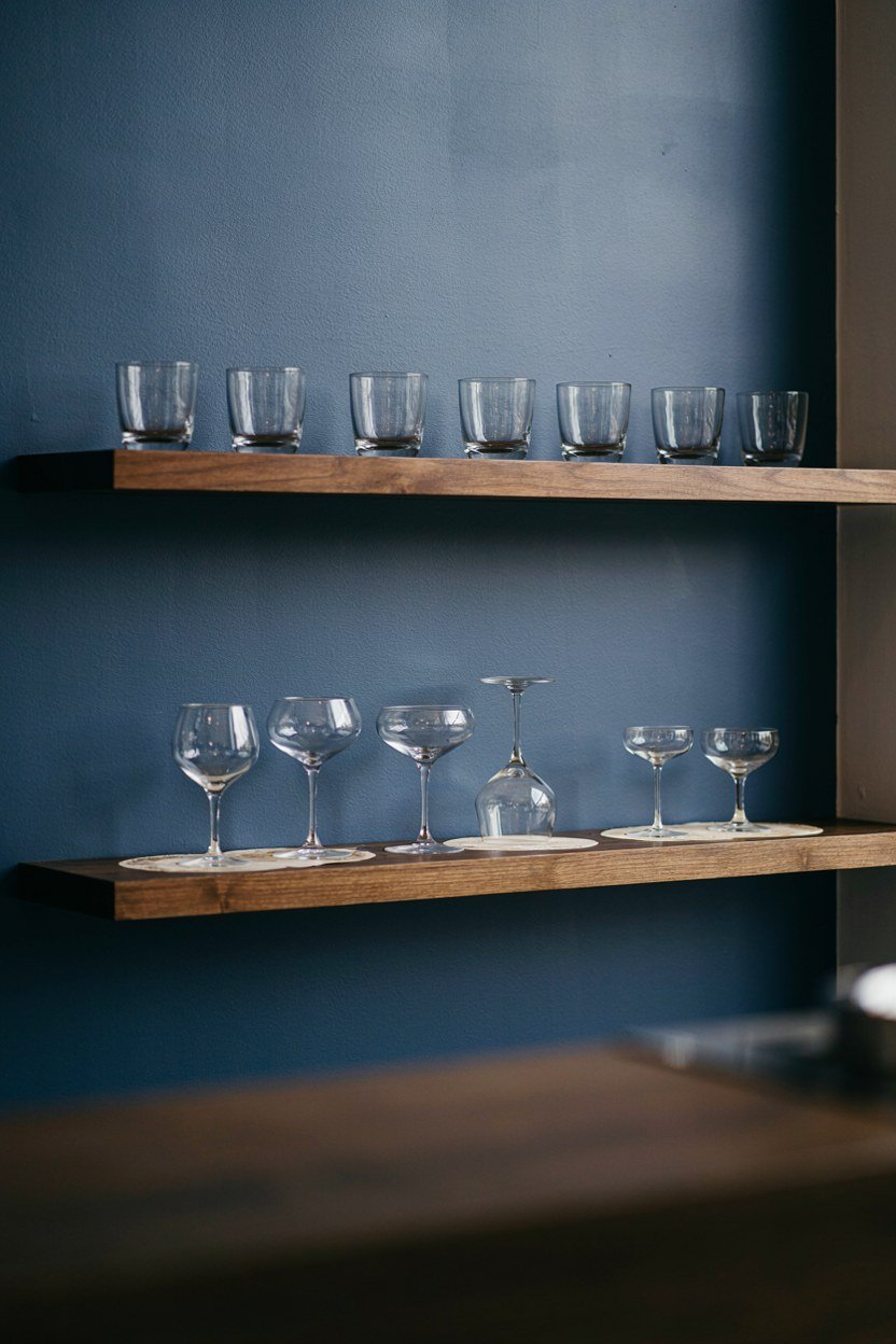
Glasses stored in a cupboard across the room turn a bar into a decoration. Open shelving above the bar keeps them within reach and adds a layer of transparency against the dark blue. It also forces you to keep them clean, which is no bad thing.
Two shelves are usually enough for a domestic bar, one for tumblers and one for stems. Any more and you are storing glasses you own rather than glasses you use. I keep six of each and the rest live in the kitchen.
Keep the glasses you use weekly at the front and the specialist ones behind. A coupe you use twice a year does not deserve prime position, and reaching past it every evening becomes irritating quickly. Arrange by frequency rather than by height or aesthetics.
Hanging Stems Under A Shelf
A stemware rail fitted to the underside of a shelf holds wine glasses upside down and saves a whole shelf of depth. It also looks like a proper bar, which is half the point of building one. Fit it far enough forward that the bowls clear the bottles behind.
Check the rail spacing against the glasses you actually own before ordering. Modern wine glasses have thicker stems than the rails sold for them, which is a small and annoying discovery to make after fitting. Measure one stem with a caliper or a ruler.
8. Fit A Small Under Counter Fridge
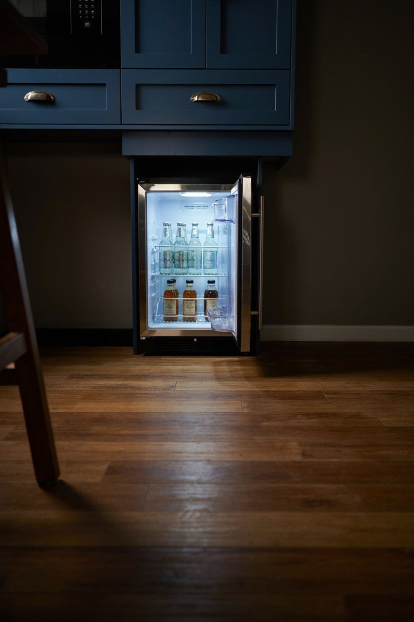
An under counter fridge is the upgrade that turns a bar from a display into something you use on a Tuesday. Not having to walk to the kitchen for ice or a mixer changes the behaviour completely. A 45cm unit fits under most bar tops and holds more than you expect.
Look for a model with a reversible door, because the hinge side matters enormously in a corner. A door that opens into the room is fine; one that opens into a wall makes the fridge useless. Check the spec sheet rather than assuming.
Check the hinge clearance against the adjacent wall before ordering, because integrated doors need more swing than they appear to. A fridge in a corner with fifty millimetres of clearance will not open past ninety degrees, which makes the shelves impossible to pull out. Manufacturers publish this figure and almost nobody reads it.
Ventilation And Noise
Integrated fridges need a ventilation gap and they will fail early without one. Read the installation drawing before the joinery is cut, because retrofitting a vent into a finished cabinet is miserable work. Most need a gap at the plinth and another at the back.
Noise matters more in a living space than in a kitchen. A compressor that is unremarkable in a kitchen is very audible behind a sofa at ten at night. Look for a rating under 40 decibels if the bar sits in a room where people talk.
9. Build In A Proper Rail For Bottles
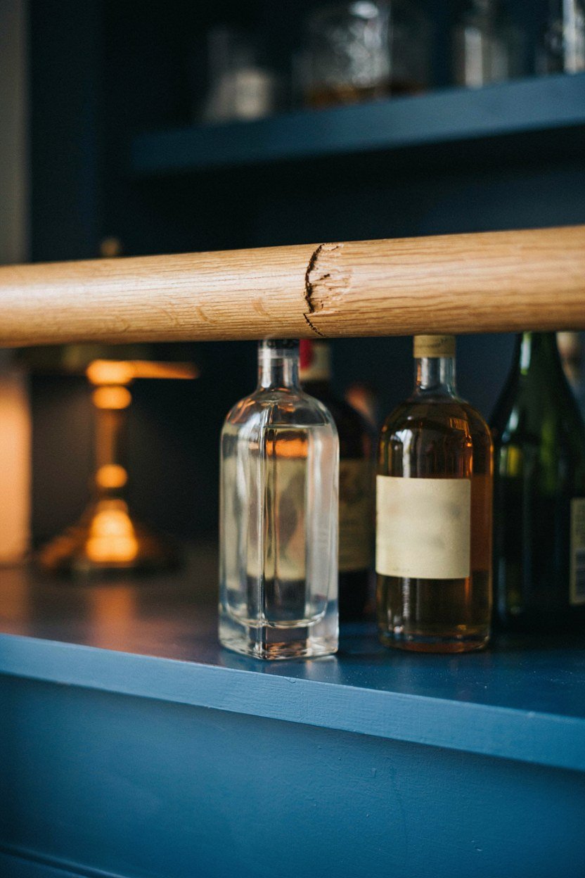
Bottles slide, and a shelf without a lip becomes a slow motion accident every time someone shuts a door. A brass or timber rail across the front of each shelf stops it and looks like a deliberate detail. It is one of the cheapest things on this list.
Height matters: around 30mm above the shelf holds a bottle safely without hiding the label. Too high and you lose the look of the bottles entirely, too low and it does nothing. I fitted mine at 25mm and it was not quite enough.
Depth matters as much as height, and a shelf deeper than about 200mm hides the back row completely. Bottles stored two deep are bottles you forget you own, which is how three open bottles of the same gin appear. One row deep, always.
Spacing Shelves For Real Bottles
Measure your tallest bottle before setting shelf heights, then add 40mm. Gin bottles in particular vary wildly and several will not fit a standard 300mm gap. This is the sort of thing that only shows up after the joinery is fixed.
Leave one shelf taller than the rest for the awkward ones. Champagne, magnums and the odd tall liqueur all need a home, and a single generous shelf handles them. Uniform shelves look tidier but store less.
10. Add Two Stools, Not Four
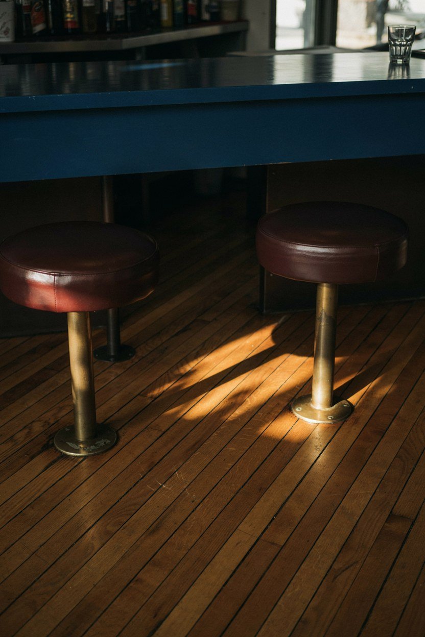
Two stools at a home bar look inviting; four look like a pub and take over the room. The bar is somewhere to lean while someone else pours, not a seating plan. Two also means people stay standing and moving, which is how these corners work best.
Backless stools slide fully under the overhang and disappear when not in use. That matters in a room that has another purpose the rest of the week. A stool with a back is more comfortable and permanently in the way.
Getting The Height Right
Allow around 25 to 30cm between the seat and the underside of the counter. Less and knees hit the cabinet, more and the stool feels like a perch. Standard bar height counters need a 75cm stool, which is taller than most people guess.
Sit on one before buying if you possibly can. Stool comfort varies enormously and photographs tell you nothing about the front edge, which is what you actually feel. A hard front edge makes a stool useless after ten minutes.
11. Sort Out The Ice Problem Early
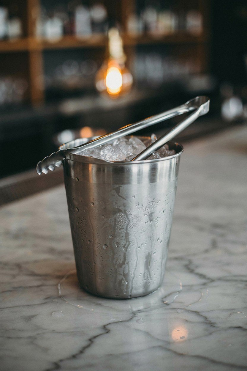
Ice is the thing that quietly decides whether a home bar gets used, and almost nobody plans for it. A freezer across the house means every drink involves a trip, and after a while you stop bothering. Either put a small ice maker in or accept a good insulated bucket.
An insulated bucket that holds its ice for four hours costs very little and solves the problem for most households. Fill it once before people arrive and forget about it. I use one and have never regretted skipping the plumbed ice maker.
If You Do Want An Ice Maker
Under counter ice makers need a water supply and a drain, which usually means running pipework from the kitchen. That is a real job and it should be decided before joinery, not after. The units themselves are not expensive; the plumbing is.
Self contained models that you fill by hand exist and skip the plumbing entirely. They take up the same space as a small fridge and produce enough for an evening. For most homes this is the sensible middle ground.
12. Use Closed Storage For The Ugly Half
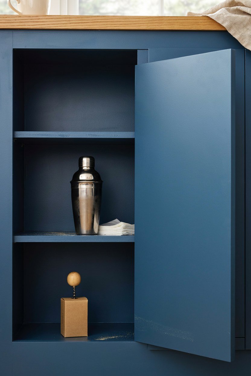
Every bar has a category of objects that look bad on display: spare mixers, a cocktail shaker with a dented lid, cocktail napkins, the corkscrew that actually works. All of that belongs behind a door. Open shelving is for bottles and glasses only.
A single cupboard under the counter is enough, and it stops the whole corner turning into clutter within a month. The discipline of having somewhere to put things is what keeps the display looking curated. Without it, everything ends up on the top.
Making The Doors Disappear
Handleless push to open doors keep the run of blue unbroken, which matters in a small area. Handles add a second metal finish and break the panel into pieces. If you want handles, use the same brass as the rail.
Paint the doors the same blue as the carcass rather than contrasting them. Contrast draws attention to the storage, which is precisely the part you want to recede. The bottles should be the only thing the eye stops on.
13. Give The Bar A Dark Ceiling Or Alcove
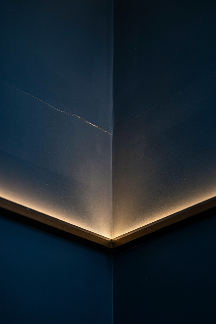
Painting the inside of the alcove, including its ceiling, makes the bar read as a defined zone rather than a shelf on a wall. The colour wrapping over the top creates a sense of enclosure that feels like an actual bar. This costs a tin of paint and an afternoon.
If your bar is not in an alcove, a deep hood or a run of dark joinery above achieves the same thing. What matters is that something dark sits above the bottles and stops the eye continuing up the wall. Without it the arrangement floats.
Contrast With The Room Beyond
The bar should be darker than the room it sits in, which is what makes it feel like a separate small place. If the whole room is already dark, use texture instead of tone to define the zone. Fluted timber or a different sheen level both work.
Keep the floor consistent through the transition. Changing the floor at the bar makes it look like a badly planned extension. Tone changes on walls, not underfoot.
14. Add One Textured Soft Surface
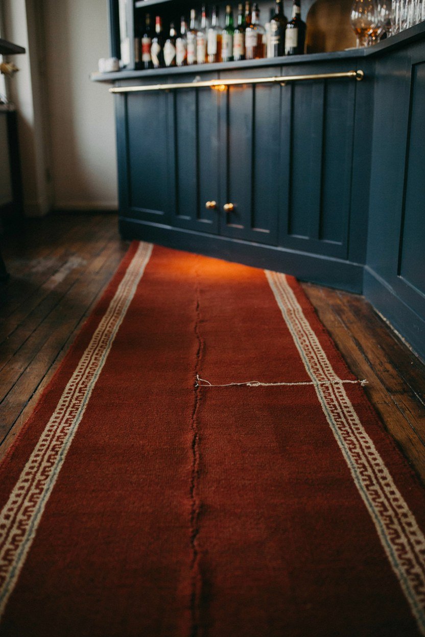
Bars are all hard surfaces, so they echo, and an echoing corner is unpleasant to stand in. One soft element fixes it: a runner underfoot, a curtain nearby, or a fabric backed stool seat. The change in sound is noticeable immediately.
Leather or wool stool tops do the job without introducing anything that looks out of place. Both age well and both handle the occasional spill better than a woven fabric. I would avoid anything pale in a spot where red wine is poured.
Choosing Something That Survives
Whatever you use has to tolerate liquid, because liquid is the entire point of the room. Wool is surprisingly good at shedding a spill if you catch it, and leather wipes clean. Cotton and linen mark permanently.
Keep the textile small and low. A large soft element competes with the bar itself and softens a look that depends on being crisp. One rug or one seat pad is plenty.
15. Plan The Power Before The Joinery

Sockets are the thing everyone forgets, and retrofitting them into finished cabinetry means cutting into a top you just paid for. You need power for the fridge, the lighting and probably a socket on the top for a blender or a kettle. Decide the positions before anything is built.
Put at least one socket at counter level and hide the rest inside the cabinet. A visible socket on a blue back panel is a small ugly detail in an otherwise considered corner. Inside the cupboard nobody sees it.
Getting An Electrician In At The Right Time
The electrician should come after the walls are prepared and before the joinery is fitted. That order sounds obvious and it goes wrong constantly, usually because the joinery arrives early. Confirm the sequence with both trades in writing.
Add one more socket than you think you need. Every home bar gains an appliance eventually, whether that is a wine cooler, a coffee machine or a phone charger. Spare capacity costs almost nothing at first fix.
What A Midnight Blue Home Bar Costs To Build
The paint and the styling are cheap; the cabinetry and the appliances are where the money goes. A painted alcove with open shelves, a brass rail and good lighting can be done for the price of a weekend and a few hundred pounds. That version already looks like the photographs.
The jump in cost comes with a stone top, bespoke joinery and an integrated fridge. All three are worth it if the bar is somewhere you will use weekly, and hard to justify if it is decorative. I would spend on the top and the lighting before anything else.
Lighting is the single best value item on the list. A warm dimmable strip under a shelf costs less than a bottle of decent whisky and changes the corner more than any other single change. Start there if the budget is tight.
| Element | Priority | Rough Cost |
|---|---|---|
| Paint and preparation | Do this first | Low |
| Warm strip lighting and dimmer | Best value on the list | Low |
| Brass rail and brackets | Small parts, big effect | Low |
| Fluted or mirrored back panel | Defines the bar | Low to mid |
| Stone counter top | Where the quality shows | Mid to high |
| Bespoke joinery and cupboard | Only if used weekly | High |
| Under counter fridge | Changes daily use | Mid |
The Mistakes That Ruin A Home Bar
The most common mistake is treating the bar as decoration and then wondering why nobody uses it. If the ice is in another room and the glasses are in a cupboard upstairs, it is a display cabinet with bottles in it. Function first, and the look follows.
The second mistake is cool lighting, which I have now mentioned three times because it is the one that undoes everything else. A perfect blue, good brass and a stone top all look cheap under a 4000K downlight. Fix the bulbs before blaming the paint.
The third is overfilling it. A bar with forty bottles looks like storage, while a bar with twelve looks like a choice. Keep the everyday spirits on display and put the rest in the cupboard where they belong.
The Fix That Solves Most Of These
Stand where your guests will stand and look at the bar from there. Most of these problems are obvious from six feet away and invisible from behind the counter. It is the cheapest diagnostic available and almost nobody does it.
Photograph it on your phone as well, because a camera flattens a scene and shows the clutter your eye has learned to ignore. If the photo looks busy, remove three objects and take it again. Repeat until it stops looking crowded.
Conclusion: The Three Decisions That Carry The Corner
Get the blue right under lamplight, put warm light on the bottles, and give the top a pale stone. Those three decisions do most of the work, and everything else on this list refines what they establish. A bar that gets those wrong cannot be rescued by accessories.
Then make it usable. Glasses within reach, ice nearby, a cupboard for the ugly half, and two stools rather than four. A bar that is pleasant to use gets used, and a bar that gets used always looks better than one that is staged.
Finally, resist filling it. Midnight blue works because it is calm and deep, and a crowded shelf destroys that immediately. Twelve bottles, two shelves of glasses and one warm light is the whole recipe.
Frequently Asked Questions About Midnight Blue Home Bars
What shade of blue works best for a home bar?
Look for a deep blue with a grey or green undertone rather than a red one. Red undertones turn violet under warm bulbs, which is exactly when the bar gets used.
Does a home bar need a stone worktop?
No, but it needs something that survives citrus and alcohol. Quartzite and engineered quartz are the safest, while marble will stain and timber needs oiling once a year.
What lighting should I use behind a bar?
A warm strip at 2700K or below, tucked under a shelf and aimed at the bottles. Overhead light flattens the display and cool white makes spirits look grey.
How much space does a home bar actually need?
Around three feet wide and two feet deep is enough for a genuinely useful bar. An alcove beside a chimney breast or the end of a kitchen run both work well.
Should I fit an under counter fridge?
If the bar sits away from the kitchen, yes, because it changes how often you use it. Check the door is reversible and that the cabinet has the ventilation gap the model requires.
How many bottles should be on display?
Around twelve looks curated and anything past twenty starts looking like storage. Keep the everyday spirits out and put the rest behind a door.
What metal finish suits midnight blue?
Brass or copper, because warm metals pull the warmth out of the blue. Chrome and cool steel drain it and make the whole corner feel cold.