
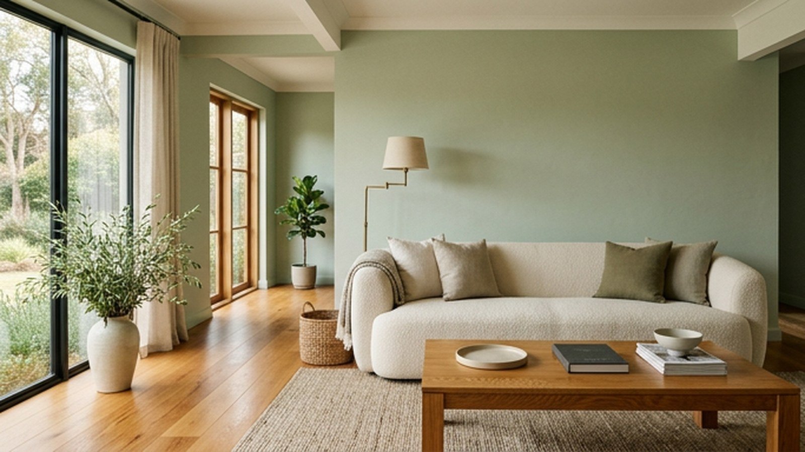
The modern living room color combinations that work best pair one calm main color with a supporting tone and a single accent, usually in natural materials rather than bright paint. Sage with cream and oak, navy with camel, or charcoal with cognac leather all feel current because each color has a clear job and the room never fights itself.
I would choose a combination by starting with what is already fixed in the room: the floor, the sofa, the kitchen cabinets in an open plan. Those big, expensive surfaces decide which wall colors will look intentional and which will clash within a week.
Below are fourteen tested pairings, from quiet neutrals to darker, moodier schemes, with where each color goes, which rooms suit it, and how to test it before painting. A quick reference table sits partway through.
How to Build a Color Combination That Works
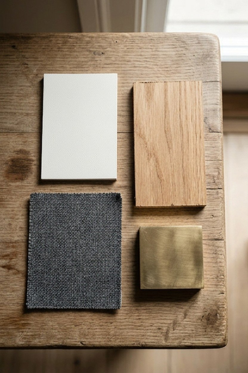
Most good living room schemes follow a rough 60-30-10 split. About 60 percent is the main color on walls and large surfaces, 30 percent is a supporting tone in the sofa, rug or curtains, and 10 percent is an accent in cushions, art or a single chair.
Choose colors that share an undertone, all warm or all cool, and the scheme will hang together even when the shades are very different. A warm beige wall with a cool blue-grey sofa is the classic mismatch that makes both look slightly wrong.
Materials count as colors too. Oak floors read as a warm mid-tone, black metal as an accent and white oak as a light neutral, so include them when you plan the 60-30-10 split rather than treating them as separate.
Artwork is the easiest place to hold the accent color. A print that combines the main color and the accent lets you pull the accent into one or two cushions without the room looking matched from a catalogue.
Warm White, Oak, and Black
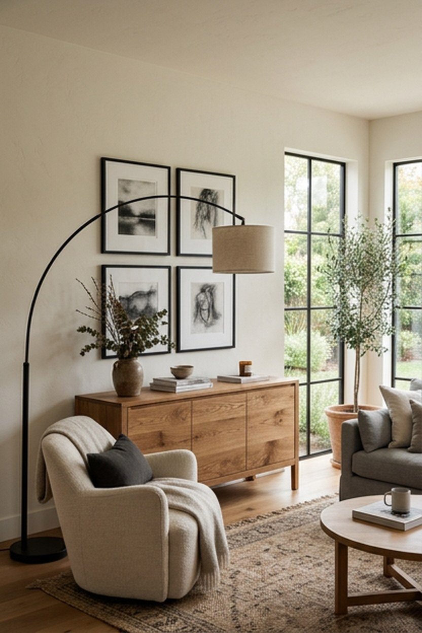
Warm white walls with oak furniture and small black accents are the most dependable modern scheme. The white keeps the room bright, the oak adds warmth, and thin black lines in lamps, frames and chair legs give it definition.
Keep the black to about 5 to 10 percent of what you can see, spread across three or four pieces. Too much black in a small room starts to feel heavy, while none at all leaves a white and oak room looking soft and unfinished.
Black window frames, a black curtain pole or black picture frames count toward that small share. Matte black looks softer and more current than gloss, and it hides fingerprints on door handles and lamp switches.
Greige and Soft Charcoal
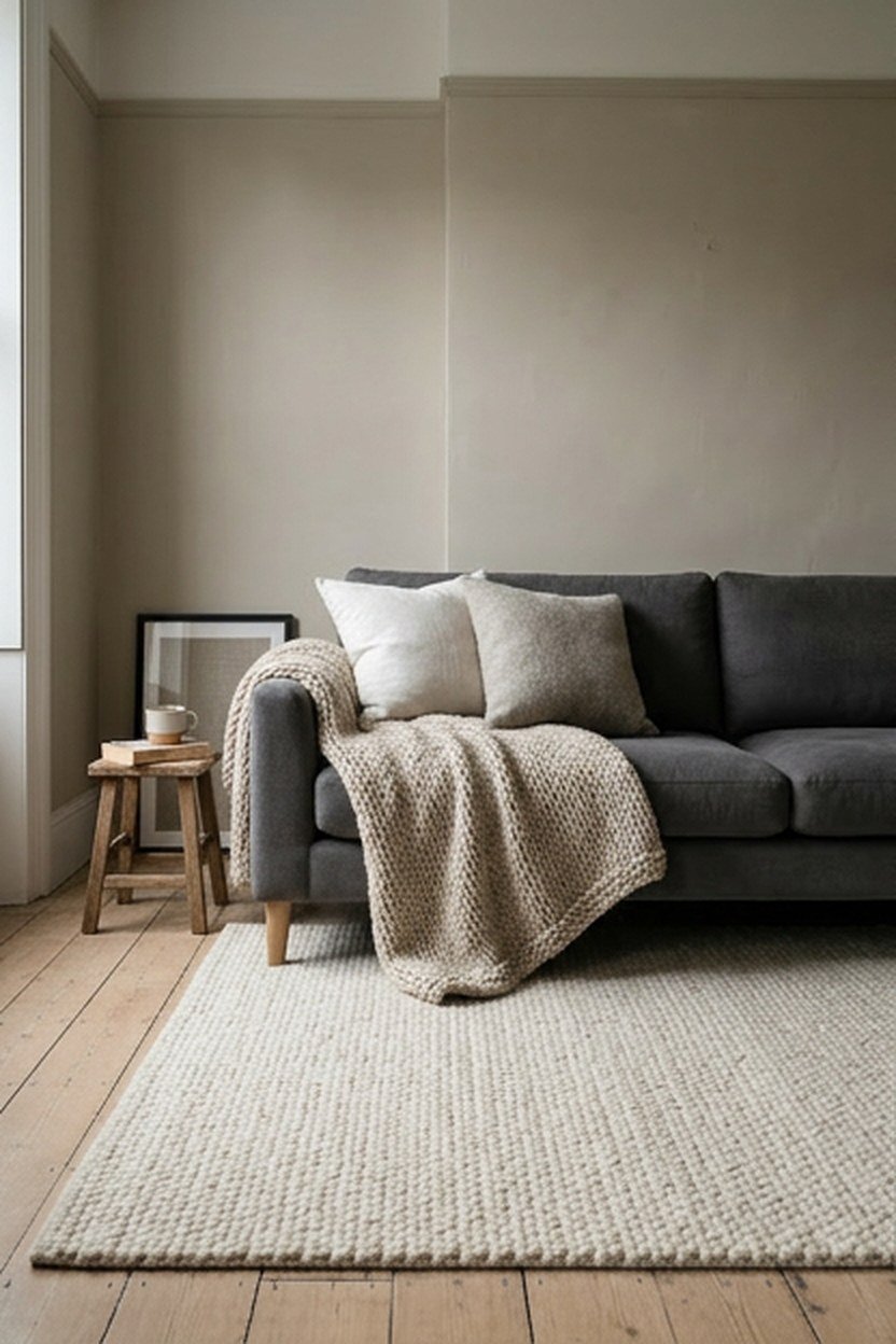
Greige, the mix of grey and beige, suits rooms that swing between warm and cool light through the day. Paired with a soft charcoal sofa or rug, it gives a calm, grown-up look that hides wear better than pure white.
Sherwin-Williams Agreeable Gray is one widely used greige that sits comfortably in most lights, though every paint should be tested on your own walls. Add texture through a nubby wool rug or linen curtains so the scheme does not look flat.
Greige pairs well with both brass and black metal, so it suits homes that mix finishes. Oak and walnut both look good against it, which makes greige a safe choice when you already own furniture in more than one wood tone.
Sage Green, Cream, and Natural Wood
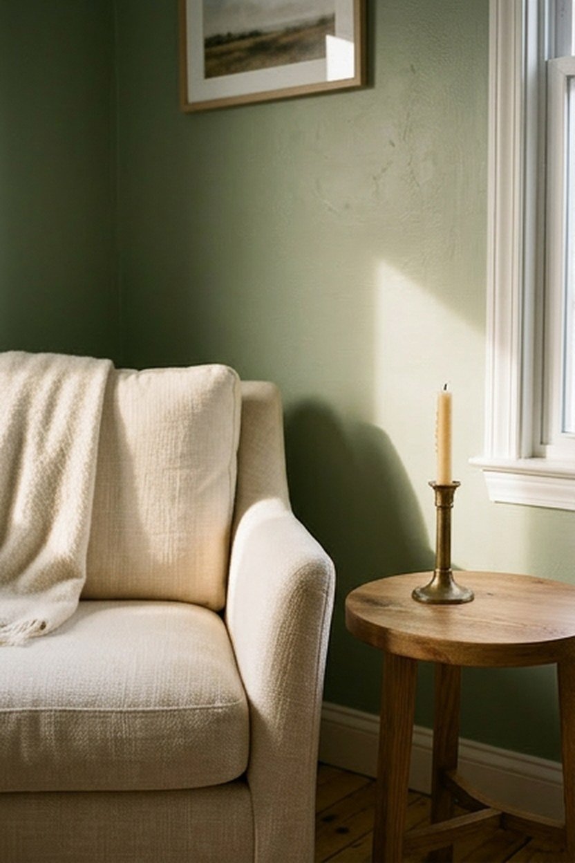
Sage green is one of the easiest colors to live with because it behaves almost like a neutral. On walls or a sofa, paired with cream and natural wood, it brings a quiet connection to the garden without becoming the whole personality of the room.
Cream works better than bright white alongside sage, since stark white makes the green look slightly grey. Brass or aged bronze accents suit the scheme and add a little warmth in the evening.
Sage also carries well into an open-plan kitchen, where green cabinets or a green island can echo the living room walls. Keep the shade identical or one step darker in the kitchen so the two spaces read as one scheme.
Choosing the Right Sage
Greyer sages suit bright, south-facing rooms, while sages with more yellow in them stay lively in north-facing light. Sherwin-Williams Evergreen Fog is a popular mid sage, but compare two or three large swatches, since sage shifts more than most colors between morning and evening.
Navy, Camel, and Crisp White
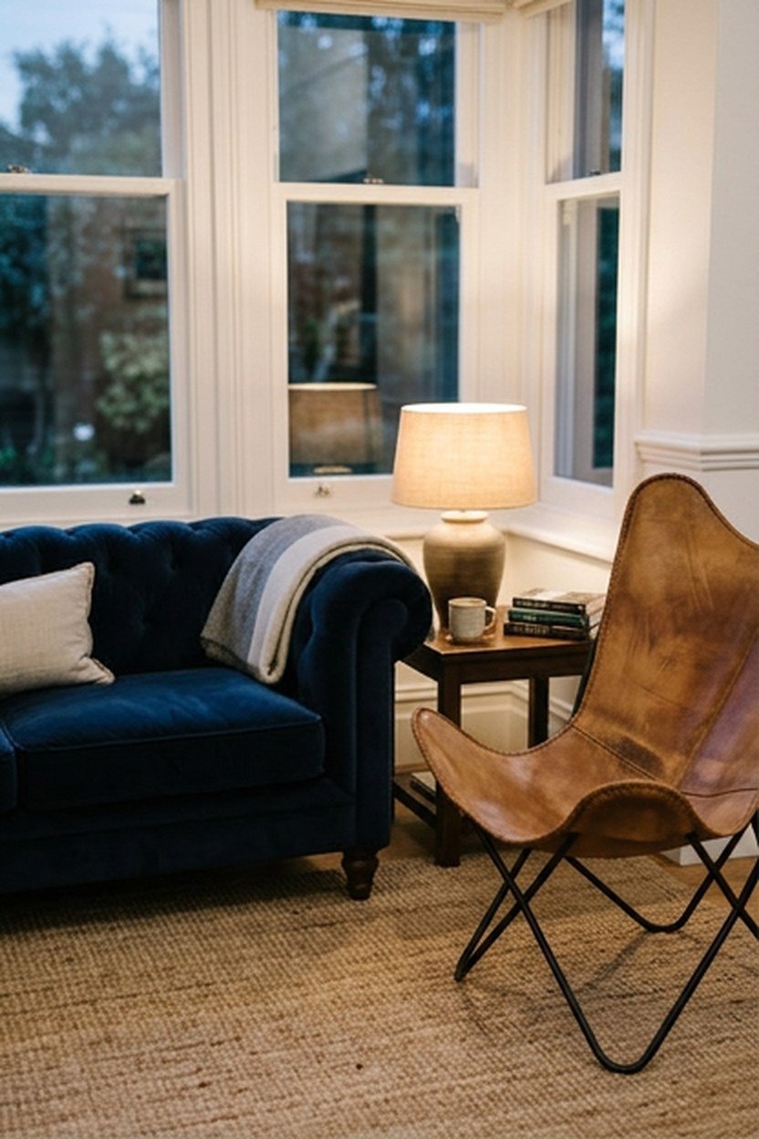
Navy and camel is a classic pairing that feels tailored and relaxed at the same time. A navy wall or sofa with camel leather, a jute rug and white trim works in both modern and more traditional living rooms.
Navy needs warm light, so keep bulbs at 2700K to stop it turning cold and flat at night. Benjamin Moore Hale Navy and Farrow and Ball Hague Blue are two well-known navies worth testing, with Hague Blue reading slightly greener.
Decide early whether navy goes on the walls or the sofa, since doing both makes a room heavy. A navy sofa against white walls is the lighter option for a small room, while navy walls with a camel sofa suit a large room with good daylight.
Terracotta, Sand, and Olive
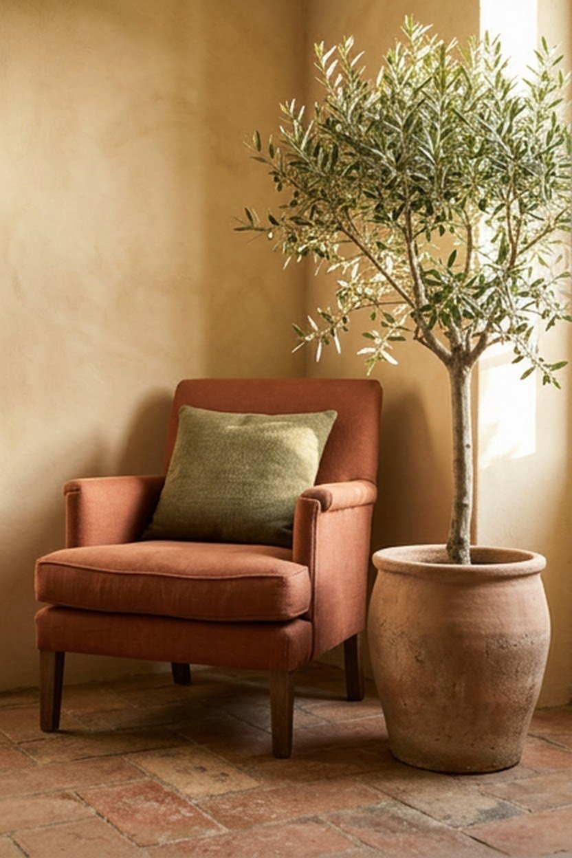
Terracotta, sand and olive give a warm, earthy scheme that suits sunny rooms and natural materials. Use sand on the walls, terracotta in cushions, a rug or a single armchair, and olive in plants, a vase or a velvet cushion.
Keep terracotta as the accent rather than the main color unless the room is large and bright. Terracotta walls in a small, dim room can feel close, while the same shade on one chair lifts the whole space.
| Combination | Main color | Supporting tone | Accent | Best for |
|---|---|---|---|---|
| Warm white, oak, black | Warm white | Oak | Black metal | Any room, small spaces |
| Sage, cream, wood | Sage or cream | Natural wood | Brass | Calm family rooms |
| Navy, camel, white | White or navy | Camel leather | Brass or wood | Classic modern rooms |
| Terracotta, sand, olive | Sand | Terracotta | Olive | Sunny, warm rooms |
| Charcoal, cognac | Charcoal | Cognac leather | Warm wood | Evening rooms, large spaces |
| Forest green, brass | Forest green | Cream | Brass | Libraries, snugs |
Charcoal Walls With Cognac Leather
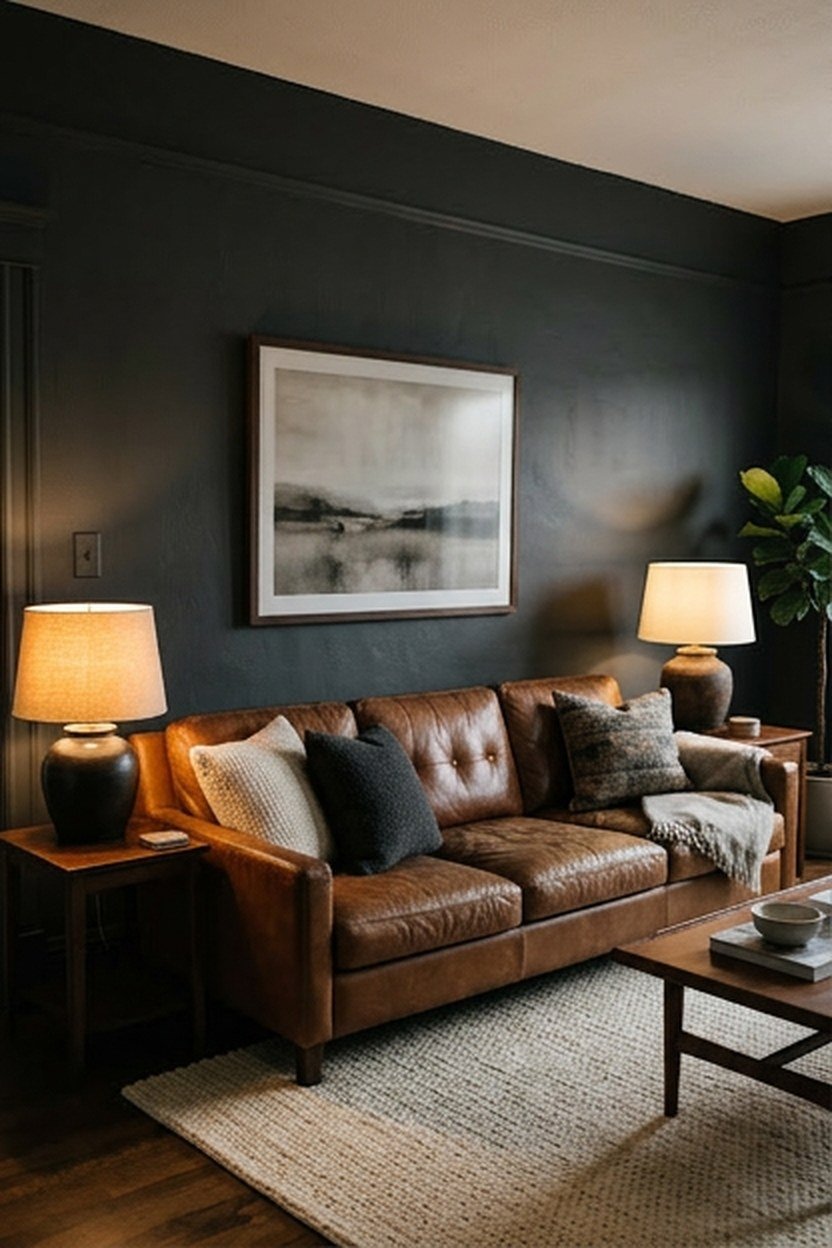
Dark charcoal walls paired with a cognac leather sofa or chair give a rich, enveloping room that feels modern and warm. The leather glows against the dark background, especially under low lamps in the evening.
Use a matte or flat finish on dark walls so they absorb light rather than showing every roller mark. Add plenty of warm lamp light and one lighter element, such as a cream rug, so the room does not feel closed in.
Brass, bronze and warm oak all glow against charcoal, and pale artwork stands out beautifully on it. Keep cushions and throws in cream, camel and rust so the dark walls read as a backdrop rather than the whole scheme.
Making Dark Walls Work in a Small Room
Dark colors can make a small living room feel cosier rather than smaller, since the corners seem to recede. Paint the ceiling and trim in the same dark color, or one shade lighter, so there are no bright edges drawing attention to the room’s size.
Soft Blue-Grey and Warm Wood
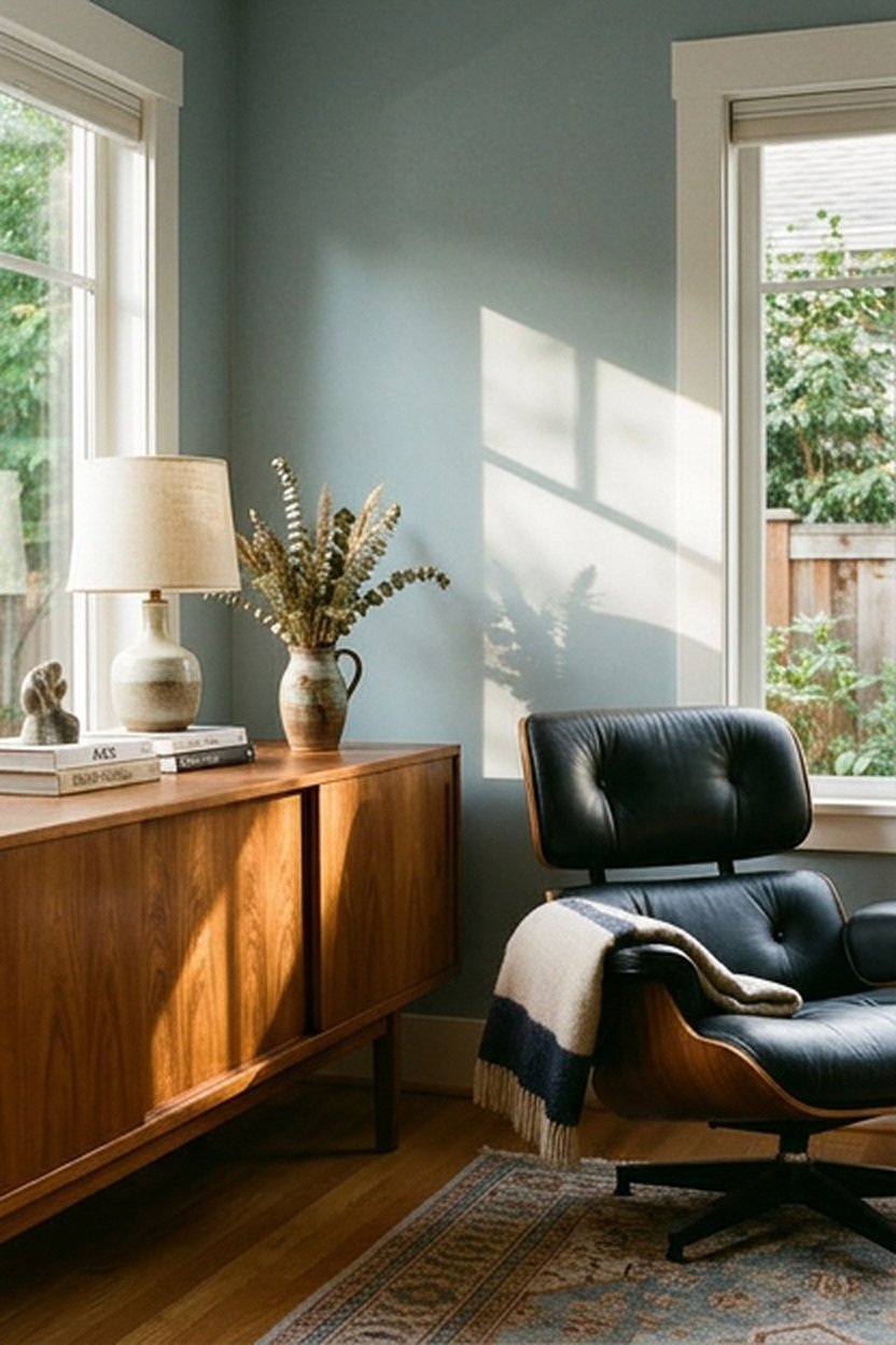
A soft blue-grey calms a busy family room, and warm wood keeps it from feeling cold. Walnut, teak or honey oak furniture works best, since the orange in the wood balances the cool wall.
This combination suits south- or west-facing rooms that get strong afternoon sun. In a north-facing room, choose a blue-grey with a touch of green, which holds its warmth better on dull days.
Textiles in cream, oatmeal and soft rust sit well against blue-grey and warm it further. Avoid pairing it with icy white and chrome, which pushes the whole room back toward cold.
Black and White With Walnut Accents
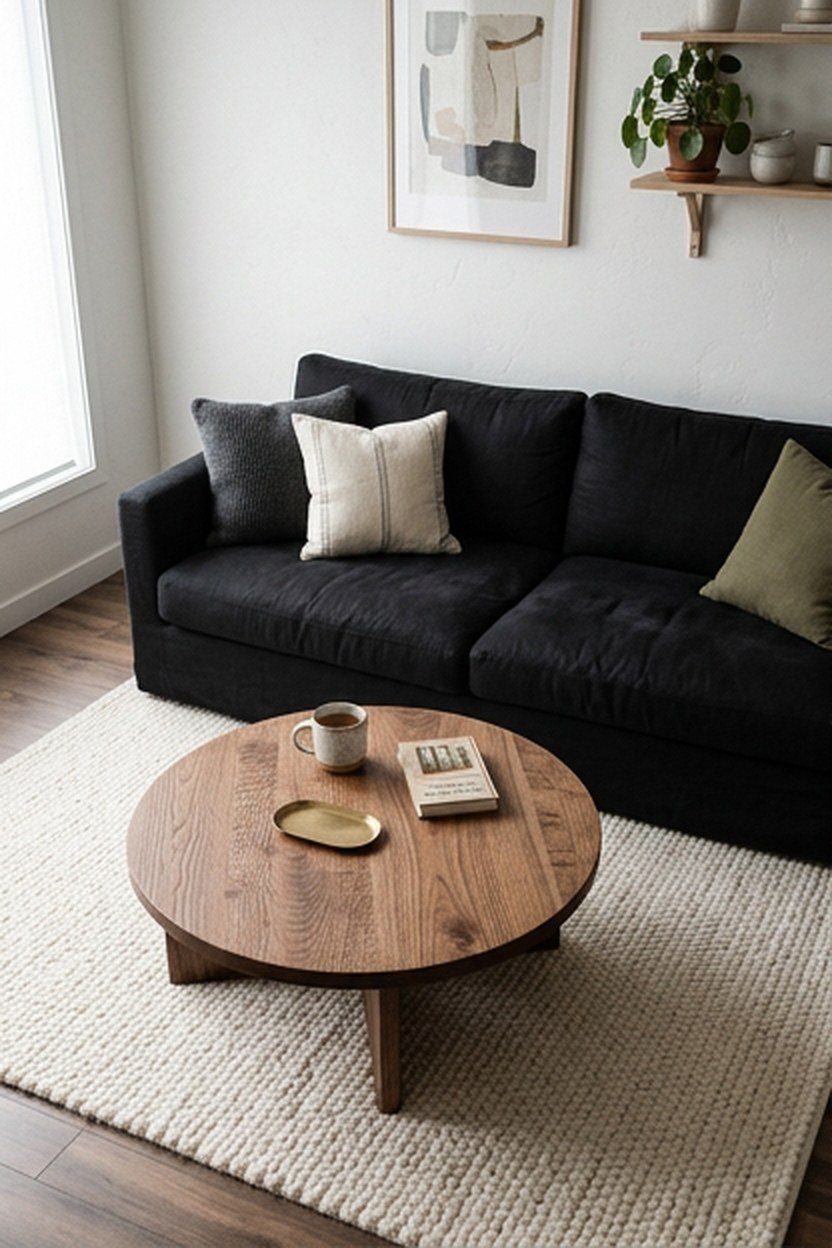
Black and white is sharp and modern, and walnut stops it from feeling clinical. White walls, a black sofa or accent wall, and walnut in a coffee table, sideboard or shelving give the room balance.
Soften the contrast with textiles in off-white and charcoal rather than pure white and pure black. Farrow and Ball Railings is a soft black with a blue undertone that looks less harsh than a true black.
Taupe, Rust, and Ivory
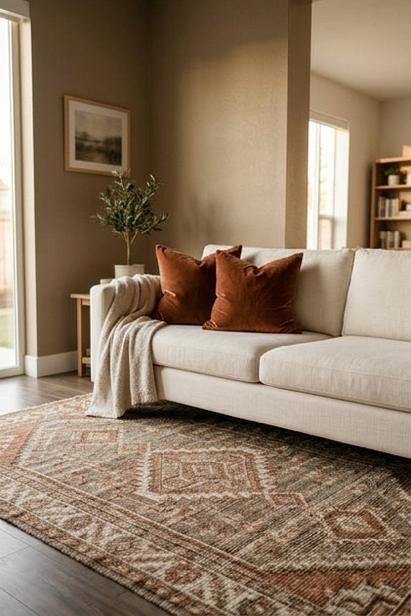
Taupe walls with ivory upholstery and rust accents give a warm, autumnal feel that works all year. Rust cushions, a rust throw or a rust-toned rug add energy without overwhelming the calm base.
Keep rust to a few pieces and repeat it at least twice so it looks deliberate. A rust cushion on the sofa and a rust vase across the room tie the space together better than a single spot of color.
Where Pattern Fits In
A patterned rug or cushion that uses all three colors pulls the scheme together. Pick one pattern in the room at most, and let solid colors and textures carry everything else.
Forest Green and Brass
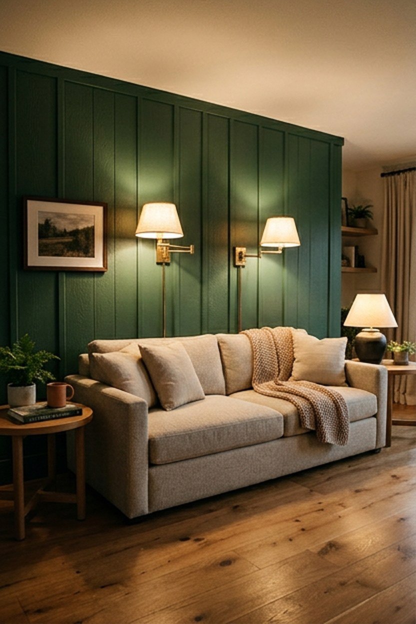
Deep forest green walls with brass lighting and hardware create a moody, elegant living room. The scheme suits snugs, rooms used mostly in the evening, and spaces with good ceiling height.
Pair it with cream or oatmeal upholstery and a warm wood floor to keep the room from feeling too dark. Farrow and Ball Card Room Green is a softer, greyer green if a true forest shade feels too strong.
Painting the skirting, doors and even the ceiling in the same green gives a cocooning, contemporary look. Wall panelling or picture rails painted green add depth and suit the traditional feel that brass lighting brings.
Blush, Grey, and Brushed Brass
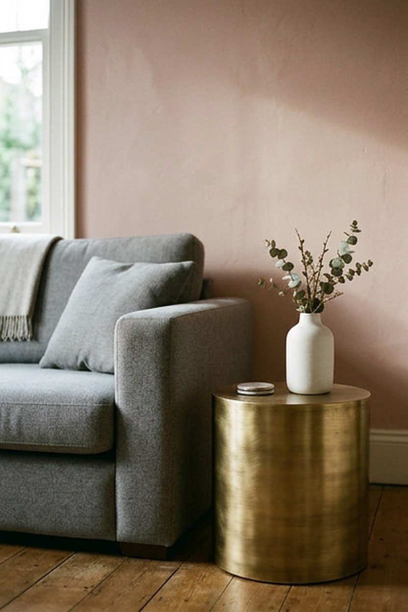
Soft blush pink with mid-grey and brushed brass is a gentle, modern combination that feels warm without being sweet. Use blush on the walls or a velvet chair, grey on the sofa, and brass in a lamp or side table.
Choose a blush with a brown or grey undertone, such as Farrow and Ball Setting Plaster, rather than a clear pink. The muted shade looks grown-up in a living room and pairs better with grey fabrics.
Blush struggles in north-facing rooms, where it can look grey or dirty on dull days. In that light, choose a warmer, peachier blush and keep bulbs at 2700K so the color stays soft in the evening.
Mushroom Brown and Chalky White
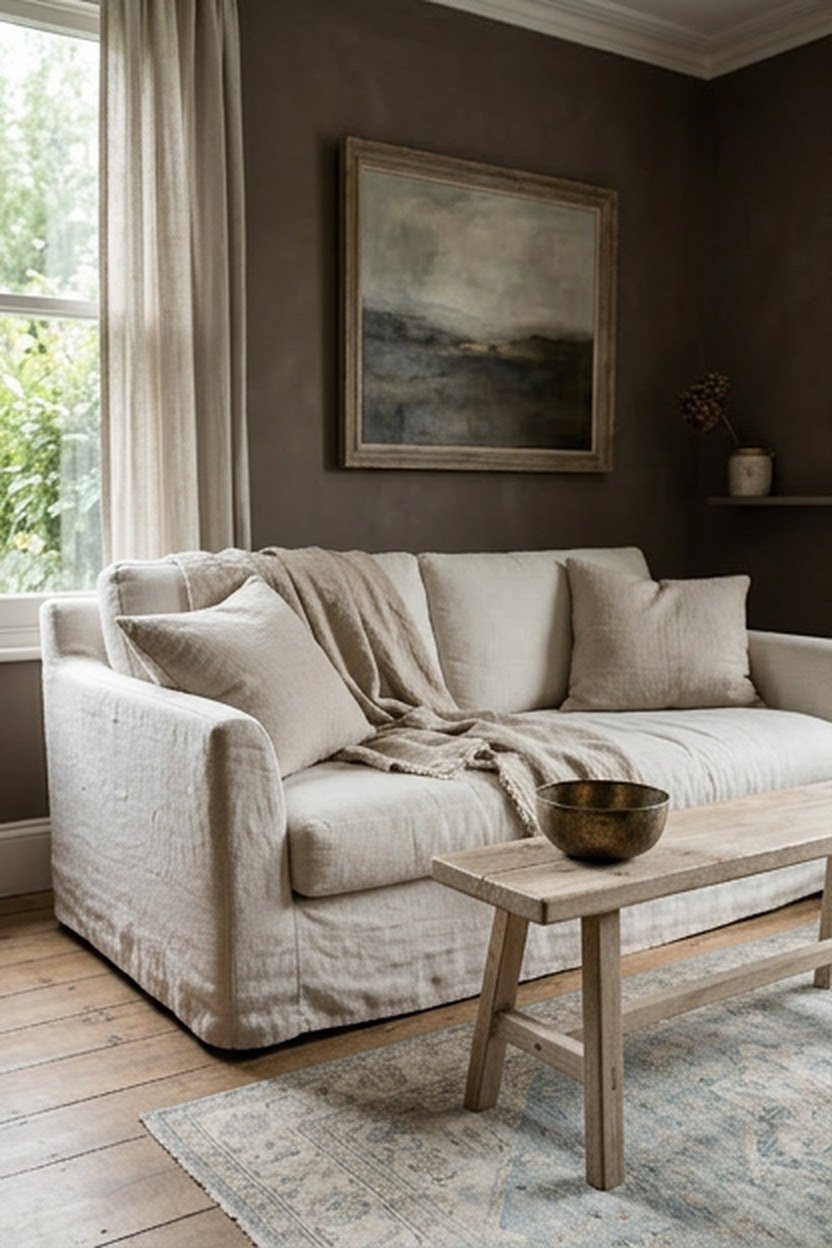
Mushroom, a soft grey-brown, has become a popular alternative to grey for walls. Paired with chalky whites and pale linen, it gives a soft, earthy room that looks especially good with natural light.
Add black or dark bronze in small amounts for contrast, and plenty of texture in wool, linen and wood. Mushroom tones can look muddy under cool bulbs, so keep the lighting at 2700K.
Pairing Mushroom With Floors
Mushroom walls suit pale oak, limed oak and stone floors best. With orange-toned pine or cherry floors the scheme can look muddy, so hold a swatch against the floor before choosing.
Deep Teal and Mustard
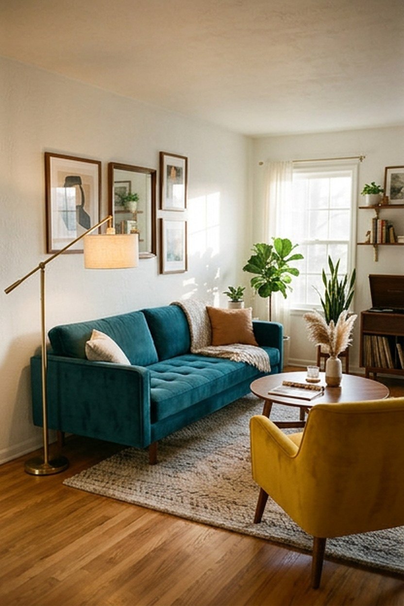
Deep teal with mustard accents is bold but still modern when used with restraint. A teal sofa or wall with mustard in one chair, a cushion or a throw gives a confident, mid-century feel.
Balance both colors with plenty of neutral space, white or warm grey walls if the sofa is teal. Walnut and brass suit the scheme and link it to the mid-century designs it draws on.
Keep the proportions uneven, with far more teal than mustard. One mustard chair or two mustard cushions against a teal sofa looks confident, while equal amounts of both colors start to feel busy.
Monochrome Beige in Layers
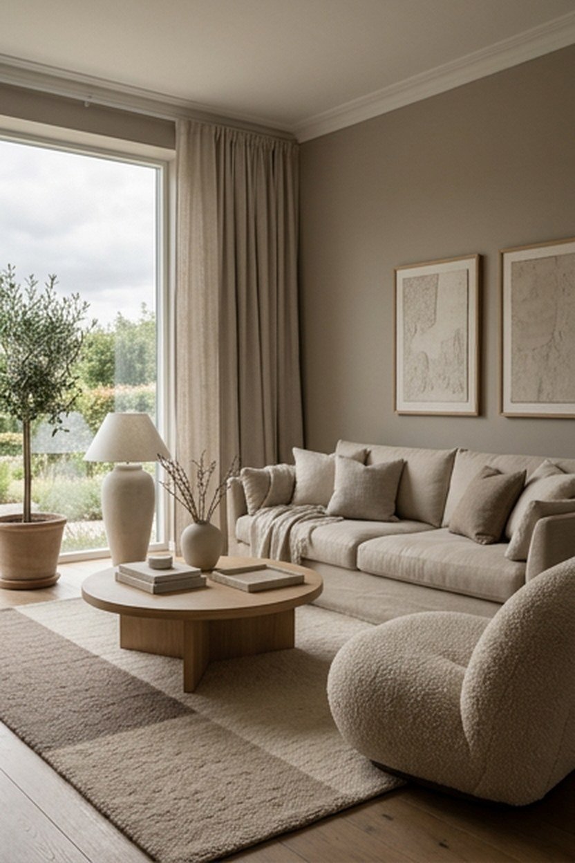
A single color in several shades, from pale oat to deep sand, gives a calm, layered room that feels expensive. The key is texture: linen, boucle, wool and wood in different beige tones stop the scheme from looking flat.
Use the lightest shade on the walls, a mid-tone on the sofa and the deepest in the rug or curtains. A few small black or dark wood accents add definition without breaking the monochrome feel.
Side lighting matters more in a monochrome room than in any other scheme. Lamps placed low and to the side pick out the weave of linen and the loops of boucle, and those small shadows are what stop a beige room from looking flat.
Testing a Combination Before You Commit
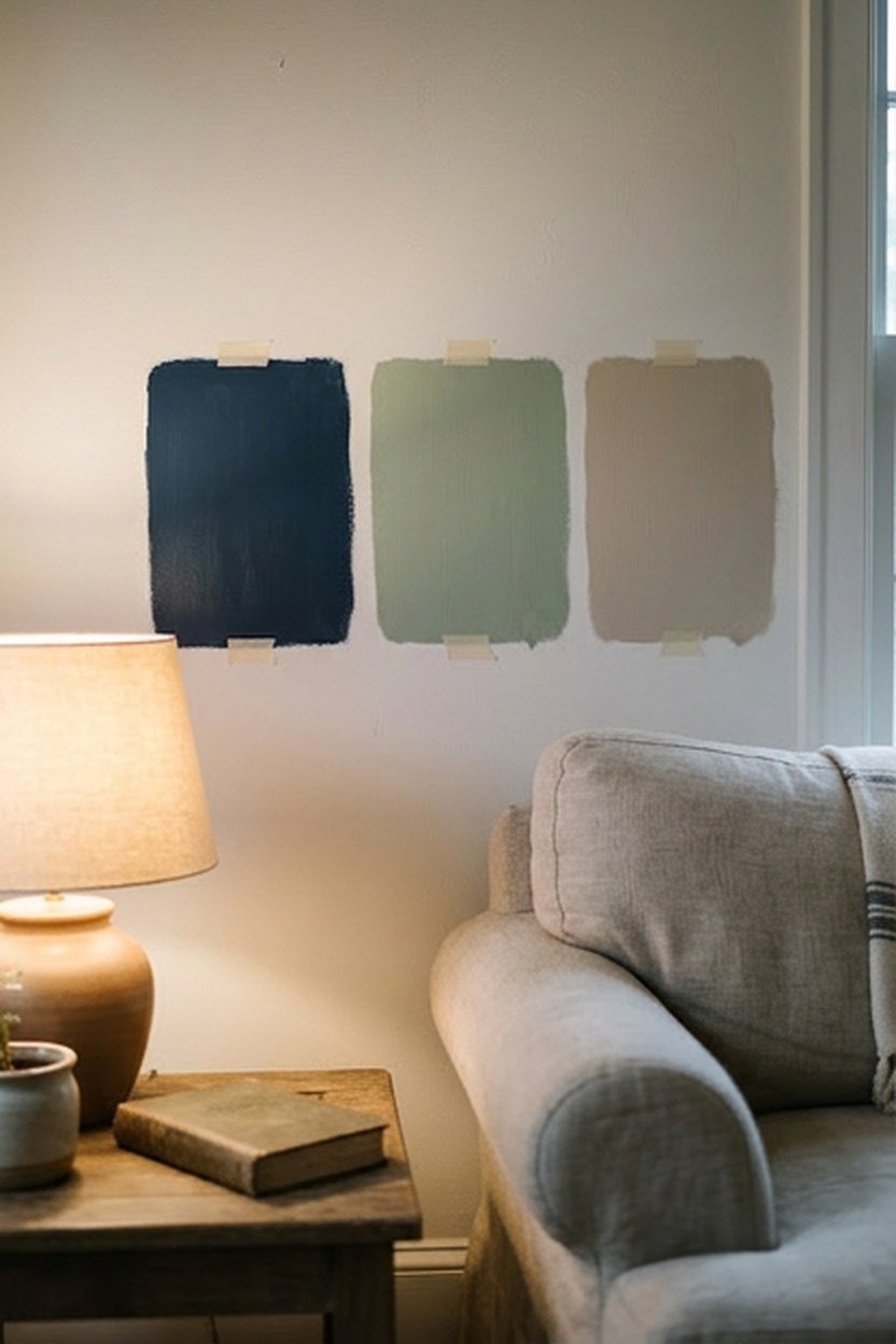
Test any combination with large paint swatches, at least 60 by 60 centimetres, next to your sofa fabric and floor. Look at them in morning, afternoon and evening light, since colors change far more than most people expect.
Build a small sample board with the paint card, a fabric swatch, a piece of wood or a flooring sample and any metal finish. Seeing them side by side shows clashing undertones in minutes, before any paint goes on the walls.
Starting Small
If you are unsure about a bold color, try it in cushions, a throw or a single accent chair first. Living with it for a few weeks costs very little and shows whether you would enjoy it across a whole wall.
Conclusion
The best modern living room color combinations use one main color, a supporting tone and a single accent, all sharing the same undertone. Neutral pairings like warm white with oak and black are hard to get wrong, while navy, forest green and charcoal bring more drama when balanced with warm light and lighter textiles.
Start from the fixed surfaces in the room, test every paint in large swatches, and add bold colors in small pieces first. A scheme built that way will still feel right long after any trend has passed.
Frequently Asked Questions
What is the 60-30-10 rule for living room colors? Around 60 percent of the room uses the main color, 30 percent a supporting tone and 10 percent an accent. It keeps a scheme balanced without feeling planned.
Which colors make a living room look bigger? Light warm whites, soft greige and pale sage reflect light and make walls recede. Keeping the ceiling and trim close in tone also helps a small room feel larger.
Can I use dark colors in a small living room? Yes. Dark walls with matching trim and ceiling can make a small room feel cosy, as long as there is enough warm lamp light and one lighter element.
What color goes with a grey sofa? Warm whites, soft greige, sage, blush and navy all work. Add wood and brass to stop the grey from feeling cold.
How many colors should a living room have? Usually three: a main color, a supporting tone and one accent. Wood, metal and plants add variety without counting as extra colors.
Which living room colors are timeless? Warm whites, greige, navy, sage and warm neutrals with natural wood tend to last. Bright accent colors are easier to change in cushions and art.