
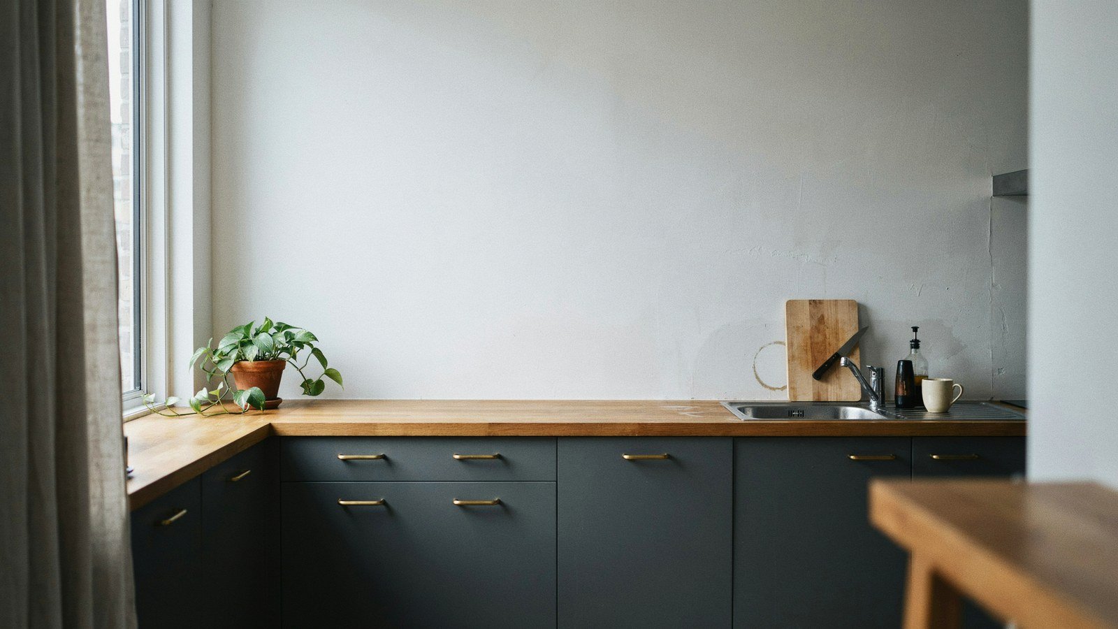
High contrast is what makes a modern kitchen look designed rather than assembled. Two tones that genuinely disagree, held apart by a quiet third, and the discipline to stop adding. Most kitchens that feel flat are not short of colour, they are short of the gap between colours.
I learned this the expensive way with a kitchen in three shades of greige. Everything matched, nothing stood out, and the room read as a corridor with appliances in it. Repainting the lower units charcoal cost two days and fixed what new worktops had not.
Below are fifteen palettes that work in real kitchens, with the reasoning behind each one and where each tends to fail. Some are a weekend with a tin of paint, others are a full replacement. All of them assume you want the kitchen to look deliberate.
What Contrast Actually Does In A Kitchen
Contrast gives the eye somewhere to land, and a kitchen has more competing objects than any other room in a house. Without a strong tonal difference, the cabinets, the splashback and the appliances all merge into one busy surface. The contrast is what sorts them into a hierarchy.
The useful measure is tonal distance rather than colour difference. Two saturated colours at the same lightness will fight each other and read as noise, while a pale and a dark version of almost anything will read as calm. Photograph a sample in black and white and the tonal gap becomes obvious immediately.
Kitchens also take contrast better than most rooms because they are lit harder. Under bright task lighting, a subtle scheme flattens out completely, which is why kitchens that look good in a showroom often look dull at home. Push the contrast further than feels comfortable on paper.
| Contrast Type | Where It Works | Where It Fails |
|---|---|---|
| Dark base, pale wall | Small kitchens, keeps the ceiling high | Low ceilings with dark uppers too |
| Pale base, dark island | Open plan, anchors the middle | Galley kitchens with no island |
| Two tone vertical split | Tall runs of full height units | Short runs, looks like a mistake |
| Colour against natural wood | Warm schemes, softens hard lines | Three or more wood tones |
| Matt against gloss | Any size, adds depth without hue | Gloss everywhere, kills the effect |
| Dark grout, pale tile | Splashbacks, defines the geometry | Busy tile shapes, becomes a grid |
How To Judge A Palette Before You Commit
Buy sample pots and paint a large piece of card rather than the wall itself. Cards can be moved around the kitchen, held against the worktop and looked at beside the window and in the darkest corner. A patch painted on one wall tells you about that wall only.
Look at every sample under the lighting you actually cook by, which for most households means after dark. Kitchens are used in the evening far more than people admit, and a palette chosen in Saturday daylight often disappoints on a Tuesday night. Warm bulbs shift greens and greys considerably.
Photograph the samples in black and white on your phone. If the two main tones look similar in that photo, the contrast is too weak and the kitchen will read as flat. This takes ten seconds and settles most arguments about whether a palette is strong enough.
1. Charcoal Base Units With A Chalk White Wall
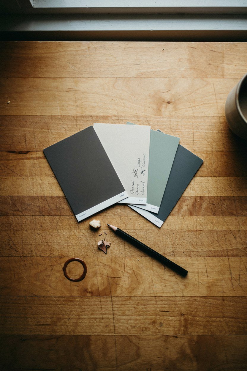
This is the palette I recommend first because it works almost everywhere and costs very little to try. Dark base units ground the room, the pale wall keeps the upper half open, and the tonal gap is unmistakable. It suits small kitchens particularly well.
The dark colour belongs below the worktop, never above it. Dark uppers in a small kitchen close the room in and make the ceiling feel lower than it is. Keep everything above the counter pale and the scheme stays generous.
Choose a charcoal with a hint of green or brown rather than a blue black. Blue toned charcoals go cold under warm bulbs and can look slightly industrial. A warmer charcoal keeps the kitchen feeling like a room rather than a workshop.
Paint the inside of the cabinet frames as well as the doors. A pale carcass edge showing around a dark door draws a light line around every unit and breaks the block of colour. It takes an extra hour and it is the difference between a paint job and a refit.
Making It Work With Existing Worktops
A mid tone timber worktop sits between the two extremes and softens the whole scheme. Laminate in a pale stone effect also works, provided it has no strong pattern. Busy speckled worktops fight a strong palette and win.
If the worktop is dark, put the contrast the other way around and paint the units pale. Dark units under a dark worktop lose the join between them and the whole lower half becomes one heavy block. The worktop should read as a line, not disappear.
2. Deep Forest Green With Warm Brass
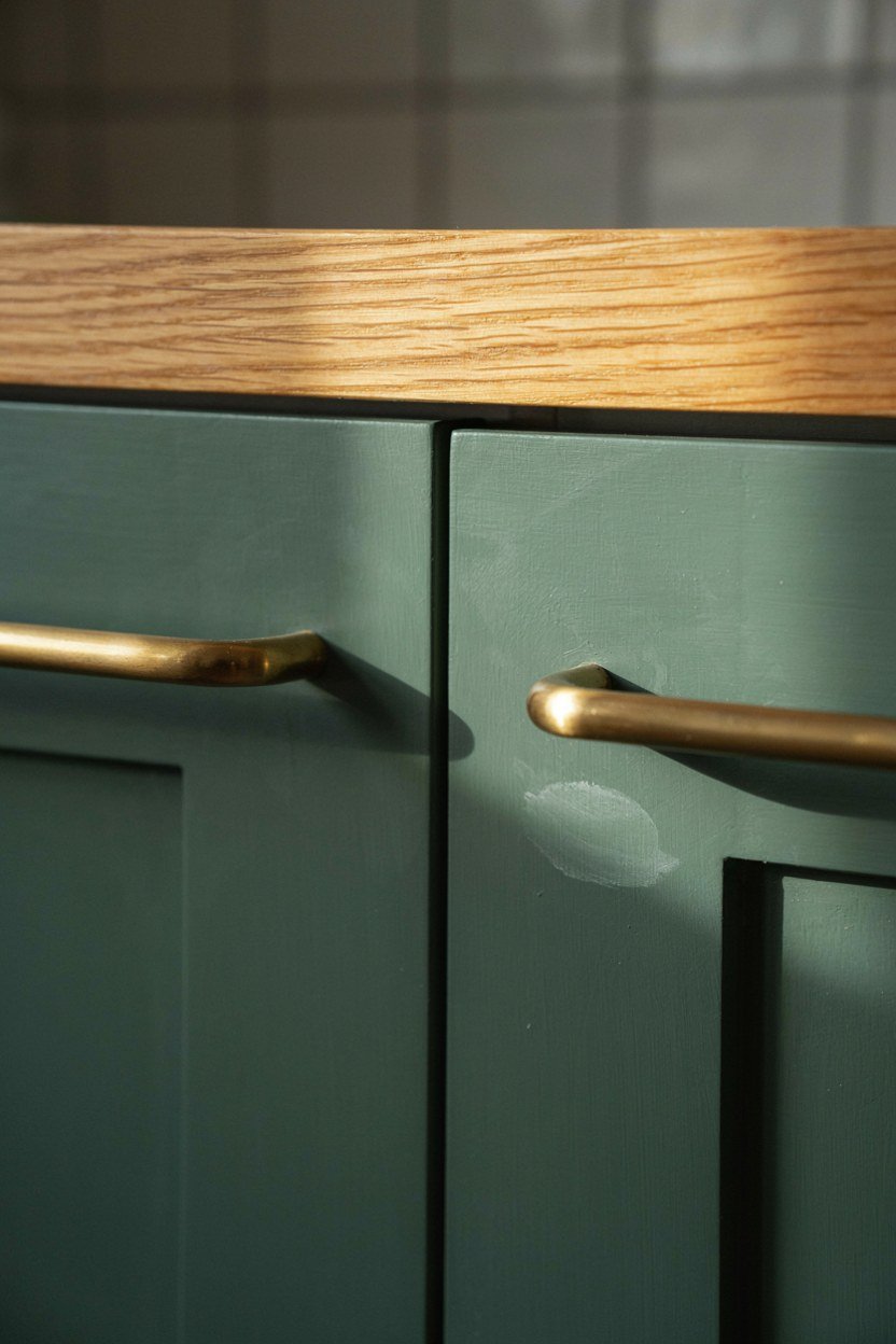
Forest green is the colour that has replaced navy in kitchens, and it holds up better under artificial light. It reads as a colour rather than a neutral, and it flatters both timber and stone. Brass against it is what makes the scheme feel finished.
Keep the green to the base units or a single run of tall cabinets. Green on every surface becomes overwhelming in a room where you also have food, plants and packaging competing for attention. One strong run is plenty.
Brass handles, a brass tap and a brass pendant give you three repeats, which is enough to read as a decision. Avoid mixing brass with chrome anywhere in the same sightline. The two finishes cancel each other out and the scheme looks unresolved.
Order a full sized door sample rather than judging from a card. Green reads very differently across a large flat area than it does on a swatch, usually darker and more saturated. Most kitchen suppliers will sell you a sample door for a small fee.
The Green To Avoid
Bright or yellow toned greens date quickly and are difficult to live with in a room used daily. They also make food look wrong, which matters more in a kitchen than anywhere else. Stay in the darker, greyer half of the green range.
Test any green against your floor before committing. Green picks up reflected colour from below more than most shades, and a warm timber floor can push a cool green towards olive. Look at the sample lying flat on the floor as well as upright.
3. Black Cabinets With Pale Oak Open Shelving
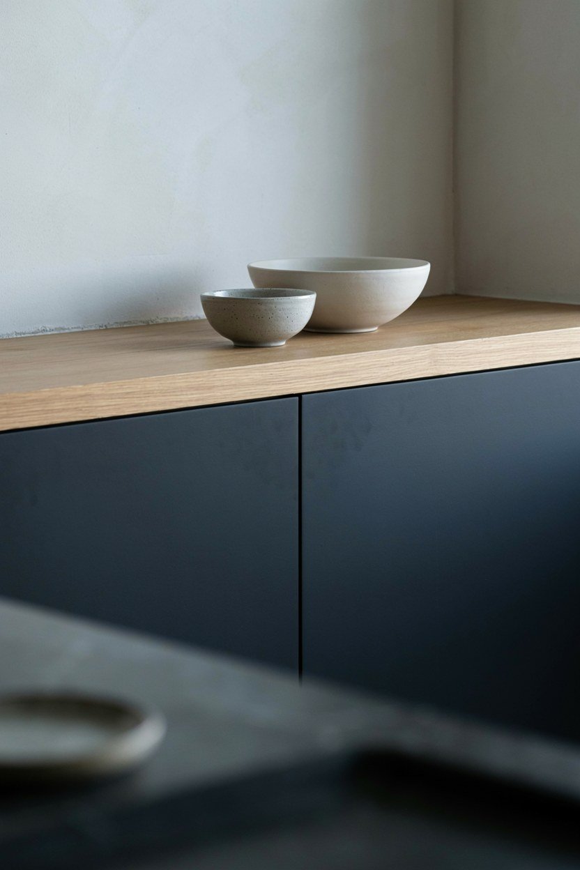
Black gives the strongest contrast available and pale oak is the warmest thing you can put against it. The combination is stark and comfortable at the same time, which is a difficult balance to strike with any other pairing. It suits modern kitchens with clean lines.
Use the oak sparingly, on one or two open shelves rather than a whole wall. Black is doing the heavy work and the timber is the relief. Too much oak and the scheme tips into Scandinavian rather than modern.
Choose a soft matt black rather than a true jet. Pure black shows every fingerprint and dust mark, and in a kitchen that means daily wiping. A very dark charcoal reads as black in the room and behaves far better.
Think about the extractor before committing to black. A stainless chimney extractor in the middle of a black run is the single loudest object in the room, and no amount of styling hides it. Either integrate it or choose one in a matching finish.
Keeping Black Cabinets Clean
Matt lacquered finishes hide marks best, while anything with a sheen shows every touch around the handles. If you want gloss, put it above the worktop where hands rarely land. The base units take the abuse.
Fit handles rather than going handleless if the doors are black. Handleless push to open doors need a hand on the door face, which on a dark matt finish leaves a visible mark within a day. A handle keeps fingers off the paint.
4. Navy Base With A White Marble Effect Worktop
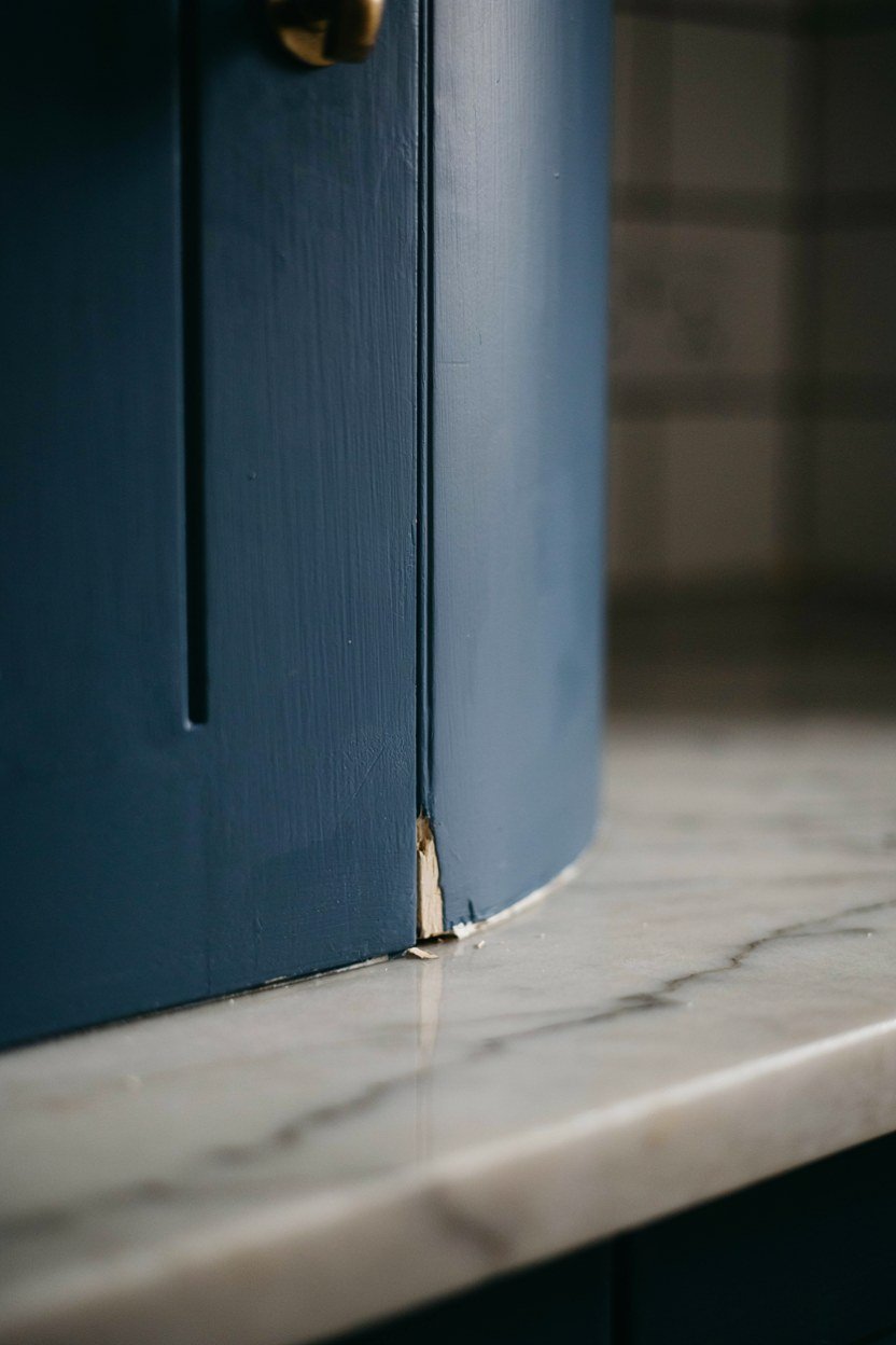
Navy and pale stone is the safest strong palette and it has aged better than most trends. The worktop provides the light half, so the walls can stay quiet and the scheme still has plenty of contrast. It works in traditional and modern kitchens alike.
Choose a navy with real depth rather than a mid blue. Mid blues read as a colour choice, while a very dark navy reads as a neutral and stays easier to live with. The darker the navy, the longer you will like it.
Keep the veining in the worktop restrained. A heavily veined marble effect competes with a strong cabinet colour and the two together look busy. Fine grey veining on white is the version that works.
Consider the socket and switch plates while the walls are open. White plastic sockets on a navy wall are a small detail that undoes an otherwise tight scheme. Metal or colour matched plates cost little more and disappear completely.
Where Navy Goes Wrong
Navy plus chrome plus white tile is the combination that reads as a bathroom rather than a kitchen. Swap the chrome for brushed nickel or brass and the whole thing warms up. The metal finish is doing more work than people expect.
Avoid navy in a north facing kitchen with little natural light. It goes flat and slightly grey, losing the depth that made it attractive. In a dark room, a warm dark green or a brown black holds its colour far better.
5. Two Tone Vertical Split On Tall Units

A run of full height cabinets painted dark at the bottom and pale at the top creates a horizontal line across the kitchen that calms the whole room. The split usually sits at the worktop height so the line continues from the base units. It makes a tall run feel less like a wall.
Set the split at a consistent height across every run, even where the units differ. A line that steps up and down looks like a mistake rather than a scheme. Measure from the floor, not from the top of each cabinet.
This works best on runs of at least three units. On a single tall cupboard the split looks accidental and the effect is lost. Short runs do better in one colour.
Keep the handles identical on both halves of the split. Different hardware above and below emphasises the division and turns a calm horizontal line into two separate kitchens. One handle, running the full height.
Choosing Which Half Goes Dark
Dark below and pale above is the reliable version because it keeps weight at the bottom. The reverse is possible in a very tall room with plenty of light, but it takes confidence and it shrinks most kitchens. Start with dark at the base.
Paint the interiors of any open sections the pale colour. A dark cavity in the middle of a run reads as a hole and draws the eye to the wrong place. Pale interiors keep the run reading as one object.
6. Terracotta And Off Black
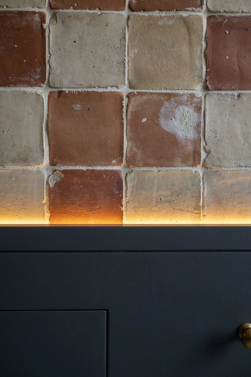
Terracotta has come back into kitchens and it needs a very dark partner to keep it from looking rustic. Against off black it turns modern, and the warmth stops the black feeling severe. This is a bolder palette than most on this list.
Use terracotta on a smaller area than you think. A splashback, an island end or a single run of doors is enough. Whole kitchens in terracotta tip into a Mediterranean look that fights the modern intent.
The third tone should be plaster or a warm off white. Cool greys against terracotta make it look muddy, which is the most common way this palette fails. Keep everything else warm.
Use a grout that matches the tile rather than contrasting with it. Terracotta with white grout becomes a grid pattern and reads as busy, which fights the modern intent entirely. A clay toned grout lets the colour run as one surface.
Getting The Terracotta Right
Look for a terracotta with grey in it rather than a pure orange. The greyed versions sit far more comfortably against black and read as sophisticated rather than childish. Paint brands often file these under clay or sienna.
Test it against your flooring first, because terracotta and timber can clash badly. A red toned oak floor under terracotta doors is too much of the same family. Pale or grey toned floors work far better.
7. Warm White Units With A Black Steel Frame
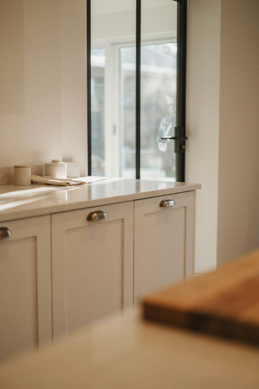
If you want contrast without committing to a dark kitchen, put the black into the framework instead. Black steel window frames, a black framed glass door or slim black shelf brackets give you the tonal gap in a small quantity. The units stay pale and the room stays bright.
This palette relies on the black being genuinely black and genuinely slim. Thick black frames become the dominant feature and the balance goes. Slim profiles read as drawing rather than as furniture.
Repeat the black at least three times so it reads as intentional. A single black frame looks like something left over from a previous kitchen. Three repeats and it becomes the scheme.
Where To Find The Third Repeat
Tap, handles and light fittings are the easy places, and all three are cheap to change. A black tap against a warm white sink is a strong contrast in a small area. This is the cheapest entry point to this whole list.
Keep the appliances out of the count. Stainless steel is a fourth finish and it will not read as part of the scheme, so treat it as neutral rather than trying to match it. Integrated appliances remove the problem entirely.
8. Olive Green With Cream And Aged Brass
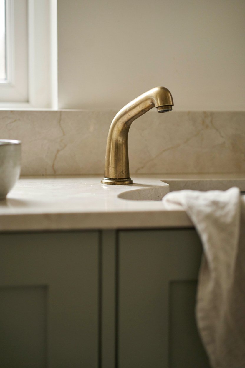
Olive is quieter than forest green and it suits kitchens that want warmth rather than drama. Against cream it gives a softer contrast that still reads clearly. This is the palette for people who find charcoal too severe.
Cream rather than white is what makes this work. Bright white against olive looks cold and slightly clinical, while cream lets the two colours sit in the same family. The warmth is the whole point.
Aged brass rather than polished suits the softness of the scheme. Bright brass against olive is a stronger look and it can feel showy in a small kitchen. The aged finish recedes and lets the colours lead.
Balancing A Softer Contrast
Because the tonal gap is smaller here, the scheme needs a third darker element to stop it going flat. A dark timber worktop or a bronze tap gives the eye a full stop. Without it, olive and cream can blur together.
Check the palette under evening light in particular. Olive shifts more than most colours under warm bulbs and can go brown. If it does, a slightly greyer olive holds its character better after dark.
9. Pale Grey Units With A Deep Burgundy Island

Putting the strong colour on the island alone is the most controlled way to use a bold shade. The island becomes the focal point, the perimeter stays quiet, and the kitchen reads as considered rather than brave. Burgundy is having a moment and it suits this treatment.
Keep the perimeter grey genuinely pale so the contrast is real. A mid grey against burgundy muddies both and the island stops standing out. The paler the perimeter, the stronger the island reads.
Match the worktop across both so the surfaces read as continuous. Changing the worktop material at the island as well as the colour is one change too many. Let the colour do the work alone.
If You Have No Island
The same idea works on a run of tall cupboards or on the section around a range cooker. What matters is that the strong colour occupies one defined block rather than being scattered. A single concentrated area reads as deliberate.
Avoid putting the strong colour on the sink run. That area holds the most visual clutter, from taps to soap to drying racks, and a bold colour behind it becomes busy. Put it where the surface stays clear.
10. Concrete Grey With Warm Timber And Black
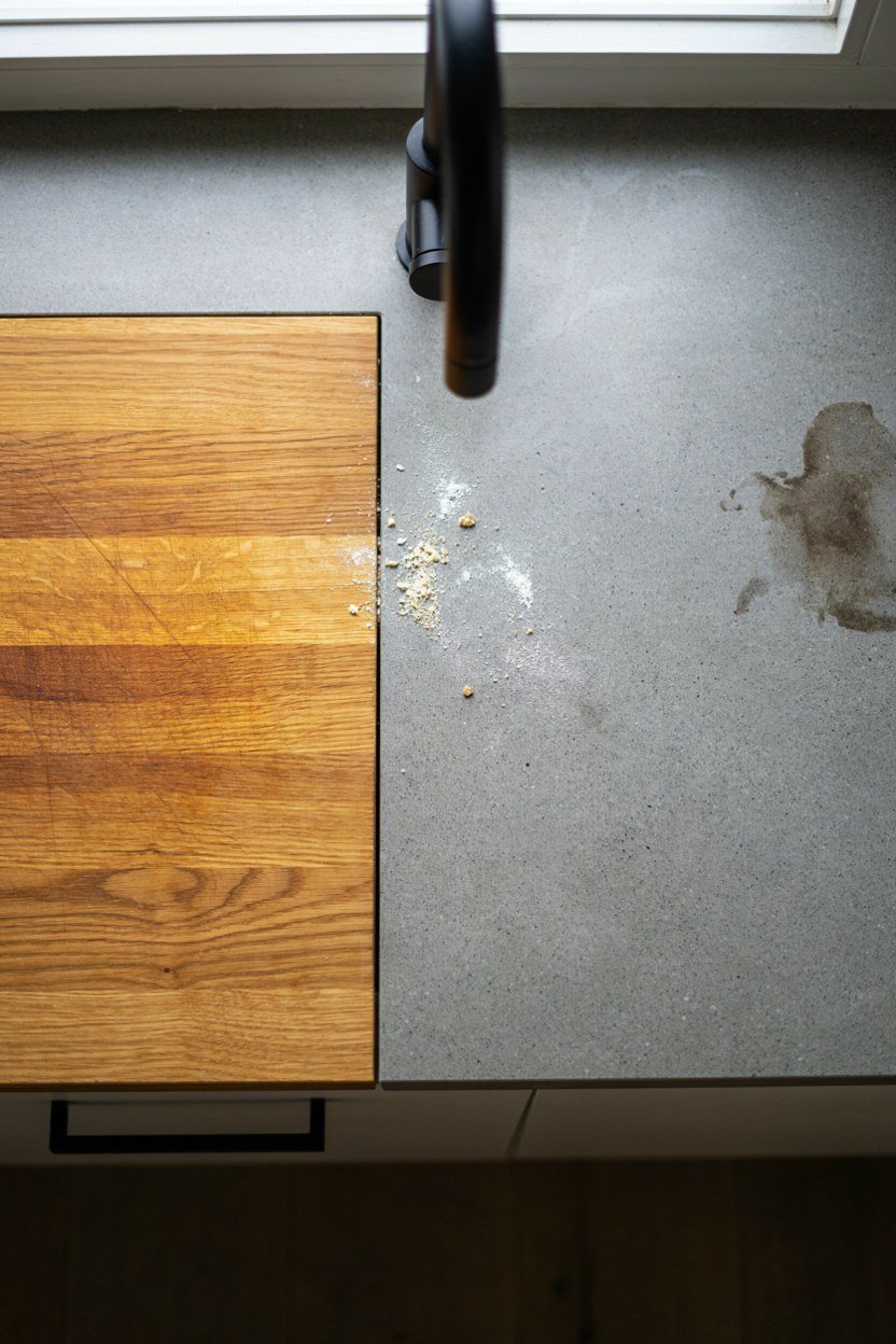
Concrete grey is a genuine neutral rather than a colour, which makes it a strong base for a three part palette. Warm timber softens it and black sharpens it, giving you a scheme with real depth. It suits open plan kitchens that need to sit beside a living area.
Use one timber only and repeat it in at least two places. Concrete plus three woods reads as accumulation and loses the crispness that made concrete appealing. A single oak or walnut, used twice, is the target.
Keep the black to hardware and one fixture. Concrete and black together in large quantities become heavy, particularly in a room without much natural light. The black is punctuation, not a third block of colour.
Working With Real Concrete Surfaces
Poured concrete worktops need sealing and they will stain regardless. Anyone unwilling to live with a wine mark should choose a concrete effect porcelain instead, which is now very convincing. The look survives, the maintenance does not.
Micro cement on walls is the lower cost route to the same feel. It goes over existing tile and gives a continuous surface with no grout lines. Check it is rated for a splashback before using it behind a hob.
11. All White With One Black Wall
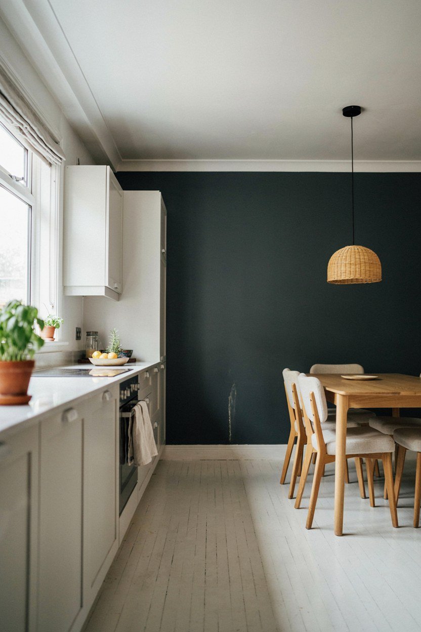
Sometimes the cleanest contrast is the simplest. A white kitchen with a single dark wall gives you the tonal gap without touching the cabinetry. It is the cheapest palette on this list and the easiest to reverse.
Choose the wall you see from the doorway or the one behind the dining table. A dark wall in the wrong place reads as a mistake rather than an intention. Stand at the door and pick the one you look at.
Take the colour to the ceiling line and around any returns. A dark wall that stops short at a corner looks unfinished and draws attention to the edge. Full height, corner to corner, always.
Keeping A White Kitchen From Looking Clinical
Add texture rather than more colour. A timber shelf, a linen blind or a woven pendant break up the flatness without introducing a fourth tone. White kitchens fail from lack of texture far more often than lack of colour.
Warm the white slightly. A brilliant white kitchen under cool lighting is genuinely unpleasant to cook in, and it makes food look grey. A warm off white with a 2700K bulb solves both problems at once.
12. Dark Wood Against Pale Painted Cabinetry
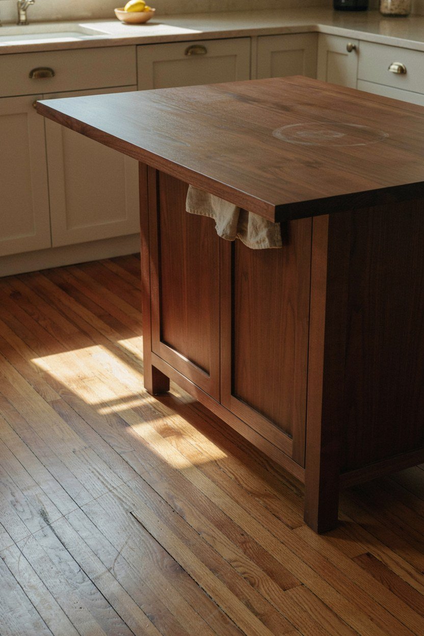
Wood counts as a colour in a contrast scheme and a dark walnut or stained oak provides plenty of it. Against pale painted units it gives warmth that no paint colour can match. This palette ages particularly well.
Put the dark timber on the island or a run of tall units so it reads as one mass. Scattered timber doors among painted ones look like a compromise. Concentrate it.
Keep the painted colour genuinely pale and slightly warm. A cool white against warm timber creates a clash that is hard to fix later. Bone, chalk and soft cream all sit better.
Matching Timber Across Suppliers
Timber varies between batches and between suppliers far more than paint does. Order all the timber elements from one place at one time if you possibly can. Matching a second order months later is close to impossible.
Ask for samples from the actual batch rather than a showroom board. Showroom samples are often several years old and have darkened. The difference between that and a fresh board can be substantial.
13. Sage Cabinets With Charcoal Worktops
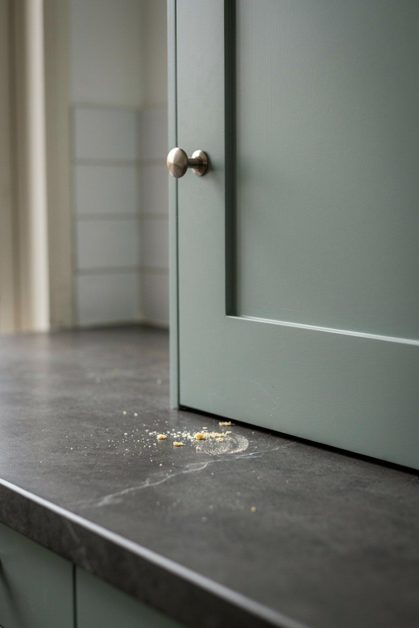
Sage is soft enough that it needs a genuinely dark partner, and a charcoal worktop provides that without adding another colour. The scheme reads as calm and modern rather than country, which is where sage usually lands. The worktop is doing the contrast work.
Choose a honed rather than polished charcoal surface. Polished dark stone shows every crumb and water mark under kitchen lighting, which is relentless. Honed hides a great deal more.
Keep the walls very pale to stop the scheme going heavy. Sage cabinets, charcoal tops and a mid grey wall together become gloomy. The wall is the light relief.
Choosing The Right Sage
Greyer sages read modern and yellower sages read traditional. For a contemporary kitchen, stay in the grey half of the range. The difference on a paint card is subtle and the difference in the room is not.
Look at sage against your splashback material before deciding. Sage picks up colour from reflective surfaces, and a warm metallic splashback can push it towards khaki. Matt materials are more forgiving.
14. Cream Units With A Dark Green Island And Black Hardware
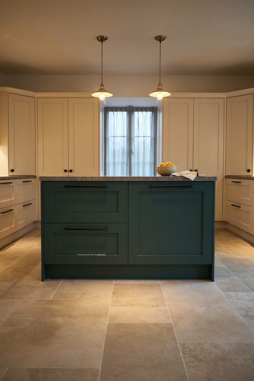
Three tones is the maximum a kitchen can carry comfortably, and this palette uses all three well. Cream perimeter, dark green island, black hardware throughout. Each has a defined job and none of them overlaps.
Run the black hardware across both the cream and the green so it ties the two together. Different handles on different colours reads as two kitchens that met in the middle. One hardware finish, everywhere.
Keep the worktop consistent across the island and the perimeter. With two cabinet colours already in play, a third surface material is one variable too many. Continuity in the worktop holds the scheme together.
Deciding Which Colour Goes Where
Put the darker colour on the smaller area. A dark green island in a cream kitchen reads as a feature, while a cream island in a green kitchen reads as an omission. The strong colour should be the minority.
If the island is very large, consider reversing it. A dark colour on a big island in a small room can dominate, and in that case the cream island with a green perimeter is the better balance. Scale decides it.
15. Plaster Pink With Deep Brown And Cream
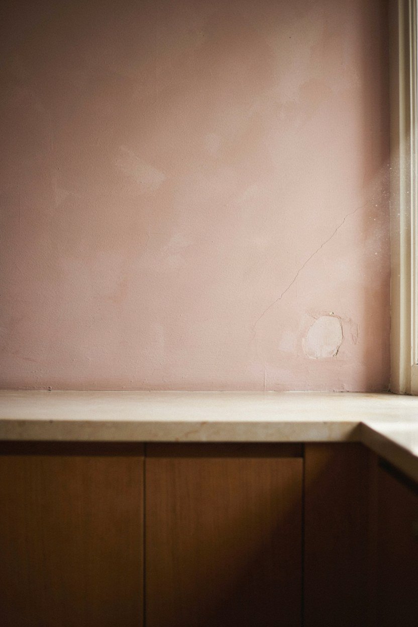
This is the least conventional palette here and it works better than it sounds. Plaster pink is a warm neutral rather than a colour, deep brown gives the contrast, and cream keeps it from feeling heavy. The result reads as modern and slightly unexpected.
Use the pink on the walls rather than the cabinetry if you are uncertain. Wall paint is a weekend to change, cabinet colour is not. It also lets you test the palette before committing.
Deep brown is having a return in kitchens and it partners pink far better than black does. Black against pink is stark, while brown is warm and lets the pink read as a neutral. This is the pairing that makes it work.
Judging Plaster Pink In Your Light
Plaster pink shifts dramatically with light. In a south facing room it can go peach and in a north facing one it can go grey mauve. Test it on two walls at opposite ends of the kitchen before ordering anything.
Keep every other surface warm. A cool grey floor under plaster pink drains the warmth and the whole scheme collapses. Warm timber or a warm toned tile keeps it alive.
What A High Contrast Kitchen Costs
Paint is by far the cheapest route into any of these palettes, and for most kitchens it is the only change needed. Repainting existing units and one wall costs a weekend and two tins, and it changes the room more than new handles or lighting will. Start there.
Hardware and taps sit in the middle and give a disproportionate return. Swapping chrome for brass or black across a whole kitchen usually costs less than a single appliance and shifts the entire character. It is the best value item after paint.
Worktops and full replacement cabinetry are the expensive end and rarely necessary to achieve contrast. If the layout works, the carcasses are sound and the doors are flat, paint will get you most of the way. Replacement is a layout decision, not a colour one.
| Change | Effect On Contrast | Rough Cost |
|---|---|---|
| Repainting base units | Largest single change | Low |
| One dark wall | Instant contrast, easily reversed | Low |
| Hardware and tap swap | Ties the scheme together | Low to mid |
| New splashback | Defines the middle band | Mid |
| Replacement doors on existing carcasses | Full change without a refit | Mid |
| New worktops | Only if the current ones fight the palette | High |
| Full replacement kitchen | A layout decision, not a colour one | High |
The Mistakes That Flatten A Kitchen Palette
The most common mistake is choosing two tones that are close in lightness. They may be different colours, but under kitchen lighting they merge and the room reads as one muddy surface. The black and white photograph test catches this in seconds.
The second is spreading the strong colour too thin. A bold shade scattered across doors, a splashback and an island loses all its impact, because contrast depends on one thing standing against another. Concentrate the strong colour in one block.
The third is letting a fourth finish creep in unnoticed. Chrome appliance handles, a white plastic socket, a stainless extractor and a chrome tap add up to a metal finish nobody chose. Count the finishes visible from the doorway.
The Check That Catches All Three
Stand at the kitchen door and photograph the room. Convert the photo to black and white and look at whether the two main tones separate clearly. If they do not, the palette needs pushing further apart before anything else is changed.
Then count the distinct materials and finishes in that photo. Under five and the scheme reads as designed, over seven and it reads as accumulated. This is crude and it is the fastest diagnostic available.
Conclusion: Three Rules That Make Contrast Work
Choose two tones with a real gap in lightness, put the darker one below the worktop, and repeat one metal finish at least three times. Those three rules carry every palette on this list. A kitchen that gets them right will look considered whatever colours you picked.
Then protect the scheme from drift. Count the finishes, keep the strong colour concentrated in one block, and resist adding a fourth tone when something new arrives. Palettes fail by accumulation far more often than by bad initial choices.
Finally, test in the light you actually cook in. A palette chosen in daylight and lived with after dark is the most common source of regret, and it costs nothing to avoid. Look at your samples at night before you order a thing.
Frequently Asked Questions About High Contrast Kitchens
How much contrast does a kitchen actually need?
Enough that the two main tones separate clearly in a black and white photograph. If they blur together in that test, the palette is too close.
Should dark cabinets go above or below the worktop?
Below, in almost every case. Dark upper cabinets lower the apparent ceiling and close in a small kitchen considerably.
Which metal finish suits a dark kitchen?
Brass or bronze for warmth, matt black for sharpness. Pick one and repeat it at least three times so it reads as a decision.
Can a small kitchen handle a dark colour?
Yes, provided it stays below the worktop and the walls stay pale. Small kitchens often benefit from the definition that contrast gives.
How many colours should a kitchen palette have?
Three at most, with clear jobs for each. A fourth tone is where most schemes start to look accumulated rather than designed.
Is white still a good choice for a modern kitchen?
Yes, if you add contrast somewhere. All white with a single dark wall or black framework reads modern, while all white alone reads flat.
What is the cheapest way to add contrast?
Repaint the base units and swap the handles. Both are a weekend of work and together they change the room more than any single purchase.