
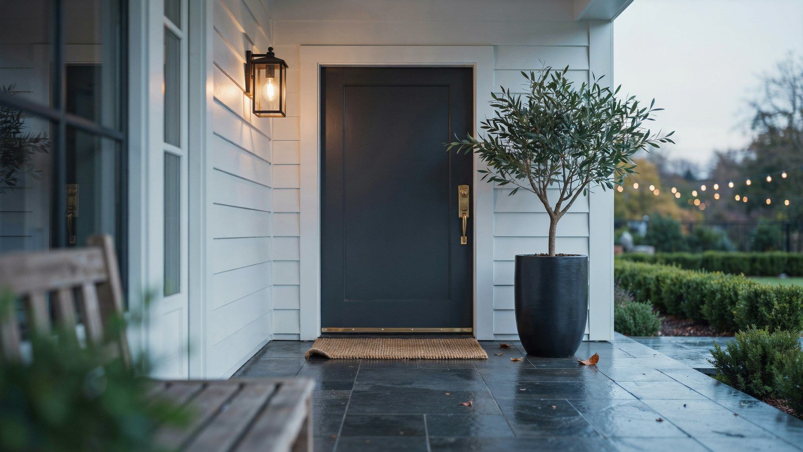
A moody front porch works because of contrast, not darkness. Something dark, something warm, and one thing that catches the light.
Paint the whole thing charcoal and you get a cave. I have seen it done and the house looked closed rather than confident.
Below are fifteen upgrades that build the look in layers, from the door colour to the last plant. Several cost a weekend and a tin of paint.
What Makes A Front Porch Read As Moody Rather Than Dark
Moody means depth. You want a dark base, a warm light source, and a few surfaces that reflect just enough to stop the whole thing flattening out.
The trick is keeping one element bright. Brass numbers, a pale doormat or a white ceiling all give the eye somewhere to rest.
Scale matters too. A small porch can carry one dark surface and little else, while a deep porch can take dark walls, dark ceiling and still feel welcoming.
| Element | Moody Choice | Keeps It From Going Flat |
|---|---|---|
| Front door | Charcoal, ink blue, forest | Warm metal hardware |
| Walls | Deep grey or greige | Pale trim line |
| Ceiling | Dark, or soft pale blue | Warm bulb, never cool |
| Floor | Slate, dark tile, stained wood | Textured mat |
| Planting | Deep green, burgundy | One silver or lime plant |
1. Paint The Door First And Judge Everything Against It
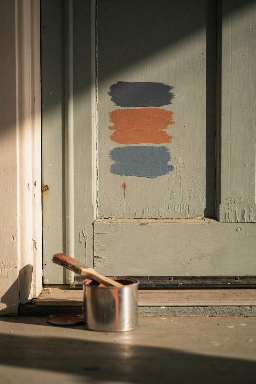
The door sets the temperature of the whole porch, so choose it before anything else. Everything after is a reaction to that colour.
Test three swatches directly on the door and look at them at dusk, not midday. Porch colours live in shadow and shift a lot as the light drops.
Use exterior grade paint with a satin or eggshell sheen. Full gloss shows every ripple in an old door, and matt holds dirt in a spot people touch daily.
Prime any bare wood first. Dark colours over unprimed timber sink in unevenly and you will see the patches within a year.
2. Choose Warm Metal Hardware To Break The Dark
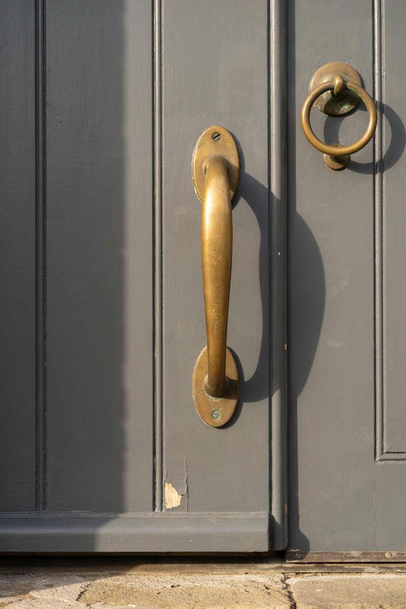
Dark paint needs one warm interruption and hardware is the cheapest place to put it. Brass, bronze or brushed copper all lift a charcoal door instantly.
Match the handle, letter plate, knocker and hinges if you can. Mixed finishes on one door read as unfinished rather than eclectic.
Unlacquered brass will darken with weather and handling. That patina suits a moody porch, but buy one small piece first if you would rather it stayed bright.
Fit the letter plate and knocker at the same time. Doing them in one go means one set of drill holes and one alignment decision.
3. Fit Oversized House Numbers
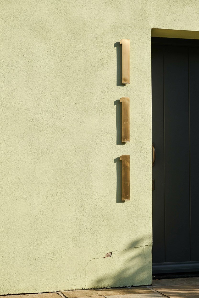
Numbers are the one place to go larger than feels sensible. Six inches is a good minimum on a modern entrance.
Mount them on the wall beside the door rather than on the door itself. They stay readable when the door is open and they survive repainting.
Pick a finish that contrasts hard with its background. Brass on charcoal, or matt black on pale render, both read from the pavement.
Fix them with a paper template rather than by eye. Numbers half an inch out of line are surprisingly obvious from the street.
4. Put Warm Light At Two Heights
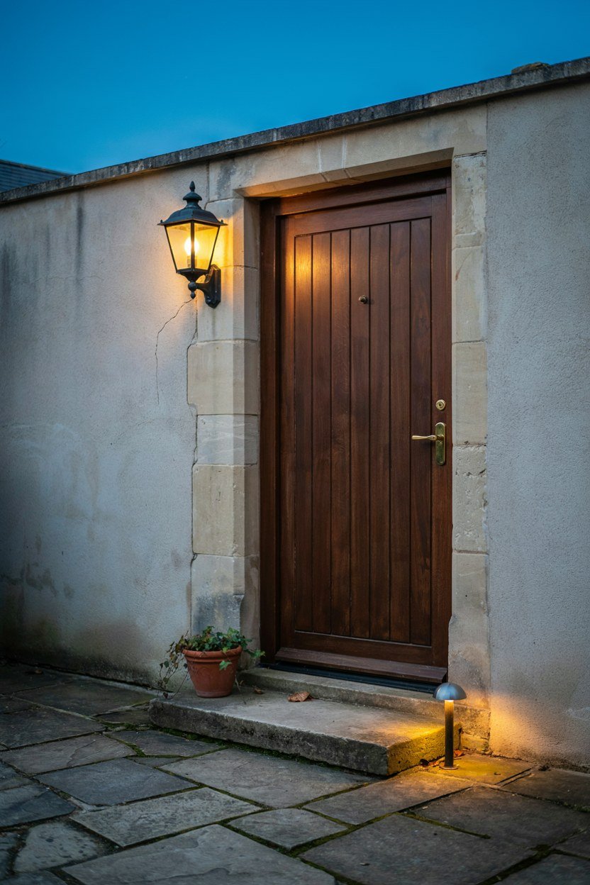
One bulb overhead flattens everything and throws shadow onto faces. Two sources at different heights build the depth the look depends on.
A wall lantern beside the door plus a low path light is the simplest pair. Both should be warm, around 2200K to 2700K.
Never use cool white on a porch. It turns a moody entrance into a service corridor and makes brick and stone look grey.
Put the porch light on a dusk sensor. A moody entrance only works if it is actually lit when people arrive.
5. Darken The Ceiling Or Deliberately Do Not
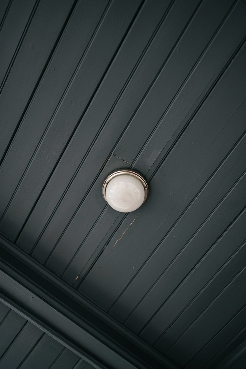
A dark porch ceiling makes the space feel enclosed and intimate, which is often the point. It also hides the wiring and any patchy plaster.
The alternative is the traditional pale blue underside, which lifts the whole porch and stops a deep overhang feeling heavy.
Pick one and commit. A white ceiling with dark everything else usually looks like the job stopped halfway.
Check for wasp nests and cobwebs before painting a ceiling. Porch ceilings are the least inspected surface on most houses.
6. Use One Statement Planter Instead Of Several
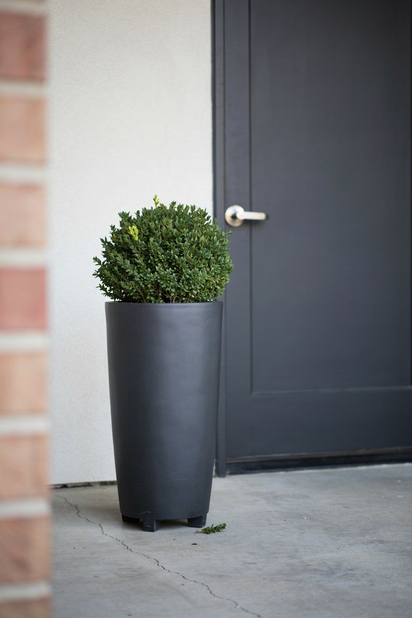
A single large planter beside the door does more than three small ones scattered across the step. It also leaves the floor clear.
Go tall rather than wide on a narrow porch. A slim planter around waist height frames the door without narrowing the walkway.
Match the planter finish to the hardware or the door, not to the house walls. That small link makes the arrangement look intentional.
Raise the planter on small feet. It stops water marks on the floor and helps the pot drain in a wet winter.
7. Plant Dark Foliage With One Bright Note
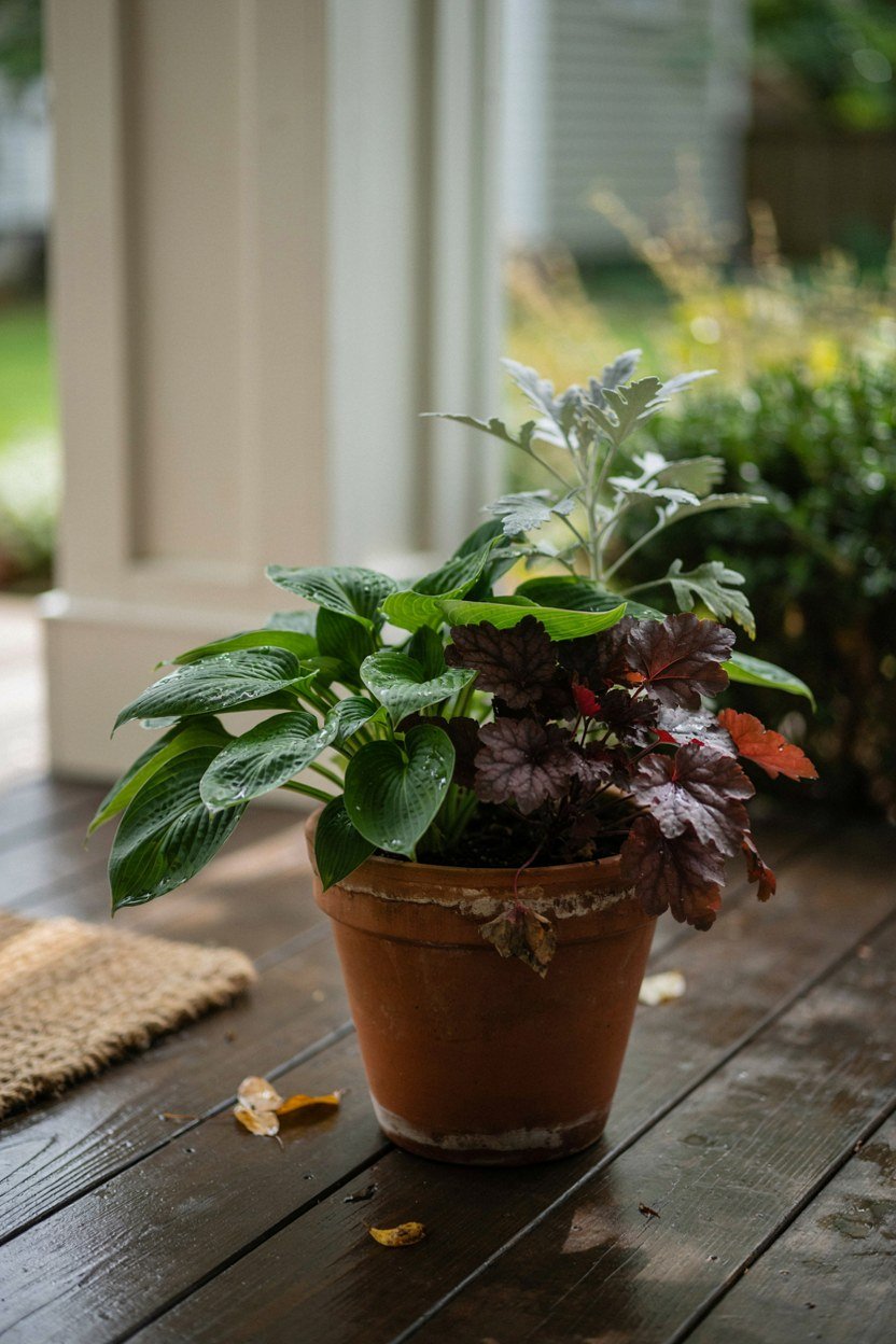
Deep green and burgundy foliage hold the mood, but pure dark planting disappears at dusk. One silver or lime plant fixes it.
Evergreens do the heavy lifting because a porch is seen all year. Skimmia, heuchera and dwarf pittosporum all sit well in shade.
Check how much sun the porch actually gets before buying. Most front porches are shadier than people assume, and sun lovers sulk there.
Feed containers through summer. Porch pots are seen daily and a tired plant undoes the whole entrance faster than peeling paint.
8. Lay A Textured Mat In A Pale Tone
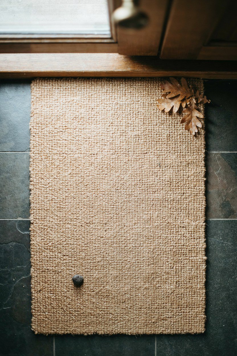
The mat is the pale note that keeps a dark porch from closing in. It also happens to be the most practical thing on it.
Coir, jute or a flat woven rubber all add texture that a painted floor lacks. Texture reads as warmth even in a dark palette.
Size it to the door width, not the doorstep. An undersized mat is the fastest way to make a good porch look cheap.
Keep a spare mat and rotate them. Washing one while the other is down means the porch never has a grubby mat on show.
9. Replace A Plastic Letter Plate
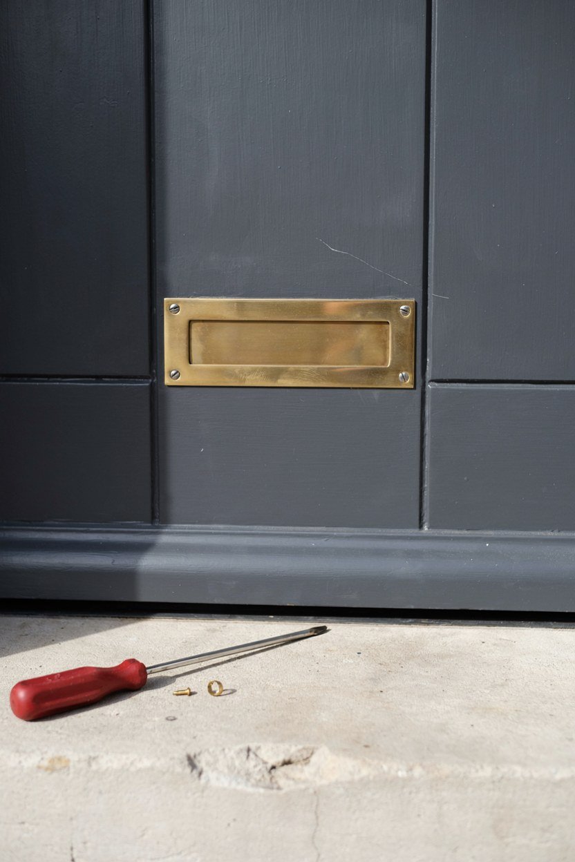
Nothing undoes a moody porch faster than a yellowed plastic letter plate. It is a small part in a very visible spot.
Swap it for the same metal as the handle. A brushed brass or matt black plate costs little and takes twenty minutes.
Check the flap seal while you are there. A draughty letter plate is a heat loss you can feel in the hallway.
Check the plate opening suits your post. Undersized flaps get forced and bent, and a bent flap never seals again.
10. Add A Bench Or Ledge If The Depth Allows
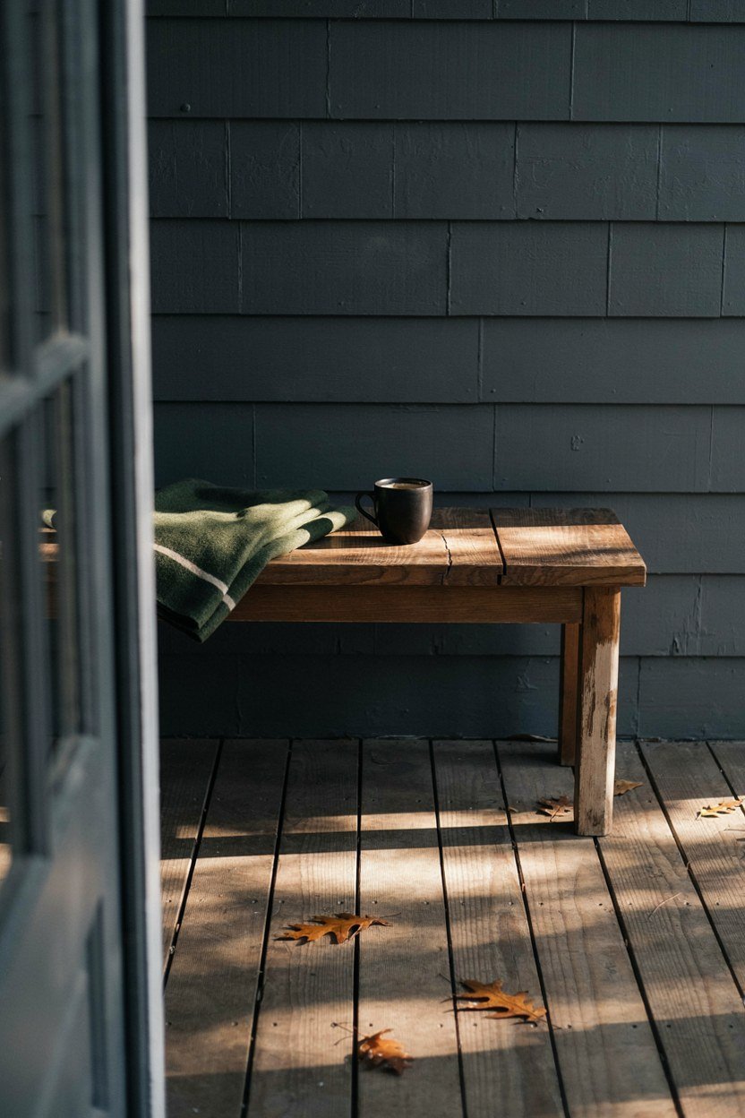
A porch with somewhere to put a bag reads as considered rather than decorative. Even twelve inches of ledge helps.
A narrow bench works if you have four feet of depth. Below that, a slim wall shelf beside the door does the same job.
Choose a material that handles weather. Powder coated steel and hardwood both survive; MDF and untreated softwood do not.
Leave walking room in front of the bench. A seat that narrows the approach gets moved within a month.
11. Treat The Floor As A Surface, Not An Afterthought
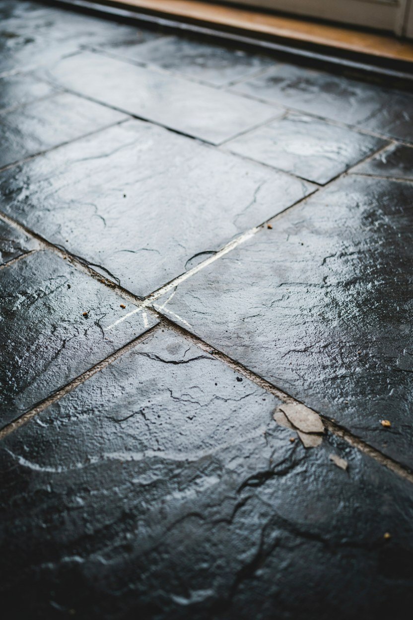
The floor is the largest single area on most porches and usually the most neglected. Dark slate, porcelain or a stained timber deck all suit the look.
Porch floor paint is the cheap route on concrete and it genuinely works, provided you prepare the surface properly.
Keep the pattern quiet. Busy tile fights the dark palette and pulls the eye down instead of towards the door.
Clean and degrease concrete before painting. Floor paint fails at the preparation stage far more often than at the product stage.
12. Frame The Entrance With Symmetry
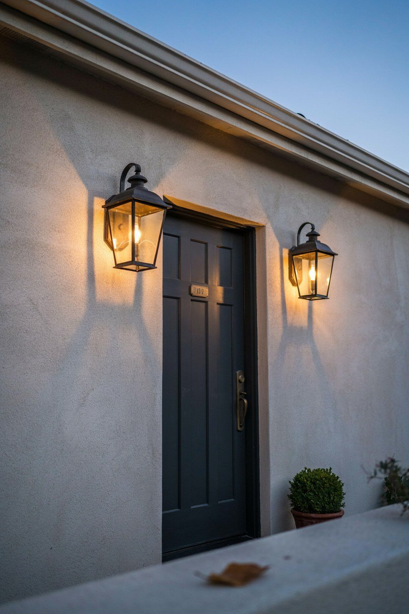
Symmetry does most of the work in making an entrance feel finished. A matched pair either side of the door reads as deliberate.
Two lanterns, two planters or two clipped shrubs all achieve it. You do not need all three, and using all three often looks fussy.
If the porch is genuinely asymmetric, lean into it instead. One tall element on the wider side balances the composition better than forcing a pair.
Stand back at the pavement to judge it. Symmetry that looks right on the step often reads differently from the street.
13. Hide The Bins And The Meter Box
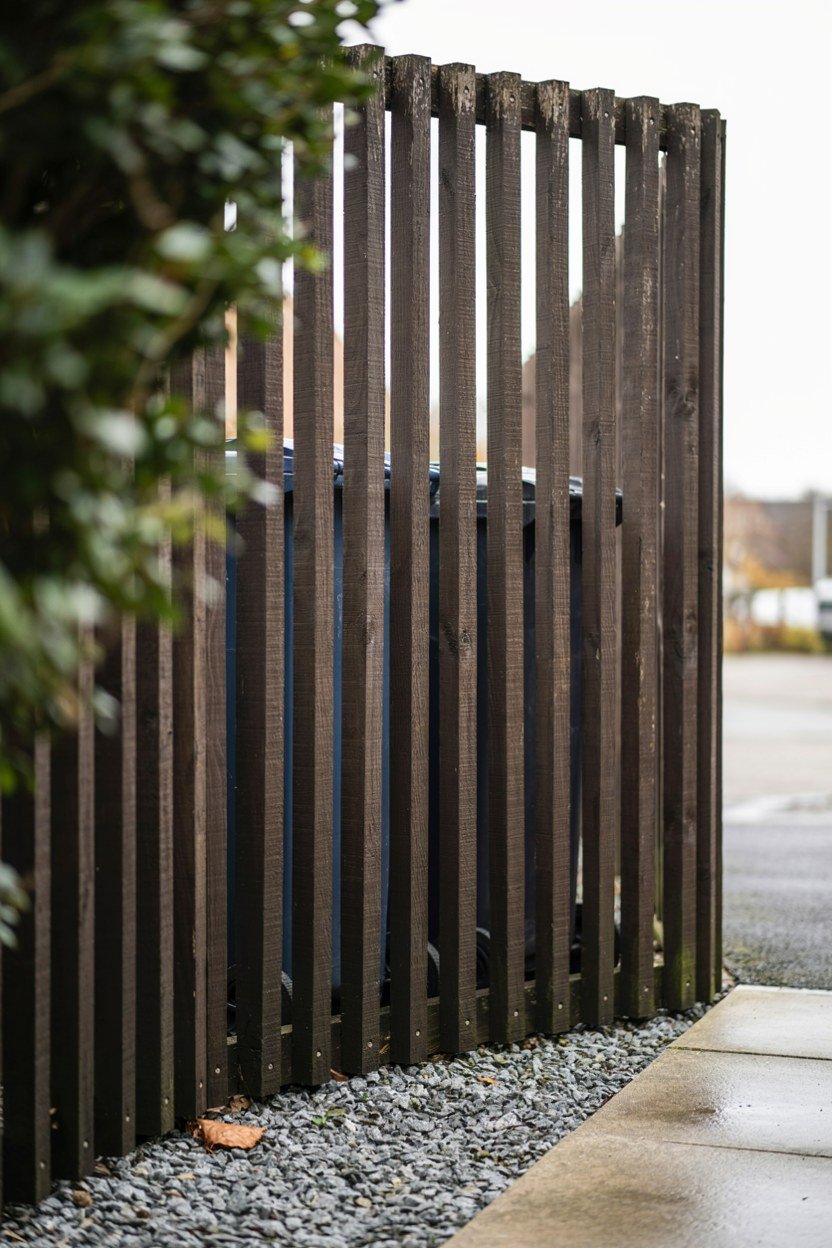
Nothing kills a moody entrance like a wheelie bin in shot. Screening is unglamorous and it changes the photo completely.
A slatted timber screen stained to match the door hides bins without looking like a barrier. Keep it lower than the door for proportion.
Meter boxes can be painted the wall colour. It will not vanish, but it stops being the first thing you notice.
Leave the meter accessible. Screening that has to be dismantled for a reading will not survive its first visit.
14. Add A Runner Or Stair Detail On Steps
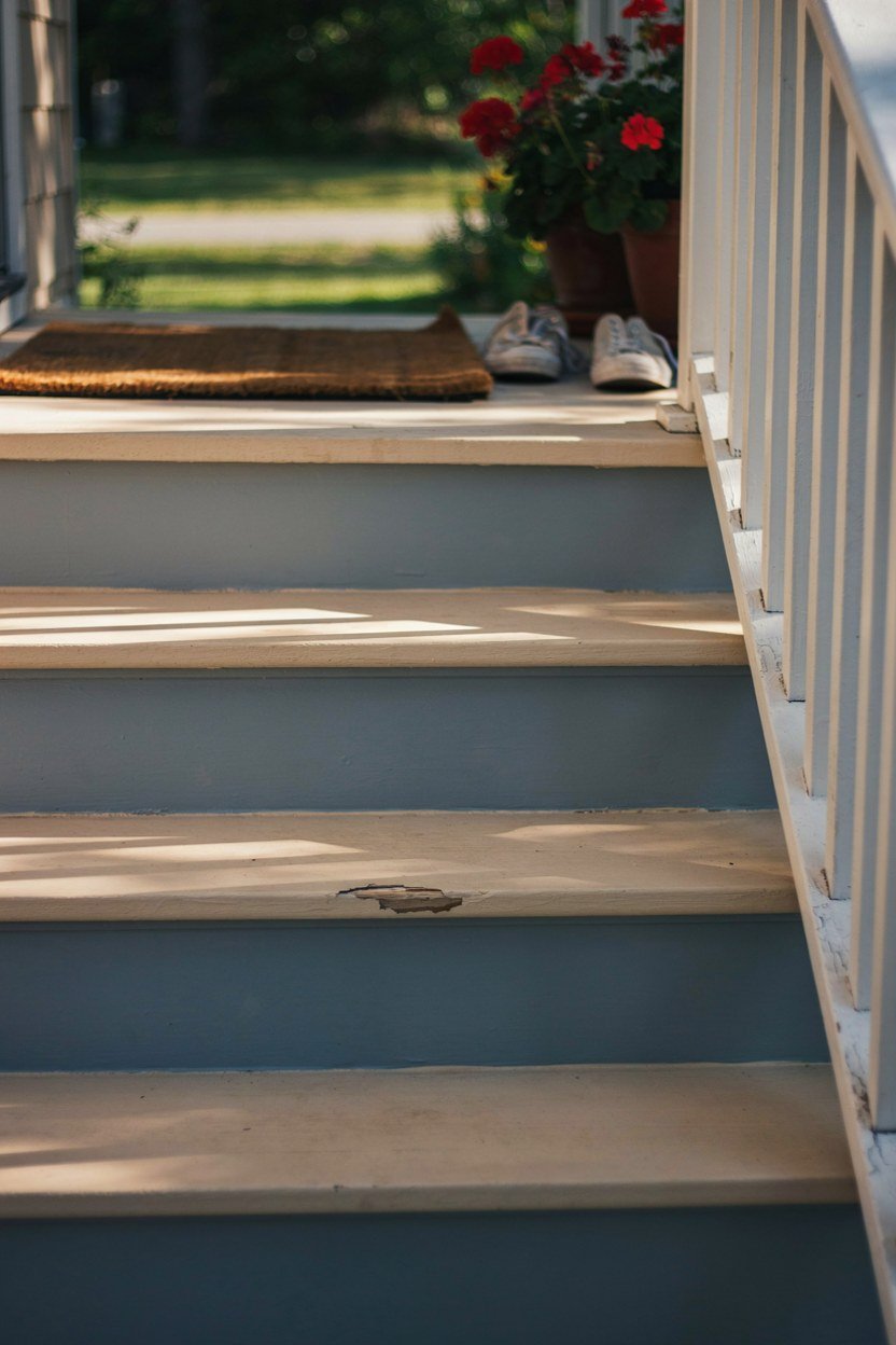
Steps are where a porch either looks finished or unresolved. A contrasting nosing or a painted riser gives them definition.
Painting risers a shade darker than the treads adds depth and hides scuffs. It also helps people judge the step in low light.
If the steps are wide, an outdoor runner in a natural fibre softens the approach. Fix it down properly, because a sliding runner on wet steps is a hazard.
Add grit to step paint if the porch faces weather. A painted step in the rain is slippery in a way bare concrete is not.
15. Keep A Seasonal Slot Rather Than Seasonal Clutter
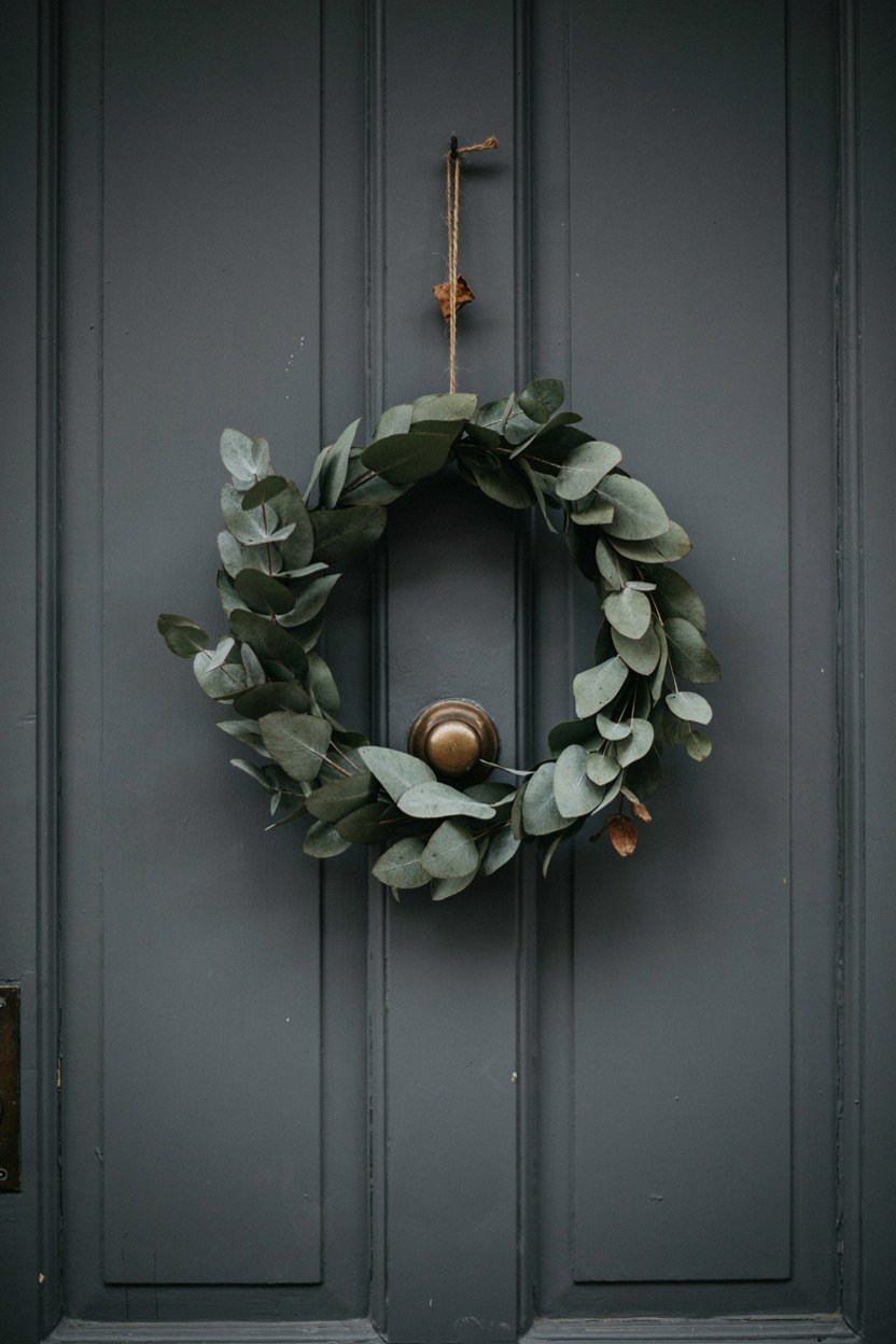
Decide in advance where seasonal things go, and keep it to one spot. Usually that is the planter or a hook beside the door.
One wreath or one seasonal plant is enough on a dark porch. The palette is doing the work already and additions compete with it.
Everything else goes away between seasons. A moody porch depends on restraint, and restraint is easier when you have chosen the slot in advance.
Store seasonal pieces somewhere dry and labelled. Half the reason porches get cluttered is that putting things away is inconvenient.
What A Moody Front Porch Costs To Put Together
Paint and hardware give the largest visible change for the least money. Lighting is next, and it is the one I would not economise on.
Flooring and joinery are the expensive end, and they can wait. A charcoal door with brass hardware and two warm lights already reads as a moody entrance.
Planting sits in the middle and improves on its own over a season or two. Buy fewer, larger plants and let them fill out.
| Upgrade | Impact | Rough Cost |
|---|---|---|
| Door paint and hardware | Highest, do this first | Low |
| Two warm light sources | Changes the mood most | Low to mid |
| Oversized numbers and letter plate | Small parts, very visible | Low |
| Planter and planting | Improves over time | Low to mid |
| Floor finish or paint | Large area, big lift | Mid |
| Bench, screening, step detail | Finishing touches | Mid |
Conclusion: Three Moves That Do Most Of The Work
If you only do three things, paint the door dark, put warm brass on it, and add a second light at a low level. That combination reads as moody from the street.
Then protect it with one pale element. A textured mat or a light ceiling stops the dark palette from tipping into gloom.
Everything else on this list refines what those three already established. A moody porch is a small set of confident decisions rather than a long list of purchases.
Frequently Asked Questions About Moody Front Porches
What colour makes the best moody front door?
Charcoal, ink blue and deep forest all work. Test swatches on the door itself and judge them at dusk rather than midday.
Will a dark porch make my entrance feel small?
Not if you keep one pale element and two warm lights. Darkness reads as small only when there is nothing for the eye to rest on.
What bulb temperature should a porch light be?
Warm, around 2200K to 2700K. Cool white makes brick and stone look grey and flattens the whole entrance.
Which plants suit a shaded moody porch?
Skimmia, heuchera and dwarf pittosporum all handle shade and hold colour year round. Add one silver or lime plant for contrast.
How big should house numbers be?
At least six inches on a modern entrance. Mount them on the wall beside the door so they stay readable when it is open.
Can I paint a concrete porch floor?
Yes, with proper masonry floor paint and thorough surface preparation. It is the cheapest way to change the largest area.
How do I stop a moody porch looking gloomy?
Contrast. One warm metal, one pale texture and two light sources at different heights keep depth in the scheme.